Get certified for free when you join Fabric Data Days 2026 and dive into Fabric, Power BI, SQL, AI, and other essential data skills.
Join nowJuly 28 - August 9 | Final Round of the Power BI Dataviz World Championships. This is your chance. Learn more
Hello,
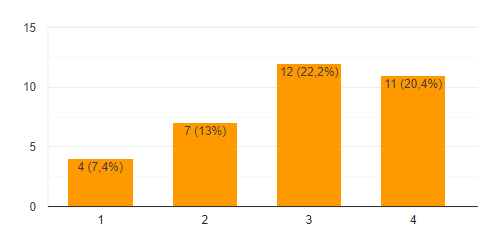
Is it possible to include both % and the value in a graph (like shown in below image) ?
Solved! Go to Solution.
hi, @Luukv93
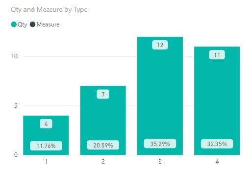
Power BI does not handle alternate or customer data labels very well but here is a hack that might work for you.
Make your chart a Line and Column Mixed chart put the Count on the Columns and PCT on the Line.
In the formatting panel
You get what you asked for but I don't really like the way its laid out - inconsitent placment sometime % is below the Value and other time above.
Best Regards,
Lin
hi, @Luukv93
Power BI does not handle alternate or customer data labels very well but here is a hack that might work for you.
Make your chart a Line and Column Mixed chart put the Count on the Columns and PCT on the Line.
In the formatting panel
You get what you asked for but I don't really like the way its laid out - inconsitent placment sometime % is below the Value and other time above.
Best Regards,
Lin
Hi Lin,
This hack works great! Thank you!
Join us in Barcelona for FabCon and SQLCon, the Fabric, Power BI, SQL, and AI community event. Save €200 with code FABCMTY200.
If you love stickers, then you will definitely want to check out our community sticker challenge, Barcelona edition!
Check out the July 2026 Power BI update to learn about new features.
| User | Count |
|---|---|
| 30 | |
| 28 | |
| 25 | |
| 24 | |
| 16 |
| User | Count |
|---|---|
| 48 | |
| 32 | |
| 17 | |
| 16 | |
| 16 |