A new Data Days event is coming soon!
This time we’re going bigger than ever. Fabric, Power BI, SQL, AI and more. We're covering it all. You won't want to miss it.
Learn more- Power BI forums
- Get Help with Power BI
- Desktop
- Service
- Report Server
- Power Query
- Mobile Apps
- Developer
- DAX Commands and Tips
- Custom Visuals Development Discussion
- Health and Life Sciences
- Power BI Spanish forums
- Translated Spanish Desktop
- Training and Consulting
- Instructor Led Training
- Dashboard in a Day for Women, by Women
- Galleries
- Data Stories Gallery
- Themes Gallery
- Contests Gallery
- QuickViz Gallery
- Quick Measures Gallery
- Visual Calculations Gallery
- Notebook Gallery
- Translytical Task Flow Gallery
- TMDL Gallery
- R Script Showcase
- Webinars and Video Gallery
- Ideas
- Custom Visuals Ideas (read-only)
- Issues
- Issues
- Events
- Upcoming Events
Level up your Power BI skills this month - build one visual each week and tell better stories with data! Get started
- Power BI forums
- Forums
- Get Help with Power BI
- Desktop
- Re: Resource Utilisation. Timeline of Total work h...
- Subscribe to RSS Feed
- Mark Topic as New
- Mark Topic as Read
- Float this Topic for Current User
- Bookmark
- Subscribe
- Printer Friendly Page
- Mark as New
- Bookmark
- Subscribe
- Mute
- Subscribe to RSS Feed
- Permalink
- Report Inappropriate Content
Power Query. Pivoting data and creating missing dates in between start and end dates
Hi,
I am building a staff utilisation dashboard.
I have a dataset with projects estimated start and end date. Each project is allocated to a project manager. An assumption is that a project manager should dedicate an even number of hours to a project per day (4.2)
| Project No | Start | End | Owner | available hours to work on project per day |
| 1 | 1/04/2020 | 30/07/2020 | Eunice | 4.2 |
| 2 | 1/04/2020 | 30/07/2020 | Ayla | 4.2 |
| 3 | 28/02/2020 | 30/05/2020 | Martin | 4.2 |
| 4 | 1/04/2020 | 30/10/2020 | Eunice | 4.2 |
| 5 | 1/05/2020 | 30/06/2020 | Ayla | 4.2 |
| 6 | 1/03/2020 | 30/06/2020 | Martin | 4.2 |
| 7 | 1/04/2020 | 30/06/2020 | Eunice | 4.2 |
| 8 | 1/04/2020 | 30/07/2020 | Ayla | 4.2 |
| 9 | 28/02/2020 | 30/05/2020 | Martin | 4.2 |
| 10 | 1/05/2020 | 30/06/2020 | Eunice | 4.2 |
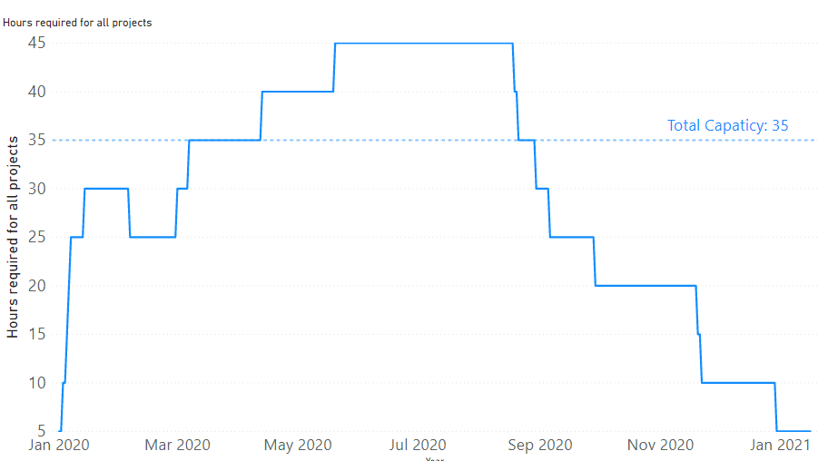
I need to be able to show how much capacity and workload we have got at any given point of time at aggragate level
The visual that I am after is something like that:
To build such visual the data should be in this layout:
| Date | Project | Name | Hours per day |
| 1/04/2020 | 1 | Eunice | 4.2 |
| 2/04/2020 | 1 | Eunice | 4.2 |
| 3/04/2020 | 1 | Eunice | 4.2 |
| … | |||
| 30/07/2020 | 1 | Eunice | 4.2 |
| 1/04/2020 | 2 | Ayla | 4.2 |
| 2/04/2020 | 2 | Ayla | 4.2 |
| 3/04/2020 | 2 | Ayla | 4.2 |
| 4/04/2020 | 2 | Ayla | 4.2 |
| … | |||
| 29/07/2020 | 2 | Ayla | 4.2 |
| 30/07/2020 | 2 | Ayla | 4.2 |
| …. |
Is there way to convert the original dataset into the final one that using PowerQuery? Or is there way to do that without creating missing rows with dates inbetween Start and End date of a project?
Solved! Go to Solution.
- Mark as New
- Bookmark
- Subscribe
- Mute
- Subscribe to RSS Feed
- Permalink
- Report Inappropriate Content
I have figured out how to do that by creating a "list" of a ranges of values between two dates in Power Query:
Dates = { Number.From([Start])..Number.From([End]) }
Then, I expanded the list to new rows and created duplicate lines with project id, names and hours for each day of a project.
- Mark as New
- Bookmark
- Subscribe
- Mute
- Subscribe to RSS Feed
- Permalink
- Report Inappropriate Content
This is very difficult to read.
Follow on LinkedIn
@ me in replies or I'll lose your thread!!!
Instead of a Kudo, please vote for this idea
Become an expert!: Enterprise DNA
External Tools: MSHGQM
YouTube Channel!: Microsoft Hates Greg
Latest book!: DAX For Humans
DAX is easy, CALCULATE makes DAX hard...
- Mark as New
- Bookmark
- Subscribe
- Mute
- Subscribe to RSS Feed
- Permalink
- Report Inappropriate Content
- Mark as New
- Bookmark
- Subscribe
- Mute
- Subscribe to RSS Feed
- Permalink
- Report Inappropriate Content
I have figured out how to do that by creating a "list" of a ranges of values between two dates in Power Query:
Dates = { Number.From([Start])..Number.From([End]) }
Then, I expanded the list to new rows and created duplicate lines with project id, names and hours for each day of a project.
Helpful resources

Power BI Monthly Update - April 2026
Check out the April 2026 Power BI update to learn about new features.

Data Days 2026 coming soon!
Sign up to receive a private message when registration opens and key events begin.

New to Fabric Survey
If you have recently started exploring Fabric, we'd love to hear how it's going. Your feedback can help with product improvements.

| User | Count |
|---|---|
| 35 | |
| 32 | |
| 26 | |
| 21 | |
| 18 |
| User | Count |
|---|---|
| 68 | |
| 36 | |
| 32 | |
| 25 | |
| 23 |

