cancel
Showing results for 
Search instead for 
Did you mean: 

July 7 - July 17 | Round 2 of the Power BI Dataviz World Championships. Don't miss your chance! Learn more

Reply
EXCHD
Frequent Visitor

Power Query. Pivoting data and creating missing dates in between start and end dates

Hi,

I am building a staff utilisation dashboard.


I have a dataset with projects estimated start and end date. Each project is allocated to a project manager.  An assumption is that a project manager should dedicate an even number of hours to a project per day (4.2)


Project NoStartEndOwneravailable hours to work on project per day
11/04/202030/07/2020Eunice4.2
21/04/202030/07/2020Ayla4.2
328/02/202030/05/2020Martin4.2
41/04/202030/10/2020Eunice4.2
51/05/202030/06/2020Ayla4.2
61/03/202030/06/2020Martin4.2
71/04/202030/06/2020Eunice4.2
81/04/202030/07/2020Ayla4.2
928/02/202030/05/2020Martin4.2
101/05/202030/06/2020Eunice4.2


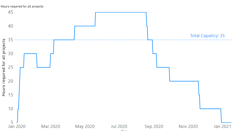
I need to be able to show how much capacity and workload we have got at any given point of time at aggragate level

The visual that I am after is something like that:

graph.PNG

To build such visual the data should be in this layout: 

DateProjectNameHours per day
1/04/20201Eunice4.2
2/04/20201Eunice4.2
3/04/20201Eunice4.2
   
30/07/20201Eunice4.2
1/04/20202Ayla4.2
2/04/20202Ayla4.2
3/04/20202Ayla4.2
4/04/20202Ayla4.2
   
29/07/20202Ayla4.2
30/07/20202Ayla4.2
….   


Is there way to convert the original dataset into the final one that using PowerQuery? Or is there way to do that without creating missing rows with dates inbetween Start and End date of a project?


1 ACCEPTED SOLUTION
EXCHD
Frequent Visitor

I have figured out how to do that by creating a "list" of a ranges of values between two dates in Power Query:

Dates = { Number.From([Start])..Number.From([End]) }


Then, I expanded the list to new rows and created duplicate lines with project id, names and hours for each day of a project.


View solution in original post

3 REPLIES 3
Greg_Deckler
Community Champion
Community Champion

This is very difficult to read.


Follow on LinkedIn
@ me in replies or I'll lose your thread!!!
Instead of a Kudo, please vote for this idea
Become an expert!: Enterprise DNA
External Tools: MSHGQM
YouTube Channel!: Microsoft Hates Greg
Latest book!:
DAX For Humans

DAX is easy, CALCULATE makes DAX hard...

Fixed the formatting. Hope it is easier to read now. Please tell me if not clear I can try to explain better what I need
EXCHD
Frequent Visitor

I have figured out how to do that by creating a "list" of a ranges of values between two dates in Power Query:

Dates = { Number.From([Start])..Number.From([End]) }


Then, I expanded the list to new rows and created duplicate lines with project id, names and hours for each day of a project.


Helpful resources

Announcements
FabCon and SQLCon Barcelona 2026

FabCon & SQLCon – Barcelona 2026

Join us in Barcelona for FabCon and SQLCon, the Fabric, Power BI, SQL, and AI community event. Save €200 with code FABCMTY200.

Fabric Community Sticker Design Challenge Barcelona Carousel

Fabric Community Sticker Challenge - Barcelona 2026

If you love stickers, then you will definitely want to check out our community sticker challenge, Barcelona edition!

July Power BI Update Carousel

Power BI Monthly Update - July 2026

Check out the July 2026 Power BI update to learn about new features.

Power BI DataViz World Championships carousel

Power BI DataViz World Championships - June 2026

A new Power BI DataViz World Championship is coming this June! Don't miss out on submitting your entry.

Top Solution Authors