FabCon is coming to Atlanta
Join us at FabCon Atlanta from March 16 - 20, 2026, for the ultimate Fabric, Power BI, AI and SQL community-led event. Save $200 with code FABCOMM.
Register now!- Power BI forums
- Get Help with Power BI
- Desktop
- Service
- Report Server
- Power Query
- Mobile Apps
- Developer
- DAX Commands and Tips
- Custom Visuals Development Discussion
- Health and Life Sciences
- Power BI Spanish forums
- Translated Spanish Desktop
- Training and Consulting
- Instructor Led Training
- Dashboard in a Day for Women, by Women
- Galleries
- Data Stories Gallery
- Themes Gallery
- Contests Gallery
- QuickViz Gallery
- Quick Measures Gallery
- Visual Calculations Gallery
- Notebook Gallery
- Translytical Task Flow Gallery
- TMDL Gallery
- R Script Showcase
- Webinars and Video Gallery
- Ideas
- Custom Visuals Ideas (read-only)
- Issues
- Issues
- Events
- Upcoming Events
Learn from the best! Meet the four finalists headed to the FINALS of the Power BI Dataviz World Championships! Register now
- Power BI forums
- Forums
- Get Help with Power BI
- Desktop
- Pie Chart Separating Values in Same Row
- Subscribe to RSS Feed
- Mark Topic as New
- Mark Topic as Read
- Float this Topic for Current User
- Bookmark
- Subscribe
- Printer Friendly Page
- Mark as New
- Bookmark
- Subscribe
- Mute
- Subscribe to RSS Feed
- Permalink
- Report Inappropriate Content
Pie Chart Separating Values in Same Row
This is the data columns i have in Power BI:
Client ID | Manufacturer |
223 | Honda |
345 | Kia |
777 | VW, Seat |
696 | Seat |
122 | Honda, Kia, VW |
009 | Kia, Seat |
845 | VW |
123 | Honda, Seat |
321 | Kia, Seat |
As you can see, there are some "Manufacturers" that have multiple values in them.
I need to create a pie chart that shows the total manufacturers selected individually. Meaning that if Cliend ID: "122" has Honda, Kia, and VW then thats a selection for each one and should show individually in the pie chart. If i create a pie chart right now with the data i have then the key would show "Honda, Kia, VW" as one when it should be separated.
Final outcome i would like:
Key:
Manufacturer | Count |
Honda | 3 |
Kia | 4 |
VW | 3 |
Seat | 5 |
The next step after getting the above, or maybe should do this from the start, would be for the key to show the overall percentage instead of the individual count. So in this case if the total count is 15 then i need to divide each count by 15, but i would need to have a calculation to sum all the manufacturers.
Solved! Go to Solution.
- Mark as New
- Bookmark
- Subscribe
- Mute
- Subscribe to RSS Feed
- Permalink
- Report Inappropriate Content
Hi @clim2f88j
To achieve your first goal please follow next steps:
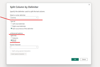
1. In PQ you need to extract your rows with values to different rows as split by comma as shown at the pictures :
2. You need to Trim the column of manufacturer :
3. Just "close and apply" and put it on your pie chart
****
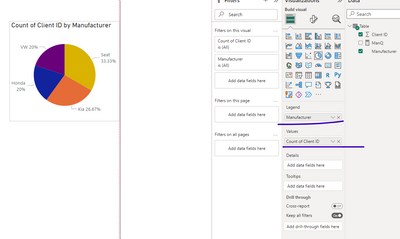
In terms of data visualization, this type of graph is ineffective and even incorrect for two reasons.
In the first place, our brain is unable to calculate the areas of segments
A second and more critical point is that you don't show one part of the whole here. Instead, you rank the parts based on their dominance (percent of all).
Therefore, I recommend switching to a bar chart, as shown in the image.
If this post helps, then please consider Accepting it as the solution to help the other members find it more quickly
Rita Fainshtein | Microsoft MVP
https://www.linkedin.com/in/rita-fainshtein/
Blog : https://www.madeiradata.com/profile/ritaf/profile
- Mark as New
- Bookmark
- Subscribe
- Mute
- Subscribe to RSS Feed
- Permalink
- Report Inappropriate Content
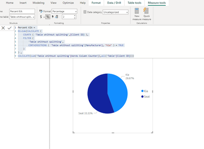
Hi @clim2f88j you can use "calculate" for this purpose.
But that means, you need to create separate measures for every manufacturer.
Please Follow this step if that is your desire:
1. Add Column to count words of your manufacturers : ( you will need it for your "ALL")
2. Than count percent of every manufacturer by formula:
Then you need to put these measures separately.
I have updated the Sample file again.
Here is a link
If this post helps, then please consider Accepting it as the solution to help the other members find it more quickly
Rita Fainshtein | Microsoft MVP
https://www.linkedin.com/in/rita-fainshtein/
Blog : https://www.madeiradata.com/profile/ritaf/profile
- Mark as New
- Bookmark
- Subscribe
- Mute
- Subscribe to RSS Feed
- Permalink
- Report Inappropriate Content
Hi @clim2f88j
To achieve your first goal please follow next steps:
1. In PQ you need to extract your rows with values to different rows as split by comma as shown at the pictures :
2. You need to Trim the column of manufacturer :
3. Just "close and apply" and put it on your pie chart
****
In terms of data visualization, this type of graph is ineffective and even incorrect for two reasons.
In the first place, our brain is unable to calculate the areas of segments
A second and more critical point is that you don't show one part of the whole here. Instead, you rank the parts based on their dominance (percent of all).
Therefore, I recommend switching to a bar chart, as shown in the image.
If this post helps, then please consider Accepting it as the solution to help the other members find it more quickly
Rita Fainshtein | Microsoft MVP
https://www.linkedin.com/in/rita-fainshtein/
Blog : https://www.madeiradata.com/profile/ritaf/profile
- Mark as New
- Bookmark
- Subscribe
- Mute
- Subscribe to RSS Feed
- Permalink
- Report Inappropriate Content
Your solution is not complete, You are showing duplicates for manufacturers. That is why your Pie Chart is too clumpsy
- Mark as New
- Bookmark
- Subscribe
- Mute
- Subscribe to RSS Feed
- Permalink
- Report Inappropriate Content
Hi @Thejeswar
I appreciate you bringing to my attention the lack of "TRIM".
Corrections have been made to the solution and sample file.
. It does not change the fact that a pie chart is incorrect in the above example.
In data visualization, there is no such thing as "is too clumsy".
Pie charts show a part of the whole.
It was right if the question was which part of the whole is the seat.
The pie becomes an effective graph when there is a comparison of several parts.
Since ranking is a vertical comparison made by our brain, and a percent is just a unit of comparison
Rita Fainshtein | Microsoft MVP
https://www.linkedin.com/in/rita-fainshtein/
Blog : https://www.madeiradata.com/profile/ritaf/profile
- Mark as New
- Bookmark
- Subscribe
- Mute
- Subscribe to RSS Feed
- Permalink
- Report Inappropriate Content
Haven't tried it yet but this seems easy to follow.
Follow up question: My data is connected to SharePoint, therefore each time i refresh it its updated or new data added. Are there any issues with adding columns in PQ like this? Will it affect the excisting data when i refresh? Will the new incoming data be split as well?
Thank you!
- Mark as New
- Bookmark
- Subscribe
- Mute
- Subscribe to RSS Feed
- Permalink
- Report Inappropriate Content
Hi @clim2f88j
A POWER QUERY's steps are recorded in the file's memory (similar to macro recordings and other automations).
Refreshing the report causes them to be redone.
As a result, any new rows that are pulled from your data source will be processed exactly the same way as the existing rows.
I hope this information was helpful
Rita:)
Rita Fainshtein | Microsoft MVP
https://www.linkedin.com/in/rita-fainshtein/
Blog : https://www.madeiradata.com/profile/ritaf/profile
- Mark as New
- Bookmark
- Subscribe
- Mute
- Subscribe to RSS Feed
- Permalink
- Report Inappropriate Content
So the issue i ran into by splitting the column by delimeter is that now i will have "duplicate" records. This will affect all my other pages and graphs i have since it will think i have more results in the PQ that it should.
Is there a way in the chart to do a DAX, similar as an Excel formula where if "countif" contains *specific manufacturer* then provide that total?
- Mark as New
- Bookmark
- Subscribe
- Mute
- Subscribe to RSS Feed
- Permalink
- Report Inappropriate Content
Hi @clim2f88j you can use "calculate" for this purpose.
But that means, you need to create separate measures for every manufacturer.
Please Follow this step if that is your desire:
1. Add Column to count words of your manufacturers : ( you will need it for your "ALL")
2. Than count percent of every manufacturer by formula:
Then you need to put these measures separately.
I have updated the Sample file again.
Here is a link
If this post helps, then please consider Accepting it as the solution to help the other members find it more quickly
Rita Fainshtein | Microsoft MVP
https://www.linkedin.com/in/rita-fainshtein/
Blog : https://www.madeiradata.com/profile/ritaf/profile
- Mark as New
- Bookmark
- Subscribe
- Mute
- Subscribe to RSS Feed
- Permalink
- Report Inappropriate Content
So what i did instead is, i duplicated the main query and split my column there. Then i used the query with the split column to create the chart. It's working fine, so let me know if you see an issue with doing this.
- Mark as New
- Bookmark
- Subscribe
- Mute
- Subscribe to RSS Feed
- Permalink
- Report Inappropriate Content
Hi @clim2f88j ,
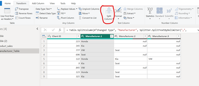
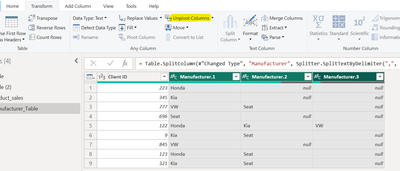
1. Select the Manufacturer Column and Use Split by Delimter to split the entries ("Comma" delimiter to be use with each occurence"
2. Post which the data would look like this
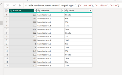
3. Now, select the 3 manufacturer columns and click on Unpivot Columns as shown below
4. After doing step 3, this is how the table will look
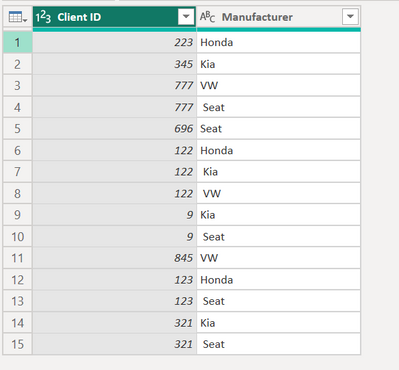
5. Remove the Attribute column and rename Value to Manufacturer. PFB the screenshot for the same
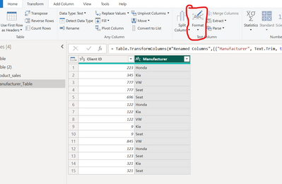
6. Select the Manufacturer Column and Trim it using the Format Drop Down to remove any unwanted spaces in the names. This will help iwth grouping the column for getting the count and percentage
7. Get the Count of Manufacturer using the below measure

If this helps, mark it as solution to help others. You can appreciate with a Kudo!
Regards,
Helpful resources

Join our Fabric User Panel
Share feedback directly with Fabric product managers, participate in targeted research studies and influence the Fabric roadmap.

Power BI Monthly Update - February 2026
Check out the February 2026 Power BI update to learn about new features.

| User | Count |
|---|---|
| 53 | |
| 51 | |
| 36 | |
| 15 | |
| 14 |
| User | Count |
|---|---|
| 93 | |
| 77 | |
| 41 | |
| 26 | |
| 26 |


