FabCon is coming to Atlanta
Join us at FabCon Atlanta from March 16 - 20, 2026, for the ultimate Fabric, Power BI, AI and SQL community-led event. Save $200 with code FABCOMM.
Register now!- Power BI forums
- Get Help with Power BI
- Desktop
- Service
- Report Server
- Power Query
- Mobile Apps
- Developer
- DAX Commands and Tips
- Custom Visuals Development Discussion
- Health and Life Sciences
- Power BI Spanish forums
- Translated Spanish Desktop
- Training and Consulting
- Instructor Led Training
- Dashboard in a Day for Women, by Women
- Galleries
- Data Stories Gallery
- Themes Gallery
- Contests Gallery
- QuickViz Gallery
- Quick Measures Gallery
- Visual Calculations Gallery
- Notebook Gallery
- Translytical Task Flow Gallery
- TMDL Gallery
- R Script Showcase
- Webinars and Video Gallery
- Ideas
- Custom Visuals Ideas (read-only)
- Issues
- Issues
- Events
- Upcoming Events
The Power BI Data Visualization World Championships is back! Get ahead of the game and start preparing now! Learn more
- Power BI forums
- Forums
- Get Help with Power BI
- Desktop
- Re: Percentage based bar chart?
- Subscribe to RSS Feed
- Mark Topic as New
- Mark Topic as Read
- Float this Topic for Current User
- Bookmark
- Subscribe
- Printer Friendly Page
- Mark as New
- Bookmark
- Subscribe
- Mute
- Subscribe to RSS Feed
- Permalink
- Report Inappropriate Content
Percentage based bar chart?
I would like to make bar chart where customersatisfaction is based on percentage so that it is scaled based on max value.
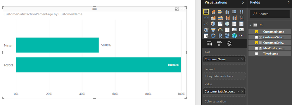
So Toyota have 100% satisfaction and Nissan 50%.
CustomerName, TimeStamp, CustomerSatisfaction
Nissan, 2016-12-1, 65
Toyota, 2016-12-1, 130
How to do?
Solved! Go to Solution.
- Mark as New
- Bookmark
- Subscribe
- Mute
- Subscribe to RSS Feed
- Permalink
- Report Inappropriate Content
Hi @Anonymous,
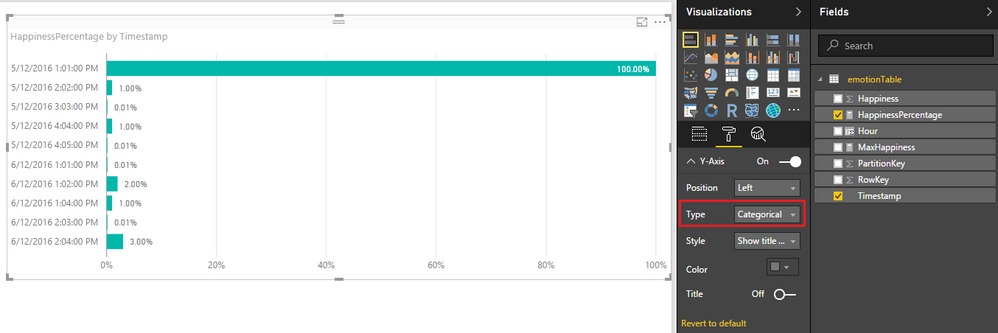
I have tested it on my side, your formula works fine for me. Note: make sure you have change the Type of Y-Axis to Categorital in Format tab for the bar Chart.![]()
Here is the sample pbix file for your reference.
Regards
- Mark as New
- Bookmark
- Subscribe
- Mute
- Subscribe to RSS Feed
- Permalink
- Report Inappropriate Content
You have to create 2 measures . 1 measure to find the max value and 2 nd measure to divide with the max value
1. MaxCustomer Satisfaction = CALCULATE(MAX(CS[Customer Satisfaction]),ALL(CS[Customer Name]))
2. CustomerSatisfactionPercentage = DIVIDE(SUM(CS[Customer Satisfaction]),[MaxCustomerSatisfaction])
- Mark as New
- Bookmark
- Subscribe
- Mute
- Subscribe to RSS Feed
- Permalink
- Report Inappropriate Content
I tried, but not looking good.
Is it so that purpose of MaxCustomerSatisfaction is add value "130" to each row as reference value? (basically highest value of all)
And is it so that purpose of CustomerSatisfactionpercentage is show percentage of the row compared to MaxCustomerSatisfaction like 100% or 50%
What I see is that MaxCustomerSatisfaction value for each row is varying and highest value is 1.
- Mark as New
- Bookmark
- Subscribe
- Mute
- Subscribe to RSS Feed
- Permalink
- Report Inappropriate Content
Hi @Anonymous,
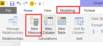
The formulas provided by Thiyags should work. You should use the formulas to create two measures instead of calculate column.
Here is the sample pbix file for your reference.![]()
Regards
- Mark as New
- Bookmark
- Subscribe
- Mute
- Subscribe to RSS Feed
- Permalink
- Report Inappropriate Content
Sorry. You advice seems to be very correct. But could not apply as I used to simple scenario.
This is the real case.
emotionTable
PartitionKey, RowKey, Timestamp, Happiness
000000000001,1, 05/12/2016 13:01:01, 0,9999
000000000002,2, 05/12/2016 14:02:01, 0,0100
000000000003,3, 05/12/2016 15:03:01, 0,0001
000000000004,4, 05/12/2016 16:04:01, 0,0100
000000000005,5, 05/12/2016 16:05:01, 0,0001
000000000006,6, 06/12/2016 13:01:01, 0,0001
000000000007,7, 06/12/2016 13:02:01, 0,0200
000000000008,8, 06/12/2016 14:03:01, 0,0001
000000000009,9, 06/12/2016 14:04:01, 0,0300
0000000000010,10, 06/12/2016 13:04:01, 0,0100
Measures:
MaxHappiness = CALCULATE(MAX(emotionTable[Content.Happiness]),ALL(emotionTable[Timestamp]))
HappinessPercentage = DIVIDE(SUM(emotionTable[Content.Happiness]),[MaxHappiness])
I expected that all bar in chart in MaxHappines would be 0,999(row1) to be used as referenced value.
But what I see is all bars showing value 1.0. Obviouly something wrong with my MaxHappiness measure.
Target raports:
1) I see happiness percentage per timestamp. (Tells happiness by moment)
2) I see happiness average happiness percentage by hour. (I see happiness level by hour)
- Mark as New
- Bookmark
- Subscribe
- Mute
- Subscribe to RSS Feed
- Permalink
- Report Inappropriate Content
Hi @Anonymous,
I have tested it on my side, your formula works fine for me. Note: make sure you have change the Type of Y-Axis to Categorital in Format tab for the bar Chart.![]()
Here is the sample pbix file for your reference.
Regards
Helpful resources

Power BI Dataviz World Championships
The Power BI Data Visualization World Championships is back! Get ahead of the game and start preparing now!

| User | Count |
|---|---|
| 39 | |
| 37 | |
| 33 | |
| 32 | |
| 29 |
| User | Count |
|---|---|
| 132 | |
| 88 | |
| 82 | |
| 68 | |
| 64 |


