FabCon is coming to Atlanta
Join us at FabCon Atlanta from March 16 - 20, 2026, for the ultimate Fabric, Power BI, AI and SQL community-led event. Save $200 with code FABCOMM.
Register now!- Power BI forums
- Get Help with Power BI
- Desktop
- Service
- Report Server
- Power Query
- Mobile Apps
- Developer
- DAX Commands and Tips
- Custom Visuals Development Discussion
- Health and Life Sciences
- Power BI Spanish forums
- Translated Spanish Desktop
- Training and Consulting
- Instructor Led Training
- Dashboard in a Day for Women, by Women
- Galleries
- Data Stories Gallery
- Themes Gallery
- Contests Gallery
- Quick Measures Gallery
- Visual Calculations Gallery
- Notebook Gallery
- Translytical Task Flow Gallery
- TMDL Gallery
- R Script Showcase
- Webinars and Video Gallery
- Ideas
- Custom Visuals Ideas (read-only)
- Issues
- Issues
- Events
- Upcoming Events
Calling all Data Engineers! Fabric Data Engineer (Exam DP-700) live sessions are back! Starting October 16th. Sign up.
- Power BI forums
- Forums
- Get Help with Power BI
- Desktop
- Output is different from R script and plot generat...
- Subscribe to RSS Feed
- Mark Topic as New
- Mark Topic as Read
- Float this Topic for Current User
- Bookmark
- Subscribe
- Printer Friendly Page
- Mark as New
- Bookmark
- Subscribe
- Mute
- Subscribe to RSS Feed
- Permalink
- Report Inappropriate Content
Output is different from R script and plot generated by Power BI in Power BI
Hello BI developers,
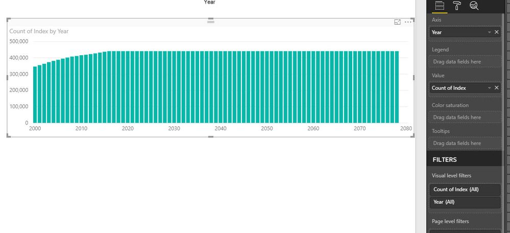
I came across a strage situation which does not make sense. I am sure I am doing somethign wrong but I cannot figure it out. I have a dataset (very huge) and need to do some visulisation. I need to some part in R to make the life easier, but the outputs are different even for the simpleset scanrio which is counting the rows. I have added an Index (auto increment) from Power BI to avoid any possible removal of duplicate rows.
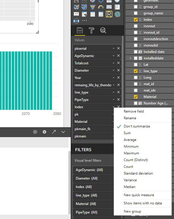
All the values in the R script have "Don't summarize", but still the values (the count) are different. Please see the screenshots. If you need more information please let me know.
library(sqldf)
library(ggplot2)

options(scipen=999)
datas=sqldf("select count() as tc, Year from dataset group by Year ")
ggplot(datas, aes(x = Year, y = tc)) +  geom_line()
Solved! Go to Solution.
- Mark as New
- Bookmark
- Subscribe
- Mute
- Subscribe to RSS Feed
- Permalink
- Report Inappropriate Content
Hi @mohsenhs82,
I can reproduce the same result. But I'm afraid this is a limitation of R visual in Power BI. Please refer to desktop-r-visuals#known-limitations. If I reduce the size of data to less than 150000, it's good.
Best Regards,
Dale
If this post helps, then please consider Accept it as the solution to help the other members find it more quickly.
- Mark as New
- Bookmark
- Subscribe
- Mute
- Subscribe to RSS Feed
- Permalink
- Report Inappropriate Content
Thank you Dale,
I see, when I plotted the total number of rows in my R scipt I saw 150k. I was suprised as I have millions of records. so this is the limitation. what a shame, but at least I know, and thanks for the link too.
Thanks
M
Helpful resources

FabCon Global Hackathon
Join the Fabric FabCon Global Hackathon—running virtually through Nov 3. Open to all skill levels. $10,000 in prizes!

Power BI Monthly Update - October 2025
Check out the October 2025 Power BI update to learn about new features.


