Get certified for free when you join Fabric Data Days 2026 and dive into Fabric, Power BI, SQL, AI, and other essential data skills.
Join nowJuly 28 - August 9 | Final Round of the Power BI Dataviz World Championships. This is your chance. Learn more
Hello,
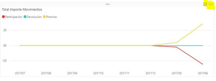
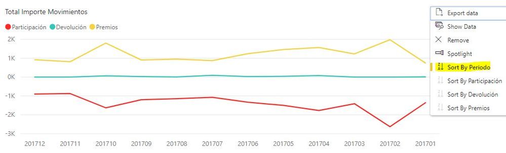
I have an issue ordering the axis on the following visualizations:
Both visualizations are the same type and the information displayed is from the same table.
Now, Is there a way or a property which could be set for ordering the Axis data?, as I am working in a DirectMode query the "Sort by Column" option from the Modeling menu is not avalaible.
Any help is appreciated.
BR
Solved! Go to Solution.
Hello @Anonymous , thanks for your recomendation.
I did not notice the options of the chart on the 3 dots, I supposed it was a configuration defined at the format or value properties of the visualization.
But looking at the options of the chart:
About the last statement, I guess is a limitation of this "visualization", to me is easier to read from de lowest value to the left to the higuest to the right.
If you love stickers, then you will definitely want to check out our community sticker challenge, Barcelona edition!
Check out the July 2026 Power BI update to learn about new features.
| User | Count |
|---|---|
| 30 | |
| 28 | |
| 23 | |
| 21 | |
| 19 |
| User | Count |
|---|---|
| 40 | |
| 31 | |
| 18 | |
| 18 | |
| 15 |