A new Data Days event is coming soon!
This time we’re going bigger than ever. Fabric, Power BI, SQL, AI and more. We're covering it all. You won't want to miss it.
Learn more- Power BI forums
- Get Help with Power BI
- Desktop
- Service
- Report Server
- Power Query
- Mobile Apps
- Developer
- DAX Commands and Tips
- Custom Visuals Development Discussion
- Health and Life Sciences
- Power BI Spanish forums
- Translated Spanish Desktop
- Training and Consulting
- Instructor Led Training
- Dashboard in a Day for Women, by Women
- Galleries
- Data Stories Gallery
- Themes Gallery
- Contests Gallery
- QuickViz Gallery
- Quick Measures Gallery
- Visual Calculations Gallery
- Notebook Gallery
- Translytical Task Flow Gallery
- TMDL Gallery
- R Script Showcase
- Webinars and Video Gallery
- Ideas
- Custom Visuals Ideas (read-only)
- Issues
- Issues
- Events
- Upcoming Events
Did you hear? There's a new SQL AI Developer certification (DP-800). Start preparing now and be one of the first to get certified. Register now
- Power BI forums
- Forums
- Get Help with Power BI
- Desktop
- Re: Matrix - Display Values above Columns
- Subscribe to RSS Feed
- Mark Topic as New
- Mark Topic as Read
- Float this Topic for Current User
- Bookmark
- Subscribe
- Printer Friendly Page
- Mark as New
- Bookmark
- Subscribe
- Mute
- Subscribe to RSS Feed
- Permalink
- Report Inappropriate Content
Matrix - Display Values above Columns
Hello,
We have a basic matrix with columns, rows and values. We would like the values to appear ABOVE the columns. Right now it only displays the opposite -- values BELOW the columns. How can this be fixed? This works very easily in Tableau and Excel Pivot Tables.
Please see screenshots below of incorrect version (Power BI) and correct version (Tableau).
Thanks,
Dan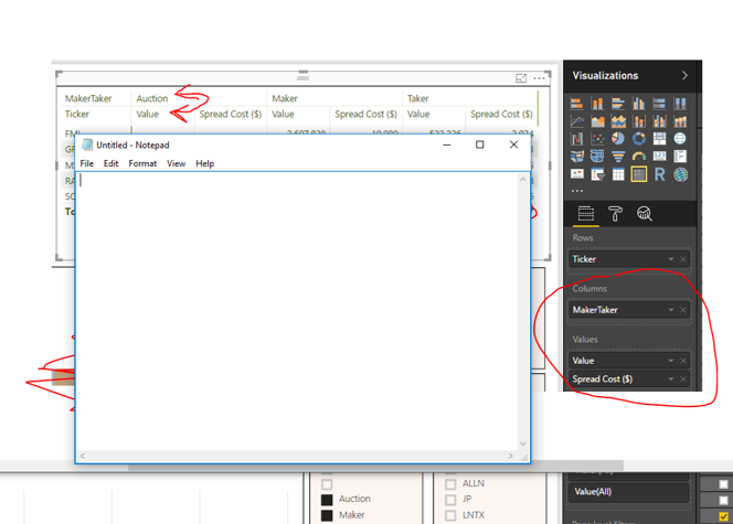
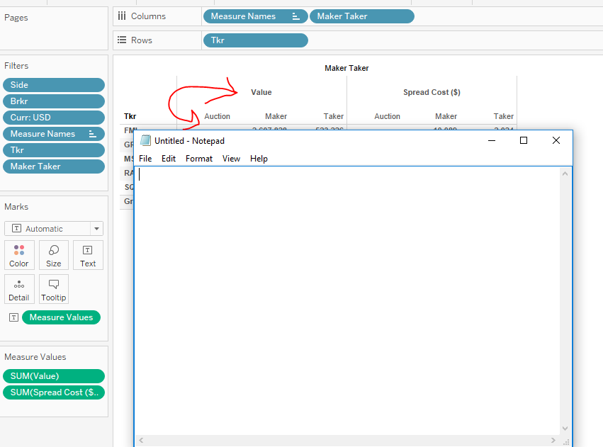
Solved! Go to Solution.
- Mark as New
- Bookmark
- Subscribe
- Mute
- Subscribe to RSS Feed
- Permalink
- Report Inappropriate Content
Hi @dancarr22,
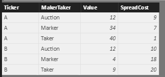
For Power BI Matrix visual, the value level shows below the column level. Based on your screenshot, I create the similar structure data sample as follows.
Then I create Matix visual like you.
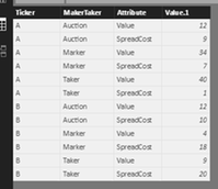
If you want to display data like the format in Tableau, you need to unpivot Value and SpreadCost columns. Please right click your table->Query Editor->select both Value and SpreadCost columns->Unpivot columns(see the button highlighted in yellow background), click apply, you will get the data shown in screenshot.
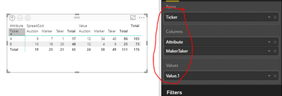
Then select the Ticker as Row level, the Attribute and MarkerTicker as column level, the Value.1 as Value level, you will get expected result.
Best Regards,
Angelia
- Mark as New
- Bookmark
- Subscribe
- Mute
- Subscribe to RSS Feed
- Permalink
- Report Inappropriate Content
I am facing the same problem, someone know any 'Custom Visual' that resolve this problem?
- Mark as New
- Bookmark
- Subscribe
- Mute
- Subscribe to RSS Feed
- Permalink
- Report Inappropriate Content
Can we just agree that Power BI lacks a basic funtionality here? 🙂
OP requested a basic thing:
Put a dimension into the columns area of a matrix visual like the year:
2018 - 2019 - 2020
Then add two measures, the following happens:
2018 2019 2020
Meas1 Meas2 Meas1 Meas2 Meas1 Meas2
And what OP wanted, was this:
Meas1 Meas2
2018 2019 2020 2018 2019 2020
This can be achieved in a Pivot table in Excel in 2 seconds. No change of the raw data required.
In Power BI, no chance.
The only thing that comes close:
Go to the format pane of the matrix visual and under VALUES select "Show On Rows".
Not exactly the wanted result, but close enough most time.
- Mark as New
- Bookmark
- Subscribe
- Mute
- Subscribe to RSS Feed
- Permalink
- Report Inappropriate Content
Still 2023, and no simple solution given.
- Mark as New
- Bookmark
- Subscribe
- Mute
- Subscribe to RSS Feed
- Permalink
- Report Inappropriate Content
Hi @far ,
Currently there is another solution that is the creation of a Field parameter
https://learn.microsoft.com/en-us/power-bi/create-reports/power-bi-field-parameters
Regards
Miguel Félix
Did I answer your question? Mark my post as a solution!
Proud to be a Super User!
Check out my blog: Power BI em Português- Mark as New
- Bookmark
- Subscribe
- Mute
- Subscribe to RSS Feed
- Permalink
- Report Inappropriate Content
Hi MFelix,
Im aware of field parameters already. Can you explain how should these be used for this solution?
Thanks!
- Mark as New
- Bookmark
- Subscribe
- Mute
- Subscribe to RSS Feed
- Permalink
- Report Inappropriate Content
Hi @Anonymous ,
Depending on the result you need currrently there are several option that you don't need to change the raw data, you may need to create calculation groups for example, or an additional table with your hierarchy.
It's not has direct has in Excel agree with you but this has to do with the way the model works and the engine, altough some things are similar to Excel, Power BI is not to do the same things has in Excel so the functionalities may vary.
Regards
Miguel Félix
Did I answer your question? Mark my post as a solution!
Proud to be a Super User!
Check out my blog: Power BI em Português- Mark as New
- Bookmark
- Subscribe
- Mute
- Subscribe to RSS Feed
- Permalink
- Report Inappropriate Content
Hi @dancarr22,
For Power BI Matrix visual, the value level shows below the column level. Based on your screenshot, I create the similar structure data sample as follows.
Then I create Matix visual like you.
If you want to display data like the format in Tableau, you need to unpivot Value and SpreadCost columns. Please right click your table->Query Editor->select both Value and SpreadCost columns->Unpivot columns(see the button highlighted in yellow background), click apply, you will get the data shown in screenshot.
Then select the Ticker as Row level, the Attribute and MarkerTicker as column level, the Value.1 as Value level, you will get expected result.
Best Regards,
Angelia
- Mark as New
- Bookmark
- Subscribe
- Mute
- Subscribe to RSS Feed
- Permalink
- Report Inappropriate Content
I have values as Measures , how Can I do Unpivot.....
- Mark as New
- Bookmark
- Subscribe
- Mute
- Subscribe to RSS Feed
- Permalink
- Report Inappropriate Content
this is not a practical solution when the table to be unpivoted has 30 fields.
There needs to be a simple way to do this in power bi like there is in excel.
- Mark as New
- Bookmark
- Subscribe
- Mute
- Subscribe to RSS Feed
- Permalink
- Report Inappropriate Content
Hi @apatnola ,
This answer is from 3 years ago, since then the tool has evolve significantly depending on what you are looking for there are other options. Currently there are calculated groups, options to unpivot only, selected columns or the use of a disconnected table.
What is the result you want to achieve and how is your data is setup?
You compare Power BI with Excel but in both cases if you have the incorrect data format the results will not be achived corretly. Altough the tools look similar they are in fact very different because they are used for different purposes.
Can you share a mockup of your data and expected result?
Regards
Miguel Félix
Did I answer your question? Mark my post as a solution!
Proud to be a Super User!
Check out my blog: Power BI em Português- Mark as New
- Bookmark
- Subscribe
- Mute
- Subscribe to RSS Feed
- Permalink
- Report Inappropriate Content
I am trying to get from
to
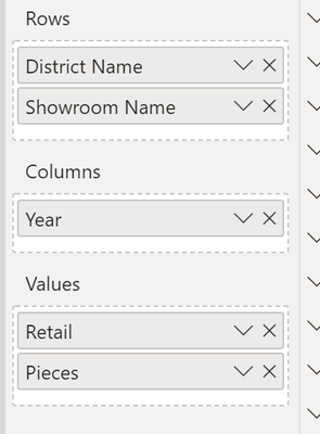
Here are the specific fields I have picked so far.
In excel's pivot table fields, you just switch the values and the column headers, that's it. Hopefully, there is a power bi solution short of creating individual measures for each column/value combination that needs to be maintained over time.
- Mark as New
- Bookmark
- Subscribe
- Mute
- Subscribe to RSS Feed
- Permalink
- Report Inappropriate Content
Hi,
See if my solutoin here helps - Rearrange a multi heading dataset into a single heading one which is Pivot ready.
Regards,
Ashish Mathur
http://www.ashishmathur.com
https://www.linkedin.com/in/excelenthusiasts/
- Mark as New
- Bookmark
- Subscribe
- Mute
- Subscribe to RSS Feed
- Permalink
- Report Inappropriate Content
Hi @apatnola
Be aware that Power BI works in tabular models so it's not exactly the same has in excel, and the concept diverge.
In this case where you have the information in this setup you need to unpivot your data, however with the power query working behind the scenes all the heavy work will be done by the application you only need to setup once, and every time it refreshes they query is run.
Is the information of your data in the format you present or is it just the final result that you are already presenting?
If you have the data in the format you are presenting and the data tends to grow you will need to pick the first 3 columns on your data (District, Showroom and year) and unpivot the other columns this is an option within power bi.
If the information is in the table format like this:
District -Showroom - Year - Retail - Pieces
All you need to do is selected the Retail and Pieces and simply use the new columns (attribute and values) on your visualizations, that will allow additional features.
I understand the "need" to do comparisions and altough I work with Power BI from the beginning I still get frustated with some things, but in the end we are talking about different tools that work in different ways and with different purposes.
Regards
Miguel Félix
Did I answer your question? Mark my post as a solution!
Proud to be a Super User!
Check out my blog: Power BI em Português- Mark as New
- Bookmark
- Subscribe
- Mute
- Subscribe to RSS Feed
- Permalink
- Report Inappropriate Content
Thank you Miguel. This is super helpful. I have 15 requested items to visualize. Let me work through the others as there may be other datapoints that i will need to pivot on.
The table the information is coming from is a very detailed table (barcode level) with 30 fields.
Also, there is no "year" in the detailed table exactly. Just a posted date joined to my calendar table. Will it work if i pivot on District - Showroom - Posted Date?
Andre
- Mark as New
- Bookmark
- Subscribe
- Mute
- Subscribe to RSS Feed
- Permalink
- Report Inappropriate Content
Hi @apatnola ,
You can do it on any columns, I have refered year because that was the value you present on the image.
In this case be aware that the columns you use for the relationship with the other tables don't unpivot them.
Regards
Miguel Félix
Did I answer your question? Mark my post as a solution!
Proud to be a Super User!
Check out my blog: Power BI em Português- Mark as New
- Bookmark
- Subscribe
- Mute
- Subscribe to RSS Feed
- Permalink
- Report Inappropriate Content
Hi there,
As far as I can tell I have my data set up the exact say way as above and when I add two attributes to the "columns" in my matrix, it will only display the one that is on top in the Visualization pane
- Mark as New
- Bookmark
- Subscribe
- Mute
- Subscribe to RSS Feed
- Permalink
- Report Inappropriate Content
Thanks Angelia!
- Mark as New
- Bookmark
- Subscribe
- Mute
- Subscribe to RSS Feed
- Permalink
- Report Inappropriate Content
Hi @dancarr22,
I believe that your question is related with the way you have your data setup, you have multiple measure and adding them to your values area, is your data in the Values area columns or calculated measures?
Regards,
MFelix
Regards
Miguel Félix
Did I answer your question? Mark my post as a solution!
Proud to be a Super User!
Check out my blog: Power BI em Português- Mark as New
- Bookmark
- Subscribe
- Mute
- Subscribe to RSS Feed
- Permalink
- Report Inappropriate Content
Hello,
Thanks for your response.
The data in the values area are numerical data fields which need to be aggregated for the given groups. They are not measures.
Need these values to appear ABOVE the columns not below them.
Please let me know if you require additional info.
Thanks for your help with this.
Thanks,
Dan
Helpful resources

Power BI Monthly Update - April 2026
Check out the April 2026 Power BI update to learn about new features.

Data Days 2026 coming soon!
Sign up to receive a private message when registration opens and key events begin.

New to Fabric Survey
If you have recently started exploring Fabric, we'd love to hear how it's going. Your feedback can help with product improvements.

| User | Count |
|---|---|
| 36 | |
| 32 | |
| 27 | |
| 23 | |
| 16 |
| User | Count |
|---|---|
| 65 | |
| 50 | |
| 30 | |
| 25 | |
| 24 |
