FabCon is coming to Atlanta
Join us at FabCon Atlanta from March 16 - 20, 2026, for the ultimate Fabric, Power BI, AI and SQL community-led event. Save $200 with code FABCOMM.
Register now!- Power BI forums
- Get Help with Power BI
- Desktop
- Service
- Report Server
- Power Query
- Mobile Apps
- Developer
- DAX Commands and Tips
- Custom Visuals Development Discussion
- Health and Life Sciences
- Power BI Spanish forums
- Translated Spanish Desktop
- Training and Consulting
- Instructor Led Training
- Dashboard in a Day for Women, by Women
- Galleries
- Data Stories Gallery
- Themes Gallery
- Contests Gallery
- QuickViz Gallery
- Quick Measures Gallery
- Visual Calculations Gallery
- Notebook Gallery
- Translytical Task Flow Gallery
- TMDL Gallery
- R Script Showcase
- Webinars and Video Gallery
- Ideas
- Custom Visuals Ideas (read-only)
- Issues
- Issues
- Events
- Upcoming Events
The Power BI Data Visualization World Championships is back! Get ahead of the game and start preparing now! Learn more
- Power BI forums
- Forums
- Get Help with Power BI
- Desktop
- Matricial dot plot
- Subscribe to RSS Feed
- Mark Topic as New
- Mark Topic as Read
- Float this Topic for Current User
- Bookmark
- Subscribe
- Printer Friendly Page
- Mark as New
- Bookmark
- Subscribe
- Mute
- Subscribe to RSS Feed
- Permalink
- Report Inappropriate Content
Matricial dot plot
Hi,
I was wondering if it is possible to create a sort of matricial dot plot (I'm not even sure than means something 😉 )
Concretely, I have persons who send messages at certain hours. I would like to have my liste of persons in X axis, all my hours in Y axis and a dot when a person send a message at the corresponding hour.
Should look like that:
3 pm x
2 pm x
1 pm x x
John Jane June
Does someone have an idea how to do that?
Thanks!
Océane
Solved! Go to Solution.
- Mark as New
- Bookmark
- Subscribe
- Mute
- Subscribe to RSS Feed
- Permalink
- Report Inappropriate Content
Hi Océane,
Yep I've this working for me.
Firstly create a measure - please change "Table1" to whatever your table is called:
Measure = if(COUNTROWS(Table1)>0,"X","")
Now in Power BI select the "Matrix" visualisation.
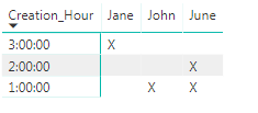
Put "Creation_Hour" as the row, "Posting_Author" as the column and the new measure as your "Values".
Hope that helps,
Alex
- Mark as New
- Bookmark
- Subscribe
- Mute
- Subscribe to RSS Feed
- Permalink
- Report Inappropriate Content
Hi Océane,
What does your data look like at the moment?
Can you provide a sample?
Thanks
Alex
- Mark as New
- Bookmark
- Subscribe
- Mute
- Subscribe to RSS Feed
- Permalink
- Report Inappropriate Content
I have 3 columns that matter :
ID_Post ; Creation_Hour ; Posting_Author
Every line is for a different post. I can have several hours for a single person (several persons for one hour is unlikely but theoretically possible)
For example, I would have
1 ; 1:00:00 ; John
2 ; 3:00:00 ; Jane
3 ; 1:00:00 ; June
4 ; 2:00:00 ; June
- Mark as New
- Bookmark
- Subscribe
- Mute
- Subscribe to RSS Feed
- Permalink
- Report Inappropriate Content
Hi Océane,
Yep I've this working for me.
Firstly create a measure - please change "Table1" to whatever your table is called:
Measure = if(COUNTROWS(Table1)>0,"X","")
Now in Power BI select the "Matrix" visualisation.
Put "Creation_Hour" as the row, "Posting_Author" as the column and the new measure as your "Values".
Hope that helps,
Alex
- Mark as New
- Bookmark
- Subscribe
- Mute
- Subscribe to RSS Feed
- Permalink
- Report Inappropriate Content
Thank you!
Actually, I was hoping for something with dots, more like a dot plot but with hours in Y axis instead of just number for scale.
Do you think that possible?
But if not, your solution works 🙂
Océane
- Mark as New
- Bookmark
- Subscribe
- Mute
- Subscribe to RSS Feed
- Permalink
- Report Inappropriate Content
I've had a look (and also at some custom visuals), but I can't see a way of doing what you're trying!
Maybe someone else will know a way.
Thanks,
Alex
Helpful resources

Power BI Dataviz World Championships
The Power BI Data Visualization World Championships is back! Get ahead of the game and start preparing now!

| User | Count |
|---|---|
| 40 | |
| 36 | |
| 34 | |
| 31 | |
| 27 |
| User | Count |
|---|---|
| 135 | |
| 103 | |
| 65 | |
| 61 | |
| 55 |


