Get Fabric certified for FREE!
Don't miss your chance to take the Fabric Data Engineer (DP-700) exam on us!
Learn more- Power BI forums
- Get Help with Power BI
- Desktop
- Service
- Report Server
- Power Query
- Mobile Apps
- Developer
- DAX Commands and Tips
- Custom Visuals Development Discussion
- Health and Life Sciences
- Power BI Spanish forums
- Translated Spanish Desktop
- Training and Consulting
- Instructor Led Training
- Dashboard in a Day for Women, by Women
- Galleries
- Data Stories Gallery
- Themes Gallery
- Contests Gallery
- QuickViz Gallery
- Quick Measures Gallery
- Visual Calculations Gallery
- Notebook Gallery
- Translytical Task Flow Gallery
- TMDL Gallery
- R Script Showcase
- Webinars and Video Gallery
- Ideas
- Custom Visuals Ideas (read-only)
- Issues
- Issues
- Events
- Upcoming Events
Next up in the FabCon + SQLCon recap series: The roadmap for Microsoft SQL and Maximizing Developer experiences in Fabric. All sessions are available on-demand after the live show. Register now
- Power BI forums
- Forums
- Get Help with Power BI
- Desktop
- Matricial dot plot
- Subscribe to RSS Feed
- Mark Topic as New
- Mark Topic as Read
- Float this Topic for Current User
- Bookmark
- Subscribe
- Printer Friendly Page
- Mark as New
- Bookmark
- Subscribe
- Mute
- Subscribe to RSS Feed
- Permalink
- Report Inappropriate Content
Matricial dot plot
Hi,
I was wondering if it is possible to create a sort of matricial dot plot (I'm not even sure than means something 😉 )
Concretely, I have persons who send messages at certain hours. I would like to have my liste of persons in X axis, all my hours in Y axis and a dot when a person send a message at the corresponding hour.
Should look like that:
3 pm x
2 pm x
1 pm x x
John Jane June
Does someone have an idea how to do that?
Thanks!
Océane
Solved! Go to Solution.
- Mark as New
- Bookmark
- Subscribe
- Mute
- Subscribe to RSS Feed
- Permalink
- Report Inappropriate Content
Hi Océane,
Yep I've this working for me.
Firstly create a measure - please change "Table1" to whatever your table is called:
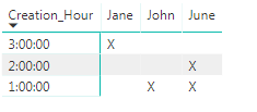
Measure = if(COUNTROWS(Table1)>0,"X","")
Now in Power BI select the "Matrix" visualisation.
Put "Creation_Hour" as the row, "Posting_Author" as the column and the new measure as your "Values".
Hope that helps,
Alex
- Mark as New
- Bookmark
- Subscribe
- Mute
- Subscribe to RSS Feed
- Permalink
- Report Inappropriate Content
Hi Océane,
What does your data look like at the moment?
Can you provide a sample?
Thanks
Alex
- Mark as New
- Bookmark
- Subscribe
- Mute
- Subscribe to RSS Feed
- Permalink
- Report Inappropriate Content
I have 3 columns that matter :
ID_Post ; Creation_Hour ; Posting_Author
Every line is for a different post. I can have several hours for a single person (several persons for one hour is unlikely but theoretically possible)
For example, I would have
1 ; 1:00:00 ; John
2 ; 3:00:00 ; Jane
3 ; 1:00:00 ; June
4 ; 2:00:00 ; June
- Mark as New
- Bookmark
- Subscribe
- Mute
- Subscribe to RSS Feed
- Permalink
- Report Inappropriate Content
Hi Océane,
Yep I've this working for me.
Firstly create a measure - please change "Table1" to whatever your table is called:
Measure = if(COUNTROWS(Table1)>0,"X","")
Now in Power BI select the "Matrix" visualisation.
Put "Creation_Hour" as the row, "Posting_Author" as the column and the new measure as your "Values".
Hope that helps,
Alex
- Mark as New
- Bookmark
- Subscribe
- Mute
- Subscribe to RSS Feed
- Permalink
- Report Inappropriate Content
Thank you!
Actually, I was hoping for something with dots, more like a dot plot but with hours in Y axis instead of just number for scale.
Do you think that possible?
But if not, your solution works 🙂
Océane
- Mark as New
- Bookmark
- Subscribe
- Mute
- Subscribe to RSS Feed
- Permalink
- Report Inappropriate Content
I've had a look (and also at some custom visuals), but I can't see a way of doing what you're trying!
Maybe someone else will know a way.
Thanks,
Alex
Helpful resources

New to Fabric Survey
If you have recently started exploring Fabric, we'd love to hear how it's going. Your feedback can help with product improvements.

Power BI DataViz World Championships - June 2026
A new Power BI DataViz World Championship is coming this June! Don't miss out on submitting your entry.

Join our Fabric User Panel
Share feedback directly with Fabric product managers, participate in targeted research studies and influence the Fabric roadmap.

| User | Count |
|---|---|
| 48 | |
| 44 | |
| 40 | |
| 18 | |
| 18 |
| User | Count |
|---|---|
| 69 | |
| 69 | |
| 32 | |
| 32 | |
| 32 |

