Join us at FabCon Vienna from September 15-18, 2025
The ultimate Fabric, Power BI, SQL, and AI community-led learning event. Save €200 with code FABCOMM.
Get registered- Power BI forums
- Get Help with Power BI
- Desktop
- Service
- Report Server
- Power Query
- Mobile Apps
- Developer
- DAX Commands and Tips
- Custom Visuals Development Discussion
- Health and Life Sciences
- Power BI Spanish forums
- Translated Spanish Desktop
- Training and Consulting
- Instructor Led Training
- Dashboard in a Day for Women, by Women
- Galleries
- Data Stories Gallery
- Themes Gallery
- Contests Gallery
- Quick Measures Gallery
- Notebook Gallery
- Translytical Task Flow Gallery
- TMDL Gallery
- R Script Showcase
- Webinars and Video Gallery
- Ideas
- Custom Visuals Ideas (read-only)
- Issues
- Issues
- Events
- Upcoming Events
Enhance your career with this limited time 50% discount on Fabric and Power BI exams. Ends September 15. Request your voucher.
- Power BI forums
- Forums
- Get Help with Power BI
- Desktop
- Re: Make a column not sum/count
- Subscribe to RSS Feed
- Mark Topic as New
- Mark Topic as Read
- Float this Topic for Current User
- Bookmark
- Subscribe
- Printer Friendly Page
- Mark as New
- Bookmark
- Subscribe
- Mute
- Subscribe to RSS Feed
- Permalink
- Report Inappropriate Content
Make a column not sum/count
I've used Power BI quite a bit lately with a SSAS cube and some Sql Server queries and created many visualiations. I am still fairly new to this though and cannot figure this out.
I imported a very simple Excel spreadsheet. 3 columns: period, actual, goal. I tried to make a line and stacked column chart. However, it keeps using the aggregations (that don't make sense). It is using a count of the goal and count of the actual and not the value from the spreadsheet.
When I go into the query, I see no place to change how/if a column is summarized. I know how to do this in PowerPivot.
Beyond that, I have no idea why it would do any aggregations since I am using all fields in the dataset and aggregation is not needed/appropriate.
When I click on the column under "Column values" it shows "Count of Actual" and the only options are "Remove Field", "Count (Distinct), and "Count". How do I kjust get the value?
- Mark as New
- Bookmark
- Subscribe
- Mute
- Subscribe to RSS Feed
- Permalink
- Report Inappropriate Content
Any solution for this Problem.
I am also facing same issue. In Power BI desktop, I can able to see column with Sum that allowing to show actual count in Graph. However when I publish same to Power BI Online, it broken and showing count of the column.
- Mark as New
- Bookmark
- Subscribe
- Mute
- Subscribe to RSS Feed
- Permalink
- Report Inappropriate Content
Make sure to change the column to decimal format then you will be able to change to don't sum.
- Mark as New
- Bookmark
- Subscribe
- Mute
- Subscribe to RSS Feed
- Permalink
- Report Inappropriate Content
Hi All,
I am also facing same issue. does anyone find solution for this.
Please help me on this.
Thanks,
Eswar
- Mark as New
- Bookmark
- Subscribe
- Mute
- Subscribe to RSS Feed
- Permalink
- Report Inappropriate Content
Click on the element you don't want to summarize, then go to the modeling tab, around the middle are the properties, select default summarization, don't summarize. Worked on Version: 2.65.5313.701
- Mark as New
- Bookmark
- Subscribe
- Mute
- Subscribe to RSS Feed
- Permalink
- Report Inappropriate Content
Check the data format within your Excel document. I've found that if the values in my tables in Excel are not "Number" (e.g. if they are listed as "Accounting" or "General" or "Custom"), then Power BI doesn't recognize the data as values, and your only options for pie or bar charts is either "Count of (data field)" or "Sum of (data field)", etc.
Hope this helps!
- Mark as New
- Bookmark
- Subscribe
- Mute
- Subscribe to RSS Feed
- Permalink
- Report Inappropriate Content
Change the type of the field in the query to Decimal or whole number from ANY. it worked for me
- Mark as New
- Bookmark
- Subscribe
- Mute
- Subscribe to RSS Feed
- Permalink
- Report Inappropriate Content
Change the type of the field in the query to Decimal or whole number from ANY. it worked for me
- Mark as New
- Bookmark
- Subscribe
- Mute
- Subscribe to RSS Feed
- Permalink
- Report Inappropriate Content
I just figured this out.
Under Fields, click on the field which is being auto-summarized. Once selected, go to the top ribbon and click "modeling". You will then see a button called "Default Summarization..." click this, and select 'do not summarize'. Above that button you can also change what the data is - this is useful for telling Power BI that the data is a postal zip code, for instance.
- Mark as New
- Bookmark
- Subscribe
- Mute
- Subscribe to RSS Feed
- Permalink
- Report Inappropriate Content
I can't see that option. Please help
- Mark as New
- Bookmark
- Subscribe
- Mute
- Subscribe to RSS Feed
- Permalink
- Report Inappropriate Content
You should try selecting the value that you need in the fields column, after which in the top menu select the summarization that you desire (dont summ for isntance). and it should solve your problem, hoep this helps.
- Mark as New
- Bookmark
- Subscribe
- Mute
- Subscribe to RSS Feed
- Permalink
- Report Inappropriate Content
Perfect! That was the answer. Thanks so much for posting. Your answer keeps on giving!
- Mark as New
- Bookmark
- Subscribe
- Mute
- Subscribe to RSS Feed
- Permalink
- Report Inappropriate Content
You need to go back to the table/query click on the dots to the right and select edit query
When the data list is displayed, find the column that you want to sum. right click on the column title to select the column and display the menu, then select "change type" and select the appropriate type such as "decimal number"
Click the "Close and Apply" button to update the query.
Now when you click on the field in the "Values" section you should have all the options
- Mark as New
- Bookmark
- Subscribe
- Mute
- Subscribe to RSS Feed
- Permalink
- Report Inappropriate Content
This helped on some columns that were marked number and when I switched t it to text, it removed the sum. Thanks. However not working on all of my columns.
- Mark as New
- Bookmark
- Subscribe
- Mute
- Subscribe to RSS Feed
- Permalink
- Report Inappropriate Content
- Mark as New
- Bookmark
- Subscribe
- Mute
- Subscribe to RSS Feed
- Permalink
- Report Inappropriate Content
Hello,
I am new to Power BI, so need expert help with the same issue. Earlier I was seeing only Count option, but after following your suggestion, I could see all other options except "Don't Summarize" like Sum, Average, Median etc.
I tried different data types like Decimal, Whole Number, Text and Duration but with no luck.
Could you please help me in finding the "Don't Summarize" option.
Thanks in advance
- Mark as New
- Bookmark
- Subscribe
- Mute
- Subscribe to RSS Feed
- Permalink
- Report Inappropriate Content
I am also new to Power BI and am having the same issue with a scatterchart. I have cost on one axis and usage on the other, and it insists on somehow summing my data. How can I get to show me the proper range of data?
- Mark as New
- Bookmark
- Subscribe
- Mute
- Subscribe to RSS Feed
- Permalink
- Report Inappropriate Content
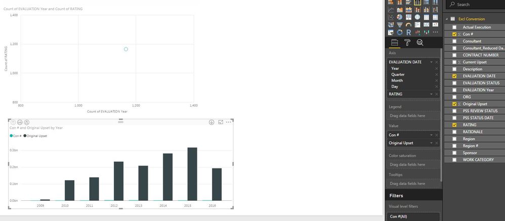
I am also struggling with aggregation. I do not want to summarize my data, and I want to see all data points. Even after I have clicked on "Do not Summarize" in modeling tab, my data is still getting summarized. only options are count or distinct count.
Even year is getting counted??
This is weird, if I use one graph, dates work fine, but with other it doesn't. Never had this issue in tableau..
Please help

- Mark as New
- Bookmark
- Subscribe
- Mute
- Subscribe to RSS Feed
- Permalink
- Report Inappropriate Content
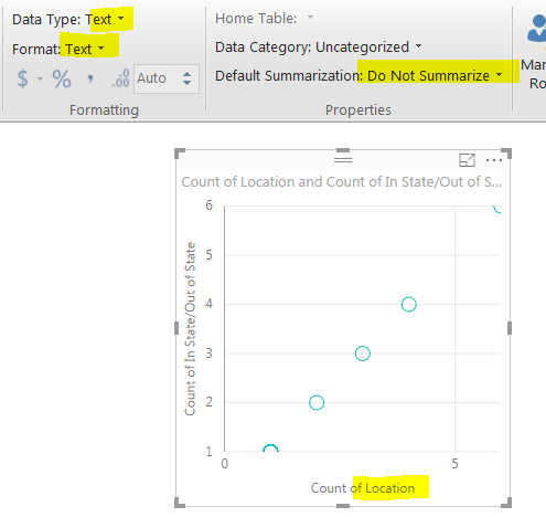
I have this issue too. I tried all the suggestions but still get this count. Here you can see that it is labled as do not summarize and as text. This Location field is city, state combo. As you can see it is doing this for both the location field and the in/out texas field.
- Mark as New
- Bookmark
- Subscribe
- Mute
- Subscribe to RSS Feed
- Permalink
- Report Inappropriate Content
@nzipp It'd be better to start a new thread than continue on the end of an old one but...
A scatter chart requires each axis to be numeric. You can't put text fields on the axis (unless you want to count them, which is what it's doing). You might want to look at a different type of visual, such as a matrix, depending on what your end-goal is.
In Wisconsin? Join the Madison Power BI User Group.
- Mark as New
- Bookmark
- Subscribe
- Mute
- Subscribe to RSS Feed
- Permalink
- Report Inappropriate Content
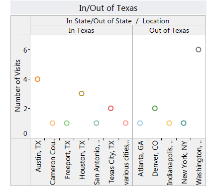
It's not an old thread as it is still actively being posted to; 4 hours ago and last month for example, by you Leo. Also, when creating dashboards everyone gets tired of looking at the same style graphs and it's important to vary it up with other styles. I have worked with numerous reporting tools and they have all been able to use scatter in this fashion; as seen below.
- Mark as New
- Bookmark
- Subscribe
- Mute
- Subscribe to RSS Feed
- Permalink
- Report Inappropriate Content
Hi, I am also struggling with this same issue. have you got solution?
Helpful resources
| User | Count |
|---|---|
| 69 | |
| 66 | |
| 62 | |
| 48 | |
| 28 |
| User | Count |
|---|---|
| 112 | |
| 83 | |
| 66 | |
| 48 | |
| 43 |


