FabCon is coming to Atlanta
Join us at FabCon Atlanta from March 16 - 20, 2026, for the ultimate Fabric, Power BI, AI and SQL community-led event. Save $200 with code FABCOMM.
Register now!- Power BI forums
- Get Help with Power BI
- Desktop
- Service
- Report Server
- Power Query
- Mobile Apps
- Developer
- DAX Commands and Tips
- Custom Visuals Development Discussion
- Health and Life Sciences
- Power BI Spanish forums
- Translated Spanish Desktop
- Training and Consulting
- Instructor Led Training
- Dashboard in a Day for Women, by Women
- Galleries
- Data Stories Gallery
- Themes Gallery
- Contests Gallery
- QuickViz Gallery
- Quick Measures Gallery
- Visual Calculations Gallery
- Notebook Gallery
- Translytical Task Flow Gallery
- TMDL Gallery
- R Script Showcase
- Webinars and Video Gallery
- Ideas
- Custom Visuals Ideas (read-only)
- Issues
- Issues
- Events
- Upcoming Events
The Power BI Data Visualization World Championships is back! Get ahead of the game and start preparing now! Learn more
- Power BI forums
- Forums
- Get Help with Power BI
- Desktop
- Line chart - connection of dots when data is missi...
- Subscribe to RSS Feed
- Mark Topic as New
- Mark Topic as Read
- Float this Topic for Current User
- Bookmark
- Subscribe
- Printer Friendly Page
- Mark as New
- Bookmark
- Subscribe
- Mute
- Subscribe to RSS Feed
- Permalink
- Report Inappropriate Content
Line chart - connection of dots when data is missing
Hi,
I use a line chart for different series of values (legend-setting is used) When for some series a specific values is not available then the line is broken.
From a pure technical point of view this is clear. But the management does not like this.
Please look at the last line - no value for "2023 Februar" so the line is interrupted.
How to draw a line between the first dot (2023 Jänner) and the dot for 2023 März?
I am not allowed to insert artifical data (either 0 or the average of the both values at each side). And there should not be a dot for the missing Februar-value. All my manager wants is a straight line!
Is this possible? (my feeling is, that is impossible but maybe someone has a brilliant idea)
Many thanks and regards
Solved! Go to Solution.
- Mark as New
- Bookmark
- Subscribe
- Mute
- Subscribe to RSS Feed
- Permalink
- Report Inappropriate Content
Hi,
While I was checking your issue Power BI somehow made this line with the gap continuous, but I am not sure how it happened so just be aware of that.
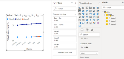
There is a workaround however - you add one more sequence to your line chart, exactly like the one with the gap, but where the gap is filled with a value - ( Jan + Mar ) / 2, for example. You remove the markers for the continuous line and change its color to the same color that is assigned to the line with the gap.
Best Regards,
Alexander
Helpful resources

Power BI Dataviz World Championships
The Power BI Data Visualization World Championships is back! Get ahead of the game and start preparing now!

| User | Count |
|---|---|
| 61 | |
| 43 | |
| 40 | |
| 38 | |
| 22 |
| User | Count |
|---|---|
| 178 | |
| 124 | |
| 116 | |
| 77 | |
| 54 |


