Get Fabric certified for FREE!
Don't miss your chance to take the Fabric Data Engineer (DP-700) exam on us!
Learn more- Power BI forums
- Get Help with Power BI
- Desktop
- Service
- Report Server
- Power Query
- Mobile Apps
- Developer
- DAX Commands and Tips
- Custom Visuals Development Discussion
- Health and Life Sciences
- Power BI Spanish forums
- Translated Spanish Desktop
- Training and Consulting
- Instructor Led Training
- Dashboard in a Day for Women, by Women
- Galleries
- Data Stories Gallery
- Themes Gallery
- Contests Gallery
- QuickViz Gallery
- Quick Measures Gallery
- Visual Calculations Gallery
- Notebook Gallery
- Translytical Task Flow Gallery
- TMDL Gallery
- R Script Showcase
- Webinars and Video Gallery
- Ideas
- Custom Visuals Ideas (read-only)
- Issues
- Issues
- Events
- Upcoming Events
We've captured the moments from FabCon & SQLCon that everyone is talking about, and we are bringing them to the community, live and on-demand. Starts on April 14th. Register now
- Power BI forums
- Forums
- Get Help with Power BI
- Desktop
- Re: Line and Column Chart Help
- Subscribe to RSS Feed
- Mark Topic as New
- Mark Topic as Read
- Float this Topic for Current User
- Bookmark
- Subscribe
- Printer Friendly Page
- Mark as New
- Bookmark
- Subscribe
- Mute
- Subscribe to RSS Feed
- Permalink
- Report Inappropriate Content
Line and Column Chart Help
Hello!
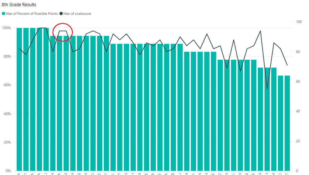
I have a line and stacked column chart right now. Ideally the columns are most recent test grades, and the line values are the previous test grades. The align zero setting is selected, but there's some issues still with the visual:
The values still aren't properly aligned. For example, the circled values are both 94/94.4 but there's a large gap between the column and the line. Thanks in advance for any help to fix this issue!
- Mark as New
- Bookmark
- Subscribe
- Mute
- Subscribe to RSS Feed
- Permalink
- Report Inappropriate Content
Any chance you can post sample data/PBIX that demonstrates this problem, difficult to recreate otherwise. Please see this post regarding How to Get Your Question Answered Quickly: https://community.powerbi.com/t5/Community-Blog/How-to-Get-Your-Question-Answered-Quickly/ba-p/38490
Follow on LinkedIn
@ me in replies or I'll lose your thread!!!
Instead of a Kudo, please vote for this idea
Become an expert!: Enterprise DNA
External Tools: MSHGQM
YouTube Channel!: Microsoft Hates Greg
Latest book!: DAX For Humans
DAX is easy, CALCULATE makes DAX hard...
- Mark as New
- Bookmark
- Subscribe
- Mute
- Subscribe to RSS Feed
- Permalink
- Report Inappropriate Content
I've figured it out, thank you!
- Mark as New
- Bookmark
- Subscribe
- Mute
- Subscribe to RSS Feed
- Permalink
- Report Inappropriate Content
Hi @Lorraine,
Glad to hear that you have resolved it by yourself. Would you please kindly share your solution so that it can benefit more community members?
Thanks,
Yuliana Gu
If this post helps, then please consider Accept it as the solution to help the other members find it more quickly.
Helpful resources

New to Fabric Survey
If you have recently started exploring Fabric, we'd love to hear how it's going. Your feedback can help with product improvements.

Power BI DataViz World Championships - June 2026
A new Power BI DataViz World Championship is coming this June! Don't miss out on submitting your entry.

Join our Fabric User Panel
Share feedback directly with Fabric product managers, participate in targeted research studies and influence the Fabric roadmap.

| User | Count |
|---|---|
| 56 | |
| 39 | |
| 35 | |
| 19 | |
| 17 |
| User | Count |
|---|---|
| 73 | |
| 70 | |
| 37 | |
| 35 | |
| 25 |

