A new Data Days event is coming soon!
This time we’re going bigger than ever. Fabric, Power BI, SQL, AI and more. We're covering it all. You won't want to miss it.
Learn more- Power BI forums
- Get Help with Power BI
- Desktop
- Service
- Report Server
- Power Query
- Mobile Apps
- Developer
- DAX Commands and Tips
- Custom Visuals Development Discussion
- Health and Life Sciences
- Power BI Spanish forums
- Translated Spanish Desktop
- Training and Consulting
- Instructor Led Training
- Dashboard in a Day for Women, by Women
- Galleries
- Data Stories Gallery
- Themes Gallery
- Contests Gallery
- QuickViz Gallery
- Quick Measures Gallery
- Visual Calculations Gallery
- Notebook Gallery
- Translytical Task Flow Gallery
- TMDL Gallery
- R Script Showcase
- Webinars and Video Gallery
- Ideas
- Custom Visuals Ideas (read-only)
- Issues
- Issues
- Events
- Upcoming Events
Level up your Power BI skills this month - build one visual each week and tell better stories with data! Get started
- Power BI forums
- Forums
- Get Help with Power BI
- Desktop
- Line Chart Style
- Subscribe to RSS Feed
- Mark Topic as New
- Mark Topic as Read
- Float this Topic for Current User
- Bookmark
- Subscribe
- Printer Friendly Page
- Mark as New
- Bookmark
- Subscribe
- Mute
- Subscribe to RSS Feed
- Permalink
- Report Inappropriate Content
Line Chart Style
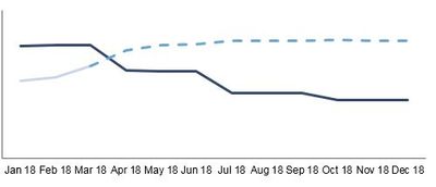
Hi, I'm new to Power BI and I know there's still a lot to learn. I'm just doing some basic visual to get used to the tool. I have a line chart with Budget vs Forecast by month. It looks like the first image below. The black line is the budget and the blue line is the actual for the past period and forecast for the future periods. Is there a way to have different line style for actual and forecast, for example, solid line for actual and dash for future forecast, like the second image?

- Mark as New
- Bookmark
- Subscribe
- Mute
- Subscribe to RSS Feed
- Permalink
- Report Inappropriate Content
Hi @Adore,
There is a workaround. It seems you have the forecast data in the source table. Maybe you can use two measures for each part. The two measures will join in a dot. Have a look at the sample below.
Measure 16 =
CALCULATE (
    SUM ( FactSales[SalesQuantity] ),
    FILTER ( DimDate, DimDate[Datekey] <= DATE ( 2008, 1, 31 ) )
)
Measure 17 =
CALCULATE (
SUM ( FactSales[SalesQuantity] ),
FILTER ( DimDate, DimDate[Datekey] >= DATE ( 2008, 1, 1 ) )
)
Best Regards,
Dale
If this post helps, then please consider Accept it as the solution to help the other members find it more quickly.
- Mark as New
- Bookmark
- Subscribe
- Mute
- Subscribe to RSS Feed
- Permalink
- Report Inappropriate Content
@Adore under your properties ie. the paintbrush on the right hand side of your pane, look for shapes, you can change the lines there
If I took the time to answer your question and I came up with a solution, please mark my post as a solution and /or give kudos freely for the effort 🙂 Thank you!
Proud to be a Super User!
- Mark as New
- Bookmark
- Subscribe
- Mute
- Subscribe to RSS Feed
- Permalink
- Report Inappropriate Content
Thanks. How would I have two different line style for the same series though? I need to have a solid line up to April and dash from May onwards.
- Mark as New
- Bookmark
- Subscribe
- Mute
- Subscribe to RSS Feed
- Permalink
- Report Inappropriate Content
@Adore as far as i know you can't do it for the same line, you will have to do two different lines however if they have the same amounts up until the point it becomes a forecast it should be easy to almost look like they are the same line... if that makes sense?
If I took the time to answer your question and I came up with a solution, please mark my post as a solution and /or give kudos freely for the effort 🙂 Thank you!
Proud to be a Super User!
Helpful resources

Power BI Monthly Update - April 2026
Check out the April 2026 Power BI update to learn about new features.

Data Days 2026 coming soon!
Sign up to receive a private message when registration opens and key events begin.

New to Fabric Survey
If you have recently started exploring Fabric, we'd love to hear how it's going. Your feedback can help with product improvements.

| User | Count |
|---|---|
| 35 | |
| 32 | |
| 26 | |
| 21 | |
| 18 |
| User | Count |
|---|---|
| 68 | |
| 39 | |
| 33 | |
| 24 | |
| 23 |

