Join us at FabCon Vienna from September 15-18, 2025
The ultimate Fabric, Power BI, SQL, and AI community-led learning event. Save €200 with code FABCOMM.
Get registered- Power BI forums
- Get Help with Power BI
- Desktop
- Service
- Report Server
- Power Query
- Mobile Apps
- Developer
- DAX Commands and Tips
- Custom Visuals Development Discussion
- Health and Life Sciences
- Power BI Spanish forums
- Translated Spanish Desktop
- Training and Consulting
- Instructor Led Training
- Dashboard in a Day for Women, by Women
- Galleries
- Data Stories Gallery
- Themes Gallery
- Contests Gallery
- Quick Measures Gallery
- Notebook Gallery
- Translytical Task Flow Gallery
- TMDL Gallery
- R Script Showcase
- Webinars and Video Gallery
- Ideas
- Custom Visuals Ideas (read-only)
- Issues
- Issues
- Events
- Upcoming Events
Compete to become Power BI Data Viz World Champion! First round ends August 18th. Get started.
- Power BI forums
- Forums
- Get Help with Power BI
- Desktop
- Difference between formatting in chart and matrix ...
- Subscribe to RSS Feed
- Mark Topic as New
- Mark Topic as Read
- Float this Topic for Current User
- Bookmark
- Subscribe
- Printer Friendly Page
- Mark as New
- Bookmark
- Subscribe
- Mute
- Subscribe to RSS Feed
- Permalink
- Report Inappropriate Content
Difference between formatting in chart and matrix visual SSAS live connection
Hello,
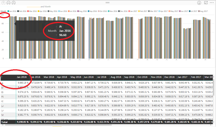
I have measure in SSAS cube which is formated as percentage. I am using that measure in both clustered chart visual and in matrix visual. The problem is that the formatting is different in both the visuals. In matrix the values are getting multiplied by 100. it is also same in table visual and multi card visual. see the screen shot below.
As you can see, in chart it showing as 96.60 but in matrix it is showing as 9,660.18%. Why am I seeing two different formating in both the visual?
- Mark as New
- Bookmark
- Subscribe
- Mute
- Subscribe to RSS Feed
- Permalink
- Report Inappropriate Content
Hi @bhavesh-jadav,
What's the version of your Power BI Desktop? Try to use the newest version first please.
Thanks,
Xi Jin.
- Mark as New
- Bookmark
- Subscribe
- Mute
- Subscribe to RSS Feed
- Permalink
- Report Inappropriate Content
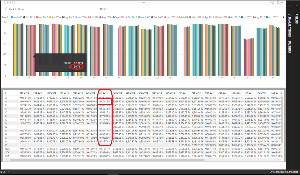
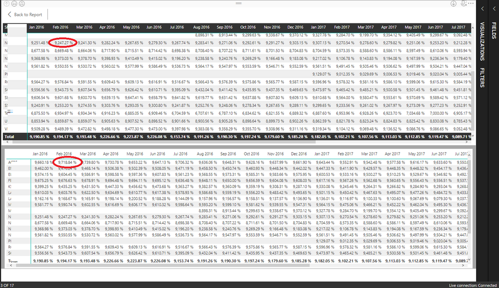
I am using latest version i.e. April 2018 version only. Another thing that I found is that when I do show data on both bar chart and matrix I can see values in thousands only ( see below screen shot). But the chart is dividing value with 100 but in matrix it is showing exact same value.
Why both visaul is showing same data in different way? In other charts i.e. Pi chart, combined chart etc. value is getting divided by 100 but in matrix, table and card visual, value is formatted in thousands. I am using SSAS Live connection so there is no way of changing formating in Power BI desktop.
- Mark as New
- Bookmark
- Subscribe
- Mute
- Subscribe to RSS Feed
- Permalink
- Report Inappropriate Content
Kindly check in the chart visual ,that it is not displaying the sum.Enable the dont summarise option in the tools pane
- Mark as New
- Bookmark
- Subscribe
- Mute
- Subscribe to RSS Feed
- Permalink
- Report Inappropriate Content
@Hardik I am using SSAS Live connection hence such options are not available. I am still not able to find cause of this problem.


