- Subscribe to RSS Feed
- Mark Topic as New
- Mark Topic as Read
- Float this Topic for Current User
- Bookmark
- Subscribe
- Printer Friendly Page
- Mark as New
- Bookmark
- Subscribe
- Mute
- Subscribe to RSS Feed
- Permalink
- Report Inappropriate Content
Legend for a matrix timeline in powerbi
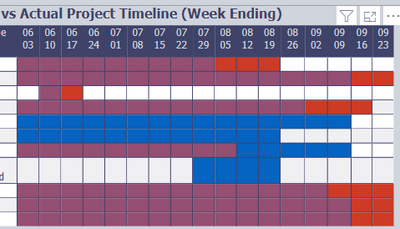
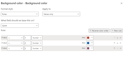
Hi - i created a timeline matrix in powerbi that shows planned and actual and the overlap (photo below). I used the code below the photo to populate the table. I am wondering what is the best way to create a legend that explains the red is planned, blue is actual and purple is where they overlap. All of the videos use a status to create a dynamic legend, but I don't have a status, thought i could create one based on the dates in my table if necessary. The data is in a stand-alone table with 2 relationships, one to date, and one to project. Any ideas on the most efficient way to create this?
- Mark as New
- Bookmark
- Subscribe
- Mute
- Subscribe to RSS Feed
- Permalink
- Report Inappropriate Content
You could create a dimension table with "enter data" to create the legend values you are using as rules, then relate it to the field you are using in your rules (or add a conditional column on the values in PQ) and drop it in the legend well.
- Mark as New
- Bookmark
- Subscribe
- Mute
- Subscribe to RSS Feed
- Permalink
- Report Inappropriate Content
I don't see the legend well in the matrix visual or did i misunderstand your suggestion?
Helpful resources
| Subject | Author | Posted | |
|---|---|---|---|
| 07-28-2024 06:28 PM | |||
| 01-04-2024 01:52 PM | |||
| 08-28-2024 03:20 AM | |||
| 08-01-2024 09:53 AM | |||
| 12-24-2024 12:50 AM |
| User | Count |
|---|---|
| 131 | |
| 102 | |
| 85 | |
| 53 | |
| 46 |


