Get certified for free when you join Fabric Data Days 2026 and dive into Fabric, Power BI, SQL, AI, and other essential data skills.
Join nowJuly 7 - July 17 | Round 2 of the Power BI Dataviz World Championships. Don't miss your chance! Learn more
Hello,
Any idea how can I make this matrix look more intersting instaed of just a bunch of numbers?
Conditional Formatting? Use a different visualization?
@Anonymous Which other visualization would you recomend.
Thanks,
Stephen
My opinion is that only you know what you will work best for your audience when it comes to design. However, there are some good books on the topic, I recently picked up The Visual Display of Quantitative Information by Edward Tufte. It's not specific to Power BI but is a great foundation for understanding the visualization of data.
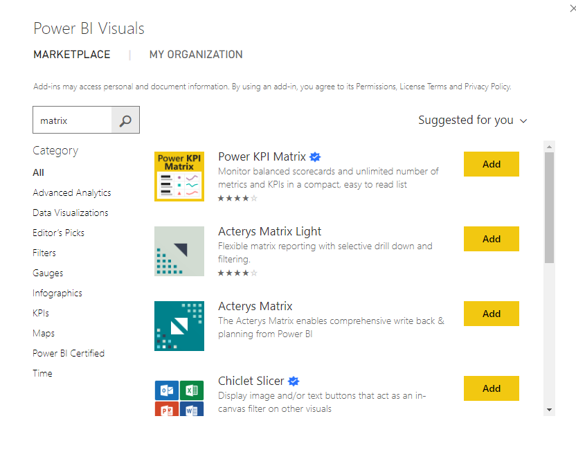
There are also some "fancy" matricies available on the Marketplace that might suit your needs.
If this is helpful, please mark this as a solution and/or give kudos to make this easier for other users to find. Cheers!
Join us in Barcelona for FabCon and SQLCon, the Fabric, Power BI, SQL, and AI community event. Save €200 with code FABCMTY200.
Join Data Days 2026: 60 days of free live/on-demand sessions, challenges, study groups, and certification opportunities.
| User | Count |
|---|---|
| 29 | |
| 23 | |
| 18 | |
| 18 | |
| 15 |
| User | Count |
|---|---|
| 50 | |
| 44 | |
| 43 | |
| 39 | |
| 33 |