This is best Fabric, Power BI, SQL and AI community event. How do we know? The last event sold out! Save €200 with code FABCMTY200.
Register nowA new Data Days event is coming soon! This time we’re going bigger than ever. Fabric, Power BI, SQL, AI and more. Don't miss out.
Hi
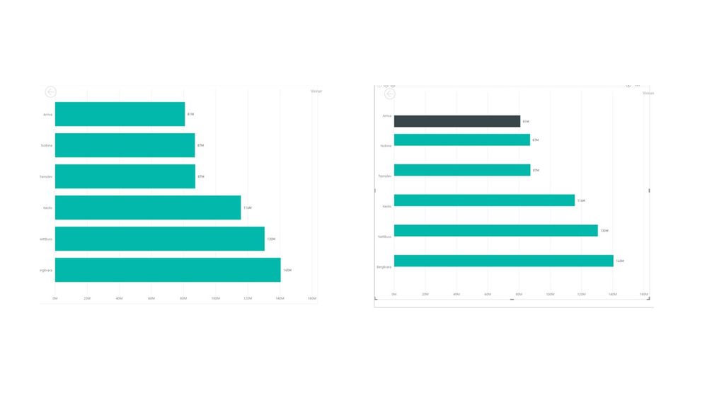
I created a highlighter to point out a certain bar in my chart. I used an if statement to do so. Why is PowerBI screwing up my Y-axis?
Solved! Go to Solution.
it seems the chart on the right is 2 series (teal and black), where the black series has value only for top bar, and teal for all bars except the top one
That is correct, I only want to highlight the top bar and not the others.
any solution?
well right now you're not really highlighting, you're transforming one data series into two, and using different colours for each.
have you tried using the format options instead?
nice solution, but I solved it by changing the chart type.
thx!
Check out the May 2026 Power BI update to learn about new features.
Sign up to receive a private message when registration opens and key events begin.
If you have recently started exploring Fabric, we'd love to hear how it's going. Your feedback can help with product improvements.
| User | Count |
|---|---|
| 31 | |
| 26 | |
| 23 | |
| 22 | |
| 13 |
| User | Count |
|---|---|
| 61 | |
| 47 | |
| 27 | |
| 23 | |
| 18 |