FabCon is coming to Atlanta
Join us at FabCon Atlanta from March 16 - 20, 2026, for the ultimate Fabric, Power BI, AI and SQL community-led event. Save $200 with code FABCOMM.
Register now!- Power BI forums
- Get Help with Power BI
- Desktop
- Service
- Report Server
- Power Query
- Mobile Apps
- Developer
- DAX Commands and Tips
- Custom Visuals Development Discussion
- Health and Life Sciences
- Power BI Spanish forums
- Translated Spanish Desktop
- Training and Consulting
- Instructor Led Training
- Dashboard in a Day for Women, by Women
- Galleries
- Data Stories Gallery
- Themes Gallery
- Contests Gallery
- QuickViz Gallery
- Quick Measures Gallery
- Visual Calculations Gallery
- Notebook Gallery
- Translytical Task Flow Gallery
- TMDL Gallery
- R Script Showcase
- Webinars and Video Gallery
- Ideas
- Custom Visuals Ideas (read-only)
- Issues
- Issues
- Events
- Upcoming Events
The Power BI Data Visualization World Championships is back! Get ahead of the game and start preparing now! Learn more
- Power BI forums
- Forums
- Get Help with Power BI
- Desktop
- KPi image inside Matrix table
- Subscribe to RSS Feed
- Mark Topic as New
- Mark Topic as Read
- Float this Topic for Current User
- Bookmark
- Subscribe
- Printer Friendly Page
- Mark as New
- Bookmark
- Subscribe
- Mute
- Subscribe to RSS Feed
- Permalink
- Report Inappropriate Content
KPi image inside Matrix table
Hi there,
Very new here, and probably this question is already resolved but I cannot figure out.
I have my data in a matrix table with a list aof Sales Representatives + 3 columns in the first column sales and ther other 2 count of
I need to show in the first column a green button for sales over $10,000, a red button less than $10,000 and for the other two column green for count over 5 and red for count less than five.
Thanks in advance for any help!
Regards
Solved! Go to Solution.
- Mark as New
- Bookmark
- Subscribe
- Mute
- Subscribe to RSS Feed
- Permalink
- Report Inappropriate Content
Hi @sajarac,
Based on my research, you could use the UNICHAR function to show different shape, you could refer below link to set different symbols:
List of Unicode Symbols:
https://www.vertex42.com/ExcelTips/unicode-symbols.html
Regards,
Daniel He
If this post helps, then please consider Accept it as the solution to help the other members find it more quickly.
- Mark as New
- Bookmark
- Subscribe
- Mute
- Subscribe to RSS Feed
- Permalink
- Report Inappropriate Content
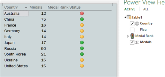
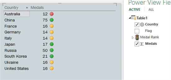
There are lots of different ways of doing this. Here are a couple.
Follow on LinkedIn
@ me in replies or I'll lose your thread!!!
Instead of a Kudo, please vote for this idea
Become an expert!: Enterprise DNA
External Tools: MSHGQM
YouTube Channel!: Microsoft Hates Greg
Latest book!: DAX For Humans
DAX is easy, CALCULATE makes DAX hard...
- Mark as New
- Bookmark
- Subscribe
- Mute
- Subscribe to RSS Feed
- Permalink
- Report Inappropriate Content
Thank you very much for your prompt reply.
However it seems like is designed for expert user, and I am currently in baby steps.
I know how to apply icons sets in excel and I was hopping to see the same fuctionality here in PBI. So far I have my table with conditional format "Font Chage" i.e if this number is below to 10,000 red, green.
But I would like to add a nice shape
- Mark as New
- Bookmark
- Subscribe
- Mute
- Subscribe to RSS Feed
- Permalink
- Report Inappropriate Content
hi @sajarac
I am also taking baby steps.
Curious to know how did you sort this one out?
I have the same need and seem to be facing the same problems as you. and have the same skill level 🙂
Thank you
J
- Mark as New
- Bookmark
- Subscribe
- Mute
- Subscribe to RSS Feed
- Permalink
- Report Inappropriate Content
Hi,
I created a Measure i.e KPI
KPI = UNICHAR(11044)
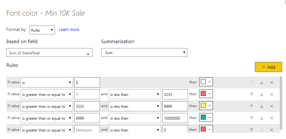
Then in my table I have added a column "KPI" KPI in my case was rename to "Min 10K Sale"
Now in that column for the conditional format I changed the format by "Rules" based on my taste
Regards,
Sajarac
- Mark as New
- Bookmark
- Subscribe
- Mute
- Subscribe to RSS Feed
- Permalink
- Report Inappropriate Content
Hi @sajarac,
Based on my research, you could use the UNICHAR function to show different shape, you could refer below link to set different symbols:
List of Unicode Symbols:
https://www.vertex42.com/ExcelTips/unicode-symbols.html
Regards,
Daniel He
If this post helps, then please consider Accept it as the solution to help the other members find it more quickly.
Helpful resources

Power BI Dataviz World Championships
The Power BI Data Visualization World Championships is back! Get ahead of the game and start preparing now!

| User | Count |
|---|---|
| 38 | |
| 37 | |
| 34 | |
| 31 | |
| 27 |
| User | Count |
|---|---|
| 136 | |
| 99 | |
| 73 | |
| 66 | |
| 65 |


