FabCon is coming to Atlanta
Join us at FabCon Atlanta from March 16 - 20, 2026, for the ultimate Fabric, Power BI, AI and SQL community-led event. Save $200 with code FABCOMM.
Register now!- Power BI forums
- Get Help with Power BI
- Desktop
- Service
- Report Server
- Power Query
- Mobile Apps
- Developer
- DAX Commands and Tips
- Custom Visuals Development Discussion
- Health and Life Sciences
- Power BI Spanish forums
- Translated Spanish Desktop
- Training and Consulting
- Instructor Led Training
- Dashboard in a Day for Women, by Women
- Galleries
- Data Stories Gallery
- Themes Gallery
- Contests Gallery
- QuickViz Gallery
- Quick Measures Gallery
- Visual Calculations Gallery
- Notebook Gallery
- Translytical Task Flow Gallery
- TMDL Gallery
- R Script Showcase
- Webinars and Video Gallery
- Ideas
- Custom Visuals Ideas (read-only)
- Issues
- Issues
- Events
- Upcoming Events
Learn from the best! Meet the four finalists headed to the FINALS of the Power BI Dataviz World Championships! Register now
- Power BI forums
- Forums
- Get Help with Power BI
- Desktop
- Re: KPI wrong value
- Subscribe to RSS Feed
- Mark Topic as New
- Mark Topic as Read
- Float this Topic for Current User
- Bookmark
- Subscribe
- Printer Friendly Page
- Mark as New
- Bookmark
- Subscribe
- Mute
- Subscribe to RSS Feed
- Permalink
- Report Inappropriate Content
KPI wrong value
Hi im having a KPI problem here i've checked several posts but couldn't be able to solve my problems.
Objective: Shows YTD average of the KPI. The correct value should be:
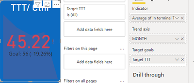
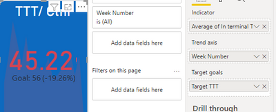
But the I change it to KPI visual, it shows only the amount of the performance last week.
Seems like if no matter if its Month or by Week.
The data is from a Excel file, month looks like this, from month 1 - 5. Week number in the same way.
The problem should be: what should I put in Trend axis in order to show YTD value?
Appreciate your help!
Solved! Go to Solution.
- Mark as New
- Bookmark
- Subscribe
- Mute
- Subscribe to RSS Feed
- Permalink
- Report Inappropriate Content
Hi !
Seems like you are using KPI viusal. It has a problem, when you plot this against Date dimension or any member or Date Dimension it will show the Last Member Value of that element.
Meanining if you plot it against Months, So it will show the KPI value for the month which is been last in the current context.
To overcome this you can overlay 2 objects, 1 with Year so it will give you yearly YTD KPI value, and other with month to show monthly trend. For Yearly one you can turn off the trend axis, For Monthly one you can hide the KPI value.
Helpful resources

Join our Fabric User Panel
Share feedback directly with Fabric product managers, participate in targeted research studies and influence the Fabric roadmap.

Power BI Monthly Update - February 2026
Check out the February 2026 Power BI update to learn about new features.

| User | Count |
|---|---|
| 61 | |
| 54 | |
| 41 | |
| 17 | |
| 13 |
| User | Count |
|---|---|
| 97 | |
| 83 | |
| 35 | |
| 29 | |
| 25 |


