FabCon is coming to Atlanta
Join us at FabCon Atlanta from March 16 - 20, 2026, for the ultimate Fabric, Power BI, AI and SQL community-led event. Save $200 with code FABCOMM.
Register now!- Power BI forums
- Get Help with Power BI
- Desktop
- Service
- Report Server
- Power Query
- Mobile Apps
- Developer
- DAX Commands and Tips
- Custom Visuals Development Discussion
- Health and Life Sciences
- Power BI Spanish forums
- Translated Spanish Desktop
- Training and Consulting
- Instructor Led Training
- Dashboard in a Day for Women, by Women
- Galleries
- Data Stories Gallery
- Themes Gallery
- Contests Gallery
- QuickViz Gallery
- Quick Measures Gallery
- Visual Calculations Gallery
- Notebook Gallery
- Translytical Task Flow Gallery
- TMDL Gallery
- R Script Showcase
- Webinars and Video Gallery
- Ideas
- Custom Visuals Ideas (read-only)
- Issues
- Issues
- Events
- Upcoming Events
The Power BI Data Visualization World Championships is back! Get ahead of the game and start preparing now! Learn more
- Power BI forums
- Forums
- Get Help with Power BI
- Desktop
- Re: KPI Visualisation
- Subscribe to RSS Feed
- Mark Topic as New
- Mark Topic as Read
- Float this Topic for Current User
- Bookmark
- Subscribe
- Printer Friendly Page
- Mark as New
- Bookmark
- Subscribe
- Mute
- Subscribe to RSS Feed
- Permalink
- Report Inappropriate Content
KPI Visualisation
Hi,
I'm facing the next problem, I have this table
Client | Avail. Hours | Spend Hours | Resume Hours
Client1 5 8 -3
Client2 15 10 5
Client3 7 14 -7
Client4 50 50 0
I need to show in a KPI the count of clients that have negative values in the column Resum Hours.
If count > 0 Then show red and the count, if <= 0 Then show green.
Thanks
Solved! Go to Solution.
- Mark as New
- Bookmark
- Subscribe
- Mute
- Subscribe to RSS Feed
- Permalink
- Report Inappropriate Content
Hi @guilledo24,
You may could create 'resume hours' as a calculated column then we could use count function, because the syntax of Count is Count<column>.
You could refer to the fomula below. Calculated Column resume Hours and Measure resume hours<0.
Resume Hours = 'Table1'[Avail. Hours]-'Table1'[Spend Hours]

resume hours<0 = var tem= CALCULATE(COUNT('Table1'[Resume Hours]),FILTER(ALL('Table1'),'Table1'[Resume Hours]<0))return  IF( tem>0,tem,-1)
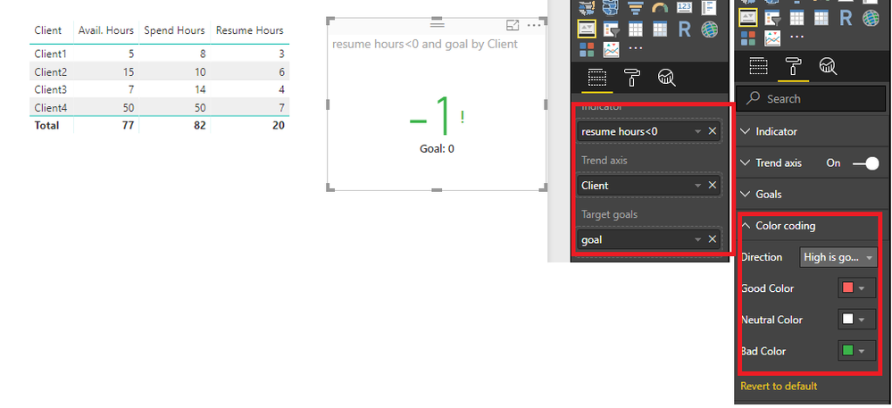
Here is the ouput.
Best Regards,
Cherry
If this post helps, then please consider Accept it as the solution to help the other members find it more quickly.
- Mark as New
- Bookmark
- Subscribe
- Mute
- Subscribe to RSS Feed
- Permalink
- Report Inappropriate Content
Hi @guilledo24,
I have made a test with your data.
You could refer to the steps below.
1. create a calculated colum with the expression below.
goal = 0
2. Create a measure with formula below.
resume hours<0 =
VAR tem =
    CALCULATE (
        COUNT ( 'Table1'[Resume Hours] );
        FILTER ( ALL ( 'Table1' ); 'Table1'[Resume Hours] < 0 )
    )
RETURN
    IF ( tem > 0; tem; -1 )
3. You could create the KPI visual with goal and measure and set the color like below.
More details, you could refer to the test file attached.
Best Regards,
Cherry
If this post helps, then please consider Accept it as the solution to help the other members find it more quickly.
- Mark as New
- Bookmark
- Subscribe
- Mute
- Subscribe to RSS Feed
- Permalink
- Report Inappropriate Content
Sorry, I forget to tell you that "resume hours" is a measure.
- Mark as New
- Bookmark
- Subscribe
- Mute
- Subscribe to RSS Feed
- Permalink
- Report Inappropriate Content
Hi @guilledo24,
You may could create 'resume hours' as a calculated column then we could use count function, because the syntax of Count is Count<column>.
You could refer to the fomula below. Calculated Column resume Hours and Measure resume hours<0.
Resume Hours = 'Table1'[Avail. Hours]-'Table1'[Spend Hours]

resume hours<0 = var tem= CALCULATE(COUNT('Table1'[Resume Hours]),FILTER(ALL('Table1'),'Table1'[Resume Hours]<0))return  IF( tem>0,tem,-1)
Here is the ouput.
Best Regards,
Cherry
If this post helps, then please consider Accept it as the solution to help the other members find it more quickly.
Helpful resources

Power BI Dataviz World Championships
The Power BI Data Visualization World Championships is back! Get ahead of the game and start preparing now!

| User | Count |
|---|---|
| 40 | |
| 35 | |
| 34 | |
| 31 | |
| 27 |
| User | Count |
|---|---|
| 135 | |
| 102 | |
| 67 | |
| 65 | |
| 56 |


