FabCon is coming to Atlanta
Join us at FabCon Atlanta from March 16 - 20, 2026, for the ultimate Fabric, Power BI, AI and SQL community-led event. Save $200 with code FABCOMM.
Register now!- Power BI forums
- Get Help with Power BI
- Desktop
- Service
- Report Server
- Power Query
- Mobile Apps
- Developer
- DAX Commands and Tips
- Custom Visuals Development Discussion
- Health and Life Sciences
- Power BI Spanish forums
- Translated Spanish Desktop
- Training and Consulting
- Instructor Led Training
- Dashboard in a Day for Women, by Women
- Galleries
- Data Stories Gallery
- Themes Gallery
- Contests Gallery
- QuickViz Gallery
- Quick Measures Gallery
- Visual Calculations Gallery
- Notebook Gallery
- Translytical Task Flow Gallery
- TMDL Gallery
- R Script Showcase
- Webinars and Video Gallery
- Ideas
- Custom Visuals Ideas (read-only)
- Issues
- Issues
- Events
- Upcoming Events
The Power BI Data Visualization World Championships is back! Get ahead of the game and start preparing now! Learn more
- Power BI forums
- Forums
- Get Help with Power BI
- Desktop
- Re: Issue with data display in the Matrix visual (...
- Subscribe to RSS Feed
- Mark Topic as New
- Mark Topic as Read
- Float this Topic for Current User
- Bookmark
- Subscribe
- Printer Friendly Page
- Mark as New
- Bookmark
- Subscribe
- Mute
- Subscribe to RSS Feed
- Permalink
- Report Inappropriate Content
Issue with data display in the Matrix visual (unrequested data grouping)
Hi community,
I am trying to utilize the Matrix visual to create the table below, however, I am facing a serious issue.
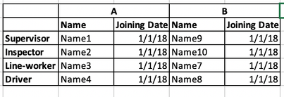
The data I'm analyzing is similar to the following:
The expected result I am trying to achieve is:
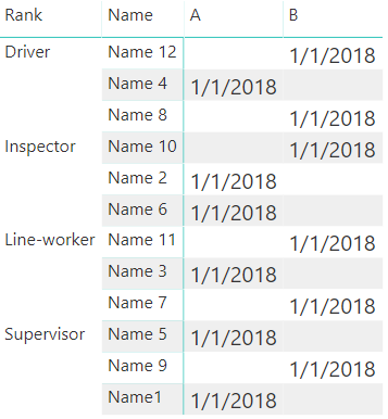
However, the actual result of such data set in the visual is:
The problem is that, by default, the visual group similar records (for example, if there are 2 supervisors in factory A, only one of them will be displayed).
The only workaround I found so far is to add a drill-down for the "ID". The problem is that in this case, under the "supervisor", 4 lines will be displayed. When dealing with a large data set this is not a good result
Any ideas of how can I generate such a table or workaround the issue?
- Mark as New
- Bookmark
- Subscribe
- Mute
- Subscribe to RSS Feed
- Permalink
- Report Inappropriate Content
Hi @SittsBI ,
By my tests and research, I'm afraid that we cannot achieve your desired output in Power BI currently.
For matrix, the value will be aggregated.
For workaround, you may try the matrix this format.
Best Regards,
Cherry
If this post helps, then please consider Accept it as the solution to help the other members find it more quickly.
- Mark as New
- Bookmark
- Subscribe
- Mute
- Subscribe to RSS Feed
- Permalink
- Report Inappropriate Content
Hi Cherry,
Thanks for the reply.
Unfortunately, this workaround is good only in small data sets.
If I have 30 factories, and each one has 1-3 in the same rank, this will not be a good solution.
Is there any other idea how to workaround this request?
Helpful resources

Power BI Dataviz World Championships
The Power BI Data Visualization World Championships is back! Get ahead of the game and start preparing now!

| User | Count |
|---|---|
| 67 | |
| 45 | |
| 43 | |
| 36 | |
| 23 |
| User | Count |
|---|---|
| 191 | |
| 127 | |
| 106 | |
| 78 | |
| 53 |


