Join us at FabCon Vienna from September 15-18, 2025
The ultimate Fabric, Power BI, SQL, and AI community-led learning event. Save €200 with code FABCOMM.
Get registered- Power BI forums
- Get Help with Power BI
- Desktop
- Service
- Report Server
- Power Query
- Mobile Apps
- Developer
- DAX Commands and Tips
- Custom Visuals Development Discussion
- Health and Life Sciences
- Power BI Spanish forums
- Translated Spanish Desktop
- Training and Consulting
- Instructor Led Training
- Dashboard in a Day for Women, by Women
- Galleries
- Data Stories Gallery
- Themes Gallery
- Contests Gallery
- Quick Measures Gallery
- Notebook Gallery
- Translytical Task Flow Gallery
- TMDL Gallery
- R Script Showcase
- Webinars and Video Gallery
- Ideas
- Custom Visuals Ideas (read-only)
- Issues
- Issues
- Events
- Upcoming Events
Enhance your career with this limited time 50% discount on Fabric and Power BI exams. Ends August 31st. Request your voucher.
- Power BI forums
- Forums
- Get Help with Power BI
- Desktop
- Re: Ideas for employee Attendance/timesheet Dashbo...
- Subscribe to RSS Feed
- Mark Topic as New
- Mark Topic as Read
- Float this Topic for Current User
- Bookmark
- Subscribe
- Printer Friendly Page
- Mark as New
- Bookmark
- Subscribe
- Mute
- Subscribe to RSS Feed
- Permalink
- Report Inappropriate Content
Ideas for employee Attendance/timesheet Dashboard
Hi,
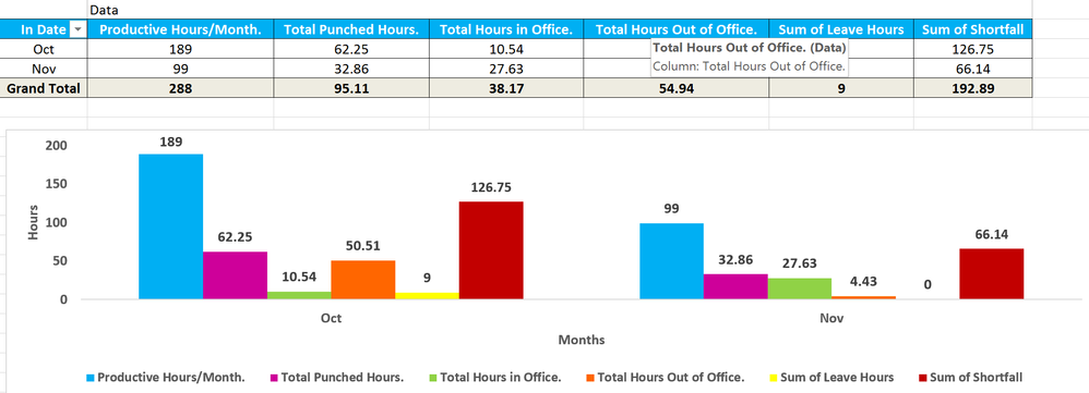
I have been asked to design a dash for empl attandnce. I haven't really done any timesheet dashboards before. I did someting in excel which was basic pivot chart. Attaching the raw data and my current excel graph.
What would be the best way to visualize and prepare the data. HR will send these excel dumps monthly. There is no on prem gateway for now, so excel upload and refresh is what we are aiming to achive. Not good with DAX so formulas would be a plus if you guys can share.
- Column A - G is auto generated
- Column H - I is what i added for myself to create graph
- Leave hours is shared from ERP so has to be added manually monthly (not sure how to handle it - maybe an IF condition or a filter in BI to select # of leave days that would add/delete the # of productive hours from the visuals?)
- Shortfall and Utilization is what i believe can be automated as calculated columns.
I would appreciate any help with Idea and suggestions.
http://www.filedropper.com/an_2 - raw file
Solved! Go to Solution.
- Mark as New
- Bookmark
- Subscribe
- Mute
- Subscribe to RSS Feed
- Permalink
- Report Inappropriate Content
Hi @koshur,
Sorry for the wrong PBIX file. Please download the correct PBIX file from the following link, if you have any problems using the new PBIX file, please let me know.
https://1drv.ms/u/s!AhsotbnGu1NogjTT9NqW-QVosaAj
Thanks,
Lydia Zhang
If this post helps, then please consider Accept it as the solution to help the other members find it more quickly.
- Mark as New
- Bookmark
- Subscribe
- Mute
- Subscribe to RSS Feed
- Permalink
- Report Inappropriate Content
Hi @koshur,
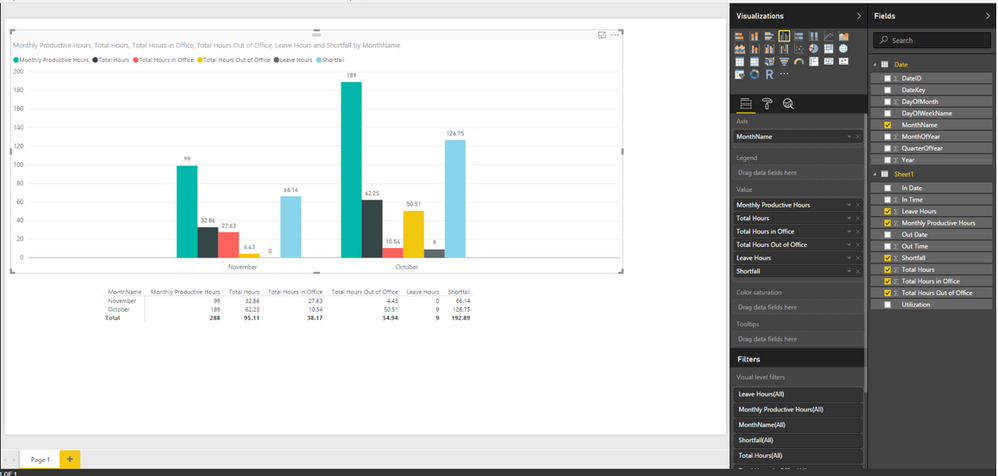
I make a test using your Excel file. It is easy to create above visuals in Power BI Desktop, after connecting to Excel file, you would need to add another calendar table in the current Power BI Desktop file and create relationship using date fields between the imported tables. Then you can create a Matrix visual and a clustered column chart using MonthName fields of calendar table and a set of fields of Excel Sheet. You can check the following screenshot , for more details, please review this attached PBIX file.
In addition, to refresh the report you created in Power BI Desktop without on-premises gateway, you can consider to store Excel in OneDrive for business, then connect to it from Power BI Desktop, create above report and upload Power BI Desktop file to Power BI Service. In this case, no gateway is required, Power BI automatically connects to the Excel workbook on OneDrive, about every hour to check for updates. If the Excel workbook has changed, Power BI will refresh the dataset and reports in the Power BI service.
Thanks,
Lydia Zhang
If this post helps, then please consider Accept it as the solution to help the other members find it more quickly.
- Mark as New
- Bookmark
- Subscribe
- Mute
- Subscribe to RSS Feed
- Permalink
- Report Inappropriate Content
Hi Lydia,
Thanks for the clue. Can you send in the pbix that contains the data measures created as mentioned in your snapshot. I am also thinking to add a cal column for daily utilization % and monthly utilization % per emp. I'll try to do that and let you know how it works. My aim is to not do anyting inside excel but all within BI and calculated columns or measures.
Best
- Mark as New
- Bookmark
- Subscribe
- Mute
- Subscribe to RSS Feed
- Permalink
- Report Inappropriate Content
Hi @koshur,
I have attached PBIX file in my first reply, based on your current screenshot, there is no need to create measures or calculated columns, just add another calendar table. You can try to create measures or calculated columns to calculate daily utilization % and monthly utilization % per emp in the PBIX file I provided.
Thanks,
Lydia Zhang
If this post helps, then please consider Accept it as the solution to help the other members find it more quickly.
- Mark as New
- Bookmark
- Subscribe
- Mute
- Subscribe to RSS Feed
- Permalink
- Report Inappropriate Content
Hi Lydia,
For some reasons the PBIX you attached looks different on my end than the one in your snapshot.

- Mark as New
- Bookmark
- Subscribe
- Mute
- Subscribe to RSS Feed
- Permalink
- Report Inappropriate Content
Hi @koshur,
Sorry for the wrong PBIX file. Please download the correct PBIX file from the following link, if you have any problems using the new PBIX file, please let me know.
https://1drv.ms/u/s!AhsotbnGu1NogjTT9NqW-QVosaAj
Thanks,
Lydia Zhang
If this post helps, then please consider Accept it as the solution to help the other members find it more quickly.
- Mark as New
- Bookmark
- Subscribe
- Mute
- Subscribe to RSS Feed
- Permalink
- Report Inappropriate Content
thanks, I'll try to play around, for sheet 1, i'm planning to have a separate cvs or excel for each emp in team and then have a team visual showing overall numbers and utilization. I'll try few things and let you know how it goes.
- Mark as New
- Bookmark
- Subscribe
- Mute
- Subscribe to RSS Feed
- Permalink
- Report Inappropriate Content
Hi ,
What i gave you was a file for one employee, how do i handle multiple employess so that i can have a filter for employee name that slices the data accordingly.
Should I Import multiple xlxs for each emp wiht EMP name as unique among all (invloves adding a column in current table as EMP name)?
What is the best approach?
- Mark as New
- Bookmark
- Subscribe
- Mute
- Subscribe to RSS Feed
- Permalink
- Report Inappropriate Content
Hi @koshur,
Since this thread is closed, could you please create another new thread in the Power BI Desktop forum and describe your new requirement?
Thanks,
Lydia Zhang
If this post helps, then please consider Accept it as the solution to help the other members find it more quickly.
- Mark as New
- Bookmark
- Subscribe
- Mute
- Subscribe to RSS Feed
- Permalink
- Report Inappropriate Content
I don't think you need expert DAX formulas to visualize what you have. I have not spend much time looking at your data but at first sight, it looks like drag and drop on the canvas and you would be able to visualize what you are expecting.
Bhavesh
Love the Self Service BI.
Please use the 'Mark as answer' link to mark a post that answers your question. If you find a reply helpful, please remember to give Kudos.
Helpful resources
| User | Count |
|---|---|
| 77 | |
| 75 | |
| 36 | |
| 31 | |
| 29 |
| User | Count |
|---|---|
| 93 | |
| 81 | |
| 57 | |
| 48 | |
| 48 |


