FabCon is coming to Atlanta
Join us at FabCon Atlanta from March 16 - 20, 2026, for the ultimate Fabric, Power BI, AI and SQL community-led event. Save $200 with code FABCOMM.
Register now!- Power BI forums
- Get Help with Power BI
- Desktop
- Service
- Report Server
- Power Query
- Mobile Apps
- Developer
- DAX Commands and Tips
- Custom Visuals Development Discussion
- Health and Life Sciences
- Power BI Spanish forums
- Translated Spanish Desktop
- Training and Consulting
- Instructor Led Training
- Dashboard in a Day for Women, by Women
- Galleries
- Data Stories Gallery
- Themes Gallery
- Contests Gallery
- Quick Measures Gallery
- Notebook Gallery
- Translytical Task Flow Gallery
- TMDL Gallery
- R Script Showcase
- Webinars and Video Gallery
- Ideas
- Custom Visuals Ideas (read-only)
- Issues
- Issues
- Events
- Upcoming Events
To celebrate FabCon Vienna, we are offering 50% off select exams. Ends October 3rd. Request your discount now.
- Power BI forums
- Forums
- Get Help with Power BI
- Desktop
- Re: How to show all data point in Y axis of a scat...
- Subscribe to RSS Feed
- Mark Topic as New
- Mark Topic as Read
- Float this Topic for Current User
- Bookmark
- Subscribe
- Printer Friendly Page
- Mark as New
- Bookmark
- Subscribe
- Mute
- Subscribe to RSS Feed
- Permalink
- Report Inappropriate Content
How to show all data point in Y axis of a scatter chart in Power BI Desktop
Hi Experts,
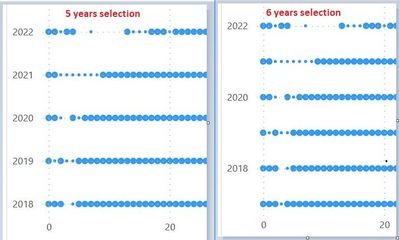
We have a scatter chart for showing the publication count by years. It is found that when 5 consecutive years is chosen, all the years are shown in the Y axis properly, however, once 6 consecutive years is chosen, only the even years are shown in the Y axis. Is it possible to show all the years in Y axis no matter it is 5 or 6 consecutive years?
Thanks
Toms
- Mark as New
- Bookmark
- Subscribe
- Mute
- Subscribe to RSS Feed
- Permalink
- Report Inappropriate Content
Hi @TomsNg
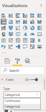
Scatter chart is used to show relation between two numerical values. If you convert one of the axis to categorical, that axis acts like a text axis and then sctatter chart can not be used.
I would recommend to go for a 'Dot plot charts'.
Hope it helps.
- Mark as New
- Bookmark
- Subscribe
- Mute
- Subscribe to RSS Feed
- Permalink
- Report Inappropriate Content
- Mark as New
- Bookmark
- Subscribe
- Mute
- Subscribe to RSS Feed
- Permalink
- Report Inappropriate Content
Hello amitchandak,
Thanks for your reply, however, it doesn't work. An error of "If your x-axis is categorical, choose a summarization for the x- or y-axis." is returned.
For your information, in our scatter chart, the Y-axis is pointing to a column named 'Publication Year' and 'Don't summarize' is chosen, the X-axis is pointing to an numeric column named 'pub_count' and 'Don't summarize' is also chosen. We just want to show every count of publication by publication year. The only problem now is it failed to show all publication years in the Y axis.
Thanks
Toms
Helpful resources
| User | Count |
|---|---|
| 97 | |
| 78 | |
| 77 | |
| 48 | |
| 26 |


