Join us at FabCon Vienna from September 15-18, 2025
The ultimate Fabric, Power BI, SQL, and AI community-led learning event. Save €200 with code FABCOMM.
Get registered- Power BI forums
- Get Help with Power BI
- Desktop
- Service
- Report Server
- Power Query
- Mobile Apps
- Developer
- DAX Commands and Tips
- Custom Visuals Development Discussion
- Health and Life Sciences
- Power BI Spanish forums
- Translated Spanish Desktop
- Training and Consulting
- Instructor Led Training
- Dashboard in a Day for Women, by Women
- Galleries
- Data Stories Gallery
- Themes Gallery
- Contests Gallery
- Quick Measures Gallery
- Notebook Gallery
- Translytical Task Flow Gallery
- TMDL Gallery
- R Script Showcase
- Webinars and Video Gallery
- Ideas
- Custom Visuals Ideas (read-only)
- Issues
- Issues
- Events
- Upcoming Events
Compete to become Power BI Data Viz World Champion! First round ends August 18th. Get started.
- Power BI forums
- Forums
- Get Help with Power BI
- Desktop
- Re: How to hide results that are below a given fre...
- Subscribe to RSS Feed
- Mark Topic as New
- Mark Topic as Read
- Float this Topic for Current User
- Bookmark
- Subscribe
- Printer Friendly Page
- Mark as New
- Bookmark
- Subscribe
- Mute
- Subscribe to RSS Feed
- Permalink
- Report Inappropriate Content
How to hide results that are below a given frequency when a table will be filtered?
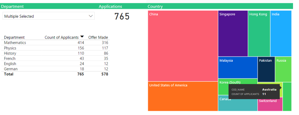
Summary: I would like to know if there is any way to have graphs and tables display “<5 “ when a filter reduces the frequency of records down to that number.
I have a dataset of thousands of students with various pieces of information such as gender, the country they live in and the course that they study.I want to prepare a dashboard that allows members of the public to see this information and filter it to show, for example, how many women are studying Engineering, or how many people from Mexico study Art.
Currently I have prepared a report based on the raw data, with each student a row, each value in a new column. I have a couple of graphs and a table that displays relevant information, mainly counting the raw numbers.
A difficulty I have is that if someone filters down to a low level, they can potentially see information that is potentially identifying; for example by asking in particular about male Greeks studying Maths, they can see that there are two of them, and one was unsuccessful.
I know that I can change visuals to hide results below a certain threshold, but I would prefer to leave an indication that a change has been made, without specifying the exact figure.
Is there is any way to have graphs and tables display “<5 “ when a filter reduces the number of records down to that level, rather than making the value invisible?
Thanks in advance for your advice.
- Mark as New
- Bookmark
- Subscribe
- Mute
- Subscribe to RSS Feed
- Permalink
- Report Inappropriate Content
Thank you for taking time to reply.
- Mark as New
- Bookmark
- Subscribe
- Mute
- Subscribe to RSS Feed
- Permalink
- Report Inappropriate Content
Hi @TM_Visual,
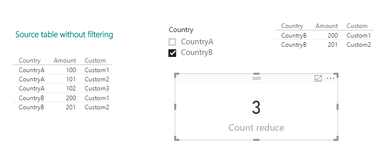
Based on my understanding, you want to show the number of records that has been reduced by slicer filter, right? For example, there are total 8 rows in source table, after filtering, there existing 3 rows in table visual, so, you want to show 5, right?
If that is the case, you can refer to below formula to create a measure and show it in a card visual.
Count reduce =
CALCULATE ( COUNT ( Sheet1[Amount] ), ALL ( Sheet1 ) )
    - COUNT ( Sheet1[Amount] )
If I have something misunderstood, please elaborate what did you mean "have graphs and tables display “<5 “ when a filter reduces the number of records down to that level, rather than making the value invisible" with an image to show your desired output.
Best regards,
Yuliana Gu
If this post helps, then please consider Accept it as the solution to help the other members find it more quickly.
- Mark as New
- Bookmark
- Subscribe
- Mute
- Subscribe to RSS Feed
- Permalink
- Report Inappropriate Content
Thanks for replying. Unfortunatley, this is not what I'm looking for.
I have a table that normally would look like
Year     Number
_______________
2014     21
2015     9
2016     2
2017     15
(please excuse the formatting)
I would like it to display:
Year     Number
_______________
2014     21
2015     <10
2016     <10
2017     15
I came up with a partial solution last night:
Number of offers = IF([Number]>9,
[Number],"<10")
Unfortunately this presents a new problem: the number is formatted to include decimal places:
Year     Number
________________
2014     21.00
2015     <10
2016     <10
2017     15.00
If I try to use
Number of offers = IF([Number]
>9,
FORMAT([Number],""),"<10")
, the table appears to be correct, but because the numbers are formatted as text, they cannot be sorted accurately. For example, they appear as:
Animal   Number
________________
Fly       1001
Dog       109
Cat       1547
Rat       191
In summary: I want to format the numbers as a number, but without two decimal places.
I cannot change the Data Type to number, as the measure can contain a text string.
Unless you know of another way to resolve my original problem, I may post this again on the forum as another query.
Thank you for trying to answer my question; that is an interesting techique that I may use in the future!
- Mark as New
- Bookmark
- Subscribe
- Mute
- Subscribe to RSS Feed
- Permalink
- Report Inappropriate Content
Hi, did you get a solution to this? If yes, please share. I tried the same, but cannot display <10 becaue the field can use only one data type.
- Mark as New
- Bookmark
- Subscribe
- Mute
- Subscribe to RSS Feed
- Permalink
- Report Inappropriate Content
Replying 8 years later! I didn't find a solution at the time, and after experimenting today I still haven't been able to create a good solution. Power BI (at least in the default visuals) always sorts numbers above text.
The best methods I have found are (using my example of "<10") , explaining to users in the visual title that values below 10 aren't displayed, or are shown as 1, or are rounded to the nearest 5. Use something similar to this measure
Sorted = IF( NumberSum = 0 , 0, IF(NumberSum < 10, 1, NumberSum))

This is visually distracting and breaks the order if users change the sort order of the visual, but could fit your needs.
Other ideas that are more time-consuming or inferior:
- CoPilot tells me that something might be possible using calculation groups in tabular editor, but i've not tried that.
- I suppose if you want to invest crazy amounts of time you could create your own custom visual (pos. with the assistance of chat gpt) that has some special sort order coding
- You could have a measure that outputs text, but pads the numbers with an invisible character. But you'd have to specify the characters for each level, for example saying that if the number is less than <100, then "----" & number, if number is below 1000 then "---" & number, if below <10000 then "--" & number, where "-" is an invisible space. But this would ruin the data if users exported it.
- Create a new thread to ask the question with your exact use case, and perhaps a real Power BI expert will pick it up with a better solution.
Sorry I couldn't help further!
- Mark as New
- Bookmark
- Subscribe
- Mute
- Subscribe to RSS Feed
- Permalink
- Report Inappropriate Content
Hi @TM_Visual,
What is the data typr of [Number] column in source table?
Actually, if it is text, we are unable to compare it with a numerica value [Number]>9. Also, when we create a new calculated column, it is not possible to return both numeric and text values in a single column.
Number of offers = IF([Number]>9, [Number],"<10"
By the way, were you using Power BI desktop to generate reports?
Best regards,
Yuliana Gu
If this post helps, then please consider Accept it as the solution to help the other members find it more quickly.


