Join us at FabCon Vienna from September 15-18, 2025
The ultimate Fabric, Power BI, SQL, and AI community-led learning event. Save €200 with code FABCOMM.
Get registered- Power BI forums
- Get Help with Power BI
- Desktop
- Service
- Report Server
- Power Query
- Mobile Apps
- Developer
- DAX Commands and Tips
- Custom Visuals Development Discussion
- Health and Life Sciences
- Power BI Spanish forums
- Translated Spanish Desktop
- Training and Consulting
- Instructor Led Training
- Dashboard in a Day for Women, by Women
- Galleries
- Data Stories Gallery
- Themes Gallery
- Contests Gallery
- Quick Measures Gallery
- Notebook Gallery
- Translytical Task Flow Gallery
- TMDL Gallery
- R Script Showcase
- Webinars and Video Gallery
- Ideas
- Custom Visuals Ideas (read-only)
- Issues
- Issues
- Events
- Upcoming Events
Compete to become Power BI Data Viz World Champion! First round ends August 18th. Get started.
- Power BI forums
- Forums
- Get Help with Power BI
- Desktop
- How to get the % of total values in columns and a ...
- Subscribe to RSS Feed
- Mark Topic as New
- Mark Topic as Read
- Float this Topic for Current User
- Bookmark
- Subscribe
- Printer Friendly Page
- Mark as New
- Bookmark
- Subscribe
- Mute
- Subscribe to RSS Feed
- Permalink
- Report Inappropriate Content
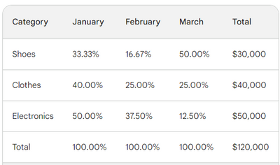
How to get the % of total values in columns and a total value in the totals in matrix (Please refer
Hi All,
In power bi I am trying to build the visualization in matrix, but do not see options to achieve the same.
Can someone help with the approach?
- Mark as New
- Bookmark
- Subscribe
- Mute
- Subscribe to RSS Feed
- Permalink
- Report Inappropriate Content
@Anonymousthank you for your kind reply,
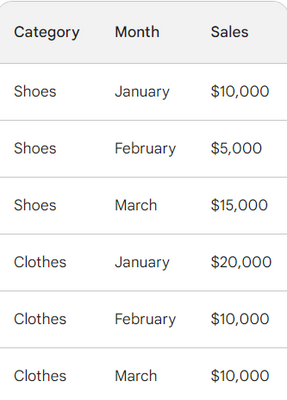
So I am having the below data set, which I am trying to get the sales by every month for every category, and in the rows the % values every month of the sum total for that category
raw data as below:
Total = Sum(Sales)
Montly % Values = DIVIDE(SUM([Sales]), CALCULATE([SUM([Sales]), ALL([Category], [Month])])) * 100
- Mark as New
- Bookmark
- Subscribe
- Mute
- Subscribe to RSS Feed
- Permalink
- Report Inappropriate Content
Hi @naren_palmure ,
In order to better understand your demands and give the right solution, could you please provide some more specific information? such as your desensitized example data and a screenshot of your desired results?
Thanks for your efforts & time in advance.
Best regards,
Community Support Team_Binbin Yu
If this post helps, then please consider Accept it as the solution to help the other members find it more quickly.
Helpful resources
| User | Count |
|---|---|
| 82 | |
| 82 | |
| 35 | |
| 32 | |
| 32 |
| User | Count |
|---|---|
| 93 | |
| 79 | |
| 62 | |
| 54 | |
| 51 |


