FabCon is coming to Atlanta
Join us at FabCon Atlanta from March 16 - 20, 2026, for the ultimate Fabric, Power BI, AI and SQL community-led event. Save $200 with code FABCOMM.
Register now!- Power BI forums
- Get Help with Power BI
- Desktop
- Service
- Report Server
- Power Query
- Mobile Apps
- Developer
- DAX Commands and Tips
- Custom Visuals Development Discussion
- Health and Life Sciences
- Power BI Spanish forums
- Translated Spanish Desktop
- Training and Consulting
- Instructor Led Training
- Dashboard in a Day for Women, by Women
- Galleries
- Data Stories Gallery
- Themes Gallery
- Contests Gallery
- QuickViz Gallery
- Quick Measures Gallery
- Visual Calculations Gallery
- Notebook Gallery
- Translytical Task Flow Gallery
- TMDL Gallery
- R Script Showcase
- Webinars and Video Gallery
- Ideas
- Custom Visuals Ideas (read-only)
- Issues
- Issues
- Events
- Upcoming Events
Get Fabric Certified for FREE during Fabric Data Days. Don't miss your chance! Request now
- Power BI forums
- Forums
- Get Help with Power BI
- Desktop
- Re: How to get a "Total column" in the clustered c...
- Subscribe to RSS Feed
- Mark Topic as New
- Mark Topic as Read
- Float this Topic for Current User
- Bookmark
- Subscribe
- Printer Friendly Page
- Mark as New
- Bookmark
- Subscribe
- Mute
- Subscribe to RSS Feed
- Permalink
- Report Inappropriate Content
How to get a "Total column" in the clustered column chart
Hi,
I'm looking to get some inputs to implement a peculiar requirement in a Power BI report.
I need add a "total column" in a clustured column chat.
- I found out that there is no seamless way to do such a thing in PBI as some of the other things in visuals. This seems to be very easily doable in excel. I wonder why is this not the case in Power BI.
- My model is something like below (subset of tables):
- "Project" table: has projects info. Relevant attributes: status code, project-id and other relevant attributes.
- "Project Type" table: has two fields, project id and dept.
- "Project Status" table: has two fields status code and status.
- Relationships are as one can imagine:
- "Project" <-> "Project Type" on project id (1:M)
- "Project" <-> "Project Status" on status code (M:1)
- Then, I need to have the clustured column chart visual as:-
- Axis on "Project Type": dept.
- Legend on "Project Status": status
- Values: total no of project
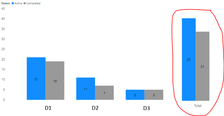
- Now there is no easy way to do this, it seems. How to get the "Total Column" to show totals of "project type" across legends i.e. "project status". See below visual
- To me it seems one way (as I can envision) would be to use some sort of DAX based method.
- I created a calculated table, with a column as below, so that the "Total" also shows up in the axis
NewTable = UNION ( VALUES ( 'Project Type '[dept] ), ROW ( "Department", "Total" ) )
- Beyond this, I couldn't quite grasp what to do next:
- Should I add another column in this new table for relationship with existing model. Wouldn't that cause erros such circular relationship.
- There should be some measure in the new table as well, which can be used in the clustured column chart visual (in place of the exisring "count of project ids"). How should this measure's DAX look like, so that for "Total", it does totals across all axis/project-types by status/legend but for other axis values it just count projects for that axis.
I referred below but seems it doen't quite fit here.
Would appreciate any pointers.
Thanks in advance!
Solved! Go to Solution.
- Mark as New
- Bookmark
- Subscribe
- Mute
- Subscribe to RSS Feed
- Permalink
- Report Inappropriate Content
Hi @Anonymous ,
Sorry for misleading you.Check below method.
Create a measure based on your new table.
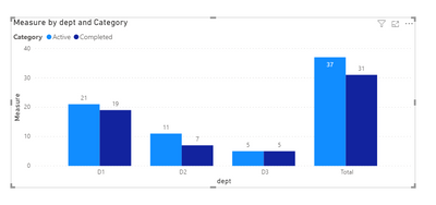
Measure = IF(SELECTEDVALUE(NewTable[dept])="Total",CALCULATE(SUM('Project Type'[Value]),ALL(NewTable[dept])),SUM('Project Type'[Value]))Finally you will see:
For details,see attached.
Best Regards,
Kelly
- Mark as New
- Bookmark
- Subscribe
- Mute
- Subscribe to RSS Feed
- Permalink
- Report Inappropriate Content
Hi @Anonymous ,
In clustered column chart, it's unavailable to put a detailed X-axis with an aggregated X-axis together,I have a workaround,that is to create 2 clustered column charts,then put them together,looking like the result you wanna achieve.
See below:
You can check the attachment for details.
Kelly
- Mark as New
- Bookmark
- Subscribe
- Mute
- Subscribe to RSS Feed
- Permalink
- Report Inappropriate Content
@v-kelly-msft Thanks for your response. I had already implemented this (by working with the formatting options of the two charts), but I would imagine this is not a very clean solution. There are are more axis values in future, these formating adjustements would have to be redone otherwise visually these charts may not look good. I'm looking for an alternate solution.
- Mark as New
- Bookmark
- Subscribe
- Mute
- Subscribe to RSS Feed
- Permalink
- Report Inappropriate Content
Hi @Anonymous ,
How about replacing the clustered column chart for totals with Multi-row card,the setting for card visual is much easier.See below:
Kelly
- Mark as New
- Bookmark
- Subscribe
- Mute
- Subscribe to RSS Feed
- Permalink
- Report Inappropriate Content
Thanks @v-kelly-msft. Yes, all of these alternate solutions I have in my backup plan. Maybe I should have included all workarounds I had thought of in the question iteself.
So would you say, to have the "totals column" in the single chart itself is not possible through any method? DAX or sometime else?
Regards.
- Mark as New
- Bookmark
- Subscribe
- Mute
- Subscribe to RSS Feed
- Permalink
- Report Inappropriate Content
Hi @Anonymous ,
Sorry for misleading you.Check below method.
Create a measure based on your new table.
Measure = IF(SELECTEDVALUE(NewTable[dept])="Total",CALCULATE(SUM('Project Type'[Value]),ALL(NewTable[dept])),SUM('Project Type'[Value]))Finally you will see:
For details,see attached.
Best Regards,
Kelly
- Mark as New
- Bookmark
- Subscribe
- Mute
- Subscribe to RSS Feed
- Permalink
- Report Inappropriate Content
There is a much simpeler solution than the ones mentioned:
Create a new clustered bar chart under the categorized one.
Place in axis the same measure(s) as in the chart above.
Keep the y-axis empty.
Place in Title of the y-axis 'Total'
The biggest advantage is that you can give this total-chart an other scale and an other format (bold labels for example).
- Mark as New
- Bookmark
- Subscribe
- Mute
- Subscribe to RSS Feed
- Permalink
- Report Inappropriate Content
I know this has been a while since you wrote your answer. But could you provide a step-by-step guide as to what you did for us newer folk? Thanks!
- Mark as New
- Bookmark
- Subscribe
- Mute
- Subscribe to RSS Feed
- Permalink
- Report Inappropriate Content
Hi All,
I have a similar problem that I am trying to solve. I have been able to achieve till getting the Total, but then if Total is selected then how to highlight Dept D1 and D2 from other visual as D1 and D2 make up Total.
Currently highlighting DI from Total visual displays D1 in other nad so for D2, but my requirment is highlighting Total should highlight both in other visual.
Please advise on how to achieve this?
- Mark as New
- Bookmark
- Subscribe
- Mute
- Subscribe to RSS Feed
- Permalink
- Report Inappropriate Content
Hello @v-kelly-msft , I need the totals but for the rows. I try the same approach for it and seem to be stuck. I just used a rand function to introduce dates and pulled it to small multiples. I try creating a table but I'm unable to see the totals when I use clustered chart viz. Any help is greatly appreciated!!!
- Mark as New
- Bookmark
- Subscribe
- Mute
- Subscribe to RSS Feed
- Permalink
- Report Inappropriate Content
hi @v-kelly-msft ,
How to edit this if want to show Total irrespective of any selection. If i select any department then i need that department and next to that i need the overall total.
- Mark as New
- Bookmark
- Subscribe
- Mute
- Subscribe to RSS Feed
- Permalink
- Report Inappropriate Content
i have a set of information , where i want the grand total as axis, and when i try above measure, i get the total in each bar. for exapmle if summation of three bar is 15, i am getting 15 on top of each bar. not sure how to resolve this, may i have a video to understand this in aproper way?
@create total in column chart
- Mark as New
- Bookmark
- Subscribe
- Mute
- Subscribe to RSS Feed
- Permalink
- Report Inappropriate Content
@v-kelly-msft Thank you so much !! And no worries for the earlier input, I should have mentioned what all things I have in mind as backup.
Btw for me the total is coming up as the first "column", in your file it is coming up as "last". Did you do something for this? I would like to put it at last.
Appreciate your help.
- Mark as New
- Bookmark
- Subscribe
- Mute
- Subscribe to RSS Feed
- Permalink
- Report Inappropriate Content
Hi @Anonymous ,
Just ranking the showing order on the top right button.
Best Regards,
Kelly
- Mark as New
- Bookmark
- Subscribe
- Mute
- Subscribe to RSS Feed
- Permalink
- Report Inappropriate Content
@Anonymous
maybe you should try to use 2 different visuals placed near each other. one for detailed, second - for total. Set manually scale of Y-axis for both of them
- Mark as New
- Bookmark
- Subscribe
- Mute
- Subscribe to RSS Feed
- Permalink
- Report Inappropriate Content
@az38 Thanks for your response. I had already implemented this (by working with the formatting options of the two charts), but I would imagine this is not a very clean solution. There are are more axis values in future, these formating adjustements would have to be redone otherwise visually these charts may not look good. I'm looking for an alternate solution.
Helpful resources

Power BI Monthly Update - November 2025
Check out the November 2025 Power BI update to learn about new features.

Fabric Data Days
Advance your Data & AI career with 50 days of live learning, contests, hands-on challenges, study groups & certifications and more!


