FabCon is coming to Atlanta
Join us at FabCon Atlanta from March 16 - 20, 2026, for the ultimate Fabric, Power BI, AI and SQL community-led event. Save $200 with code FABCOMM.
Register now!- Power BI forums
- Get Help with Power BI
- Desktop
- Service
- Report Server
- Power Query
- Mobile Apps
- Developer
- DAX Commands and Tips
- Custom Visuals Development Discussion
- Health and Life Sciences
- Power BI Spanish forums
- Translated Spanish Desktop
- Training and Consulting
- Instructor Led Training
- Dashboard in a Day for Women, by Women
- Galleries
- Data Stories Gallery
- Themes Gallery
- Contests Gallery
- QuickViz Gallery
- Quick Measures Gallery
- Visual Calculations Gallery
- Notebook Gallery
- Translytical Task Flow Gallery
- TMDL Gallery
- R Script Showcase
- Webinars and Video Gallery
- Ideas
- Custom Visuals Ideas (read-only)
- Issues
- Issues
- Events
- Upcoming Events
The Power BI Data Visualization World Championships is back! Get ahead of the game and start preparing now! Learn more
- Power BI forums
- Forums
- Get Help with Power BI
- Desktop
- Re: How to display only the top 10 values in a cha...
- Subscribe to RSS Feed
- Mark Topic as New
- Mark Topic as Read
- Float this Topic for Current User
- Bookmark
- Subscribe
- Printer Friendly Page
- Mark as New
- Bookmark
- Subscribe
- Mute
- Subscribe to RSS Feed
- Permalink
- Report Inappropriate Content
How to display only the top 10 values in a chart
I have a pie chart with a dimension that has more than 100 values and I want to present this chart only the top 10 in ascending order
Solved! Go to Solution.
- Mark as New
- Bookmark
- Subscribe
- Mute
- Subscribe to RSS Feed
- Permalink
- Report Inappropriate Content
@Anonymous try this
Measure = RANKX (ALL(DMEGF_Fornecedor[Fornecedor]), CALCULATE(SUM(Facts [Vl_PedidoCompra])))
- Mark as New
- Bookmark
- Subscribe
- Mute
- Subscribe to RSS Feed
- Permalink
- Report Inappropriate Content
@Anonymous Select the chart and then - click the 3 dots in top right corner of the chart...
- Mark as New
- Bookmark
- Subscribe
- Mute
- Subscribe to RSS Feed
- Permalink
- Report Inappropriate Content
Updating this thread as there is a solution now that probably came with the latest updates. In the Visual level filters, if you click on the drop down arrow of the group that you want to show top N of, click on the drop-down for "Filter type" and you should be able to see the choice "Top N".
With that selected, you are now able to show "Top Items" and input your value (1,2,3,4,5 ...10). Finally, pull in the column where you are calculating the value into "By value" and you should be able to quickly get what you need.
- Mark as New
- Bookmark
- Subscribe
- Mute
- Subscribe to RSS Feed
- Permalink
- Report Inappropriate Content
i use this but many a times, it shows more than 10 values
- Mark as New
- Bookmark
- Subscribe
- Mute
- Subscribe to RSS Feed
- Permalink
- Report Inappropriate Content
Hi @Anonymous,
Just to to the visual filters of the chart. Then add a filter of the leyend type Top N in this case set 10. You need also to add the By value parameter to order this top 10.
I hope it works.
- Mark as New
- Bookmark
- Subscribe
- Mute
- Subscribe to RSS Feed
- Permalink
- Report Inappropriate Content
To get your rank, you should be able to use the documentation for RANKX:
https://msdn.microsoft.com/en-us/library/gg492185.aspx
Or for EARLIER
https://msdn.microsoft.com/en-us/library/ee634551.aspx
Follow on LinkedIn
@ me in replies or I'll lose your thread!!!
Instead of a Kudo, please vote for this idea
Become an expert!: Enterprise DNA
External Tools: MSHGQM
YouTube Channel!: Microsoft Hates Greg
Latest book!: DAX For Humans
DAX is easy, CALCULATE makes DAX hard...
- Mark as New
- Bookmark
- Subscribe
- Mute
- Subscribe to RSS Feed
- Permalink
- Report Inappropriate Content
After you've sorted your top ten issue, please consider using a different chart type. Pie charts, specifically 3D pie charts are very bad choices for data visualisations. Humans cannot easily compare wedges of a slice, and a 3D distortion makes it even more difficult.
With two or three data points, a pie chart is fine, because the differences are still easy to see, but for more than that consider horizontal bar charts, sorted by value.
For a more comprehensive discussion about alternatives to pie charts please read Save the Pies for Dessert by Stephen Few.
- Mark as New
- Bookmark
- Subscribe
- Mute
- Subscribe to RSS Feed
- Permalink
- Report Inappropriate Content
I too strongly dislike the Pie Chart. Few's essay was a pleasure to read.
Nonetheless I have to commend the Pie Chart for one additional arcane application: the agenda for a 1-hr meeting. The similarity between a pie chart and the face of a clock lead to a quick and enjoyable appreciate of how the next hour will be spent. A small slice at the beginning can even be devoted to slandering the Pie Chart and recommending a 'Few' alternatives.
- Mark as New
- Bookmark
- Subscribe
- Mute
- Subscribe to RSS Feed
- Permalink
- Report Inappropriate Content
It's not so much about liking or disliking pie charts. Pie charts to serve a purpose and when used correctly, they can be of great value. Unfortunately, they are often used wrongly, i.e. with too many slices and too much bling, like 3D effects.
Your example of using a pie chart had me laugh out loud spontaneously. That is a brilliant use of a pie chart, especially when the meeting is scheduled for an hour. If the meeting takes more than an hour, I would even take exception to the notion that there's only one thing worse than a pie chart, and that's two pie charts.
But really, if the meeting is more than an hour, it would be a great visualization to show the agenda items in two pies. Plot the first 60 minutes in one pie and the remainder in another pie, which can be padded with empty minutes.
Then overlay the pie with the minute hand of a clock and show it as an animated chart that updates every minute.
Best pie chart ever!
- Mark as New
- Bookmark
- Subscribe
- Mute
- Subscribe to RSS Feed
- Permalink
- Report Inappropriate Content
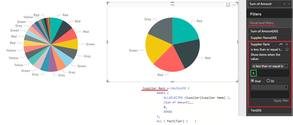
@Anonymous You need a Rank Measure and then add that Measure in the Visual Level Filter as in the picture...
then in the Visual Level Filter select => is less than and type 11 (to see the top 10)
- Mark as New
- Bookmark
- Subscribe
- Mute
- Subscribe to RSS Feed
- Permalink
- Report Inappropriate Content
Is RANK X dynamic? for example I calculate the top 10 nationalities of a population, then create a chart displaying the top 10 nationalities of the female population in 2016, will RANK X output readjust accordingly?
It seems to me that won't work. The top 10 limit should be set as a setting of the visual ideally.
- Mark as New
- Bookmark
- Subscribe
- Mute
- Subscribe to RSS Feed
- Permalink
- Report Inappropriate Content
HI @Sean,
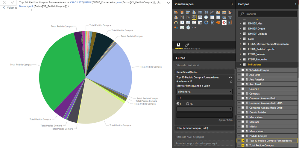
I tried to do exactly as your example, the number of values being presented is more than 10, I took one print, where is the error?
Top 10 Suppliers Purchase Order = CALCULATE (RANKX (DMEGF_Fornecedor; sum (Facts [Vl_PedidoCompra]);; 0; Dense), ALL (Facts [Vl_PedidoCompra]))
- Mark as New
- Bookmark
- Subscribe
- Mute
- Subscribe to RSS Feed
- Permalink
- Report Inappropriate Content
@Anonymous try this
Measure = RANKX (ALL(DMEGF_Fornecedor[Fornecedor]), CALCULATE(SUM(Facts [Vl_PedidoCompra])))
- Mark as New
- Bookmark
- Subscribe
- Mute
- Subscribe to RSS Feed
- Permalink
- Report Inappropriate Content
@Sean Hi I have tried inserting this > Measure = RANKX(ALL(vwHMSCustPerfReport[ShipperConsigneeName]), CALCULATE(SUM(vwHMSCustPerfReport[Amount]))) There is no error, but it doesnt work. Did I use it wrongly?
- Mark as New
- Bookmark
- Subscribe
- Mute
- Subscribe to RSS Feed
- Permalink
- Report Inappropriate Content
- Mark as New
- Bookmark
- Subscribe
- Mute
- Subscribe to RSS Feed
- Permalink
- Report Inappropriate Content
Hello Sean
I wanted to display TOP N values in my PBI graph but I have a little different scenario.
1st value for graph: I am grouping columns (lets say employee_name) and using count function with it.
2nd value for graph: District where he belongs.
I'm getting results as expected but now I want to filter TOP 10 but don't know how to do that.
- Mark as New
- Bookmark
- Subscribe
- Mute
- Subscribe to RSS Feed
- Permalink
- Report Inappropriate Content
- Mark as New
- Bookmark
- Subscribe
- Mute
- Subscribe to RSS Feed
- Permalink
- Report Inappropriate Content
@Anonymous Select the chart and then - click the 3 dots in top right corner of the chart...
- Mark as New
- Bookmark
- Subscribe
- Mute
- Subscribe to RSS Feed
- Permalink
- Report Inappropriate Content
can you try the example below?. and make sure you replace your measures and Dimension
InternetTotalSales = SUM( InternetSales_USD[SalesAmount_USD]) // replace with your measure here
BottomRank = RANKX(ALLSELECTED('Product'[ProductName]),[InternetTotalSales],,ASC,Dense)
BottomSalesByProduct = IF([BottomRank] <= 10),[InternetTotalSales])
then add the last measure to your chart
- Mark as New
- Bookmark
- Subscribe
- Mute
- Subscribe to RSS Feed
- Permalink
- Report Inappropriate Content
I shall add to the @Sean solution. If we can put an if condition and give default Rank value to all ranks more than 10 to not disturb the proportions on pie chart. Since its visualisation and pie chart shows proportion, seeing only top 10 over whole pie can interpret different proportions.
- Mark as New
- Bookmark
- Subscribe
- Mute
- Subscribe to RSS Feed
- Permalink
- Report Inappropriate Content
@achinm45 That is another reason not to use a pie chart in this scenario. A horizontal bar chart does not need to add up to 100 %, whereas in a pie chart, showing only part of the data distorts their absolute value, there would have to be an 11th data point summing up all "other" data.
- Mark as New
- Bookmark
- Subscribe
- Mute
- Subscribe to RSS Feed
- Permalink
- Report Inappropriate Content
Helpful resources

Power BI Monthly Update - November 2025
Check out the November 2025 Power BI update to learn about new features.

Fabric Data Days
Advance your Data & AI career with 50 days of live learning, contests, hands-on challenges, study groups & certifications and more!

| User | Count |
|---|---|
| 58 | |
| 45 | |
| 42 | |
| 20 | |
| 18 |


