Join the Fabric User Panel to shape the future of Fabric.
Share feedback directly with Fabric product managers, participate in targeted research studies and influence the Fabric roadmap.
Sign up now- Power BI forums
- Get Help with Power BI
- Desktop
- Service
- Report Server
- Power Query
- Mobile Apps
- Developer
- DAX Commands and Tips
- Custom Visuals Development Discussion
- Health and Life Sciences
- Power BI Spanish forums
- Translated Spanish Desktop
- Training and Consulting
- Instructor Led Training
- Dashboard in a Day for Women, by Women
- Galleries
- Data Stories Gallery
- Themes Gallery
- Contests Gallery
- QuickViz Gallery
- Quick Measures Gallery
- Visual Calculations Gallery
- Notebook Gallery
- Translytical Task Flow Gallery
- TMDL Gallery
- R Script Showcase
- Webinars and Video Gallery
- Ideas
- Custom Visuals Ideas (read-only)
- Issues
- Issues
- Events
- Upcoming Events
Get Fabric certified for FREE! Don't miss your chance! Learn more
- Power BI forums
- Forums
- Get Help with Power BI
- Desktop
- How to create a task management visual.
- Subscribe to RSS Feed
- Mark Topic as New
- Mark Topic as Read
- Float this Topic for Current User
- Bookmark
- Subscribe
- Printer Friendly Page
- Mark as New
- Bookmark
- Subscribe
- Mute
- Subscribe to RSS Feed
- Permalink
- Report Inappropriate Content
How to create a task management visual.
My dataset includes a bunch of tasks with task state 'Done' or 'Not Done'. I want a visual that will show 100% and progress towards 100%.
I'm struggling to find how to represent 100%. Should I create a new column and have each value = 'Done' then count that and use it as my 100%?
Solved! Go to Solution.
- Mark as New
- Bookmark
- Subscribe
- Mute
- Subscribe to RSS Feed
- Permalink
- Report Inappropriate Content
Hi,
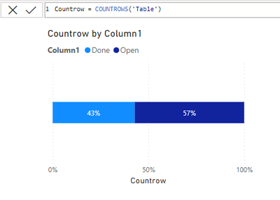
If you just need a measure you could always use the COUNTROWS function. Then put it on a 100% bar chart like below. Then use your done or Not Done column as the legend.
- Mark as New
- Bookmark
- Subscribe
- Mute
- Subscribe to RSS Feed
- Permalink
- Report Inappropriate Content
@novicepbixer thank you so much! The gauge looks great but the bar chart is exactly what I needed. Thank you for the prompt response!
- Mark as New
- Bookmark
- Subscribe
- Mute
- Subscribe to RSS Feed
- Permalink
- Report Inappropriate Content
Hi,
If you just need a measure you could always use the COUNTROWS function. Then put it on a 100% bar chart like below. Then use your done or Not Done column as the legend.
- Mark as New
- Bookmark
- Subscribe
- Mute
- Subscribe to RSS Feed
- Permalink
- Report Inappropriate Content
You can also use the gauge visual which looks pretty nice for percentages. Just create a measure = 1 for the max value. And you can use a CALCULATE function to get the total tasks "done" and then divide by the countrows function above.
Countrow = COUNTROWS('Table')
= DIVIDE(CALCULATE([Countrow],table[Column1]="Done"),[Countrow],0)
Helpful resources

Join our Community Sticker Challenge 2026
If you love stickers, then you will definitely want to check out our Community Sticker Challenge!

Power BI Monthly Update - January 2026
Check out the January 2026 Power BI update to learn about new features.

| User | Count |
|---|---|
| 61 | |
| 58 | |
| 45 | |
| 21 | |
| 18 |
| User | Count |
|---|---|
| 120 | |
| 117 | |
| 37 | |
| 35 | |
| 30 |


