FabCon is coming to Atlanta
Join us at FabCon Atlanta from March 16 - 20, 2026, for the ultimate Fabric, Power BI, AI and SQL community-led event. Save $200 with code FABCOMM.
Register now!- Power BI forums
- Get Help with Power BI
- Desktop
- Service
- Report Server
- Power Query
- Mobile Apps
- Developer
- DAX Commands and Tips
- Custom Visuals Development Discussion
- Health and Life Sciences
- Power BI Spanish forums
- Translated Spanish Desktop
- Training and Consulting
- Instructor Led Training
- Dashboard in a Day for Women, by Women
- Galleries
- Data Stories Gallery
- Themes Gallery
- Contests Gallery
- QuickViz Gallery
- Quick Measures Gallery
- Visual Calculations Gallery
- Notebook Gallery
- Translytical Task Flow Gallery
- TMDL Gallery
- R Script Showcase
- Webinars and Video Gallery
- Ideas
- Custom Visuals Ideas (read-only)
- Issues
- Issues
- Events
- Upcoming Events
Learn from the best! Meet the four finalists headed to the FINALS of the Power BI Dataviz World Championships! Register now
- Power BI forums
- Forums
- Get Help with Power BI
- Desktop
- How to create a task management visual.
- Subscribe to RSS Feed
- Mark Topic as New
- Mark Topic as Read
- Float this Topic for Current User
- Bookmark
- Subscribe
- Printer Friendly Page
- Mark as New
- Bookmark
- Subscribe
- Mute
- Subscribe to RSS Feed
- Permalink
- Report Inappropriate Content
How to create a task management visual.
My dataset includes a bunch of tasks with task state 'Done' or 'Not Done'. I want a visual that will show 100% and progress towards 100%.
I'm struggling to find how to represent 100%. Should I create a new column and have each value = 'Done' then count that and use it as my 100%?
Solved! Go to Solution.
- Mark as New
- Bookmark
- Subscribe
- Mute
- Subscribe to RSS Feed
- Permalink
- Report Inappropriate Content
Hi,
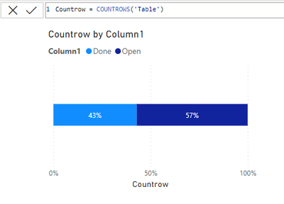
If you just need a measure you could always use the COUNTROWS function. Then put it on a 100% bar chart like below. Then use your done or Not Done column as the legend.
- Mark as New
- Bookmark
- Subscribe
- Mute
- Subscribe to RSS Feed
- Permalink
- Report Inappropriate Content
@novicepbixer thank you so much! The gauge looks great but the bar chart is exactly what I needed. Thank you for the prompt response!
- Mark as New
- Bookmark
- Subscribe
- Mute
- Subscribe to RSS Feed
- Permalink
- Report Inappropriate Content
Hi,
If you just need a measure you could always use the COUNTROWS function. Then put it on a 100% bar chart like below. Then use your done or Not Done column as the legend.
- Mark as New
- Bookmark
- Subscribe
- Mute
- Subscribe to RSS Feed
- Permalink
- Report Inappropriate Content
You can also use the gauge visual which looks pretty nice for percentages. Just create a measure = 1 for the max value. And you can use a CALCULATE function to get the total tasks "done" and then divide by the countrows function above.
Countrow = COUNTROWS('Table')
= DIVIDE(CALCULATE([Countrow],table[Column1]="Done"),[Countrow],0)
Helpful resources

Join our Fabric User Panel
Share feedback directly with Fabric product managers, participate in targeted research studies and influence the Fabric roadmap.

Power BI Monthly Update - February 2026
Check out the February 2026 Power BI update to learn about new features.

| User | Count |
|---|---|
| 63 | |
| 55 | |
| 41 | |
| 16 | |
| 14 |
| User | Count |
|---|---|
| 97 | |
| 80 | |
| 35 | |
| 29 | |
| 25 |


