cancel
Showing results for 
Search instead for 
Did you mean: 

The Fabric community is now in read-only for platform upgrade. Learn more

Reply
bbulla
Frequent Visitor

How to chart Inspection Data with multiple columns

Hi,


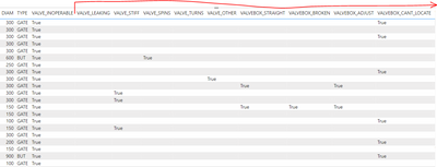
I'm trying to create some sort of chart (clustered column chart??) to display the count of defects found during insepctions.  The data looks like this.  Each record is from an inspection of a watermain valve, and each valve could have one or many defects associated to it:


bbulla_0-1671111864682.png


Each 'defect' is identified through a "True" value.  There are about a dozen or so possible defects.  I've created a clustered column chart before, but only using one field where there were multiple values.  I guess I'm getting confused on what to do with multiple fields and how to correctly count the 'True' values.


Thanks for any assistance.


2 REPLIES 2
v-yadongf-msft
Community Support
Community Support

Hi @bbulla ,


In order to better understanding your demands and give the right solution, could you please tell me what's your expected output?


Thanks for your efforts & time in advance.


Best regards,

Yadong Fang

If this post helps, then please consider Accept it as the solution to help the other members find it more quickly.

Hi Yadong,


Well I have sort of come up with something.  For each defect I am creating a measure that counts the total number of "True" values for that defect.  So basically I do this for each defect:


Valve Spins = CALCULATE(COUNTROWS('Inoperable Valves'),FILTER('Inoperable Valves', 'Inoperable Valves'[VALVE_SPINS]="True")) + 0
 
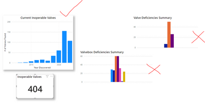
So that gives me just a number that I can plot using a graph, but the one problem I am now finding is that when I use the Clustered Chart visual they all show up bunched together.  There is no separation, since the chart is vieweing them all as one category.  
 
Is there a way to fix this?  This is what I am getting.  I'd prefer to have my charts on the right look more like the one on the left....with some space between everything.
 
bbulla_0-1671196685634.png


Helpful resources

Announcements
FabCon and SQLCon Barcelona 2026

FabCon & SQLCon – Barcelona 2026

Join us in Barcelona for FabCon and SQLCon, the Fabric, Power BI, SQL, and AI community event. Save €200 with code FABCMTY200.

Power BI DataViz World Championships carousel

Power BI DataViz World Championships - June 2026

A new Power BI DataViz World Championship is coming this June! Don't miss out on submitting your entry.