FabCon is coming to Atlanta
Join us at FabCon Atlanta from March 16 - 20, 2026, for the ultimate Fabric, Power BI, AI and SQL community-led event. Save $200 with code FABCOMM.
Register now!- Power BI forums
- Get Help with Power BI
- Desktop
- Service
- Report Server
- Power Query
- Mobile Apps
- Developer
- DAX Commands and Tips
- Custom Visuals Development Discussion
- Health and Life Sciences
- Power BI Spanish forums
- Translated Spanish Desktop
- Training and Consulting
- Instructor Led Training
- Dashboard in a Day for Women, by Women
- Galleries
- Data Stories Gallery
- Themes Gallery
- Contests Gallery
- QuickViz Gallery
- Quick Measures Gallery
- Visual Calculations Gallery
- Notebook Gallery
- Translytical Task Flow Gallery
- TMDL Gallery
- R Script Showcase
- Webinars and Video Gallery
- Ideas
- Custom Visuals Ideas (read-only)
- Issues
- Issues
- Events
- Upcoming Events
Learn from the best! Meet the four finalists headed to the FINALS of the Power BI Dataviz World Championships! Register now
- Power BI forums
- Forums
- Get Help with Power BI
- Desktop
- How to chart Inspection Data with multiple columns
- Subscribe to RSS Feed
- Mark Topic as New
- Mark Topic as Read
- Float this Topic for Current User
- Bookmark
- Subscribe
- Printer Friendly Page
- Mark as New
- Bookmark
- Subscribe
- Mute
- Subscribe to RSS Feed
- Permalink
- Report Inappropriate Content
How to chart Inspection Data with multiple columns
Hi,
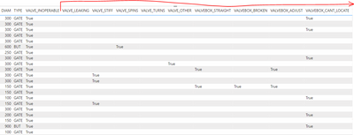
I'm trying to create some sort of chart (clustered column chart??) to display the count of defects found during insepctions. The data looks like this. Each record is from an inspection of a watermain valve, and each valve could have one or many defects associated to it:
Each 'defect' is identified through a "True" value. There are about a dozen or so possible defects. I've created a clustered column chart before, but only using one field where there were multiple values. I guess I'm getting confused on what to do with multiple fields and how to correctly count the 'True' values.
Thanks for any assistance.
- Mark as New
- Bookmark
- Subscribe
- Mute
- Subscribe to RSS Feed
- Permalink
- Report Inappropriate Content
Hi @bbulla ,
In order to better understanding your demands and give the right solution, could you please tell me what's your expected output?
Thanks for your efforts & time in advance.
Best regards,
Yadong Fang
If this post helps, then please consider Accept it as the solution to help the other members find it more quickly.
- Mark as New
- Bookmark
- Subscribe
- Mute
- Subscribe to RSS Feed
- Permalink
- Report Inappropriate Content
Hi Yadong,
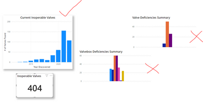
Well I have sort of come up with something. For each defect I am creating a measure that counts the total number of "True" values for that defect. So basically I do this for each defect:

Helpful resources

Join our Fabric User Panel
Share feedback directly with Fabric product managers, participate in targeted research studies and influence the Fabric roadmap.

Power BI Monthly Update - February 2026
Check out the February 2026 Power BI update to learn about new features.

| User | Count |
|---|---|
| 62 | |
| 54 | |
| 40 | |
| 17 | |
| 15 |
| User | Count |
|---|---|
| 96 | |
| 83 | |
| 36 | |
| 30 | |
| 25 |

