Get certified for free when you join Fabric Data Days 2026 and dive into Fabric, Power BI, SQL, AI, and other essential data skills.
Join nowJuly 7 - July 17 | Round 2 of the Power BI Dataviz World Championships. Don't miss your chance! Learn more
Hi,
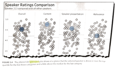
This picture is from "The big book of dashboards", and this concepts is very useful in my company's scenario,
but i can't use PowerBI to acheieve it.
What i what to do is:
when i filter some conditions, if data is in the conditions, then the dot is blue, but others are gray,
so it can show me where is the dot and i can compare it with others easily.
(If not only single dots are in the conditions, then highlight those dots)
Can anyone teach me how to do it?
Thanks in advance!
Solved! Go to Solution.
Hi @danielllin,
not quite sure if I understand the image you shared 100%, but the in the default scatter plot of Power BI there is an option of semi-dynamically setting the color of dots via Formatting -> Data colors -> Advanced controls -> setting the appropriate rules.
Take a look at the documentation provided by Microsoft
Making use of the cross-filtering and highlighting capabilities of Power BI may also be worth exploring for you.
If you can provide specific requirements of what you need, as well as some example data(or subset of real data), I'll be happy to help you.
best regards,
Sturla
Hi @danielllin,
not quite sure if I understand the image you shared 100%, but the in the default scatter plot of Power BI there is an option of semi-dynamically setting the color of dots via Formatting -> Data colors -> Advanced controls -> setting the appropriate rules.
Take a look at the documentation provided by Microsoft
Making use of the cross-filtering and highlighting capabilities of Power BI may also be worth exploring for you.
If you can provide specific requirements of what you need, as well as some example data(or subset of real data), I'll be happy to help you.
best regards,
Sturla
Hi Sturla,
Thanks, it works!! I use this way to acheieve it!
Formatting -> Data colors -> Advanced controls -> field value
Join us in Barcelona for FabCon and SQLCon, the Fabric, Power BI, SQL, and AI community event. Save €200 with code FABCMTY200.
Join Data Days 2026: 60 days of free live/on-demand sessions, challenges, study groups, and certification opportunities.
| User | Count |
|---|---|
| 27 | |
| 24 | |
| 18 | |
| 15 | |
| 15 |
| User | Count |
|---|---|
| 63 | |
| 42 | |
| 41 | |
| 38 | |
| 37 |