Get Fabric certified for FREE!
Don't miss your chance to take the Fabric Data Engineer (DP-600) exam for FREE! Find out how by attending the DP-600 session on April 23rd (pacific time), live or on-demand.
Learn more- Power BI forums
- Get Help with Power BI
- Desktop
- Service
- Report Server
- Power Query
- Mobile Apps
- Developer
- DAX Commands and Tips
- Custom Visuals Development Discussion
- Health and Life Sciences
- Power BI Spanish forums
- Translated Spanish Desktop
- Training and Consulting
- Instructor Led Training
- Dashboard in a Day for Women, by Women
- Galleries
- Data Stories Gallery
- Themes Gallery
- Contests Gallery
- QuickViz Gallery
- Quick Measures Gallery
- Visual Calculations Gallery
- Notebook Gallery
- Translytical Task Flow Gallery
- TMDL Gallery
- R Script Showcase
- Webinars and Video Gallery
- Ideas
- Custom Visuals Ideas (read-only)
- Issues
- Issues
- Events
- Upcoming Events
Next up in the FabCon + SQLCon recap series: The roadmap for Microsoft SQL and Maximizing Developer experiences in Fabric. All sessions are available on-demand after the live show. Register now
- Power BI forums
- Forums
- Get Help with Power BI
- Desktop
- Help with matrix visual
- Subscribe to RSS Feed
- Mark Topic as New
- Mark Topic as Read
- Float this Topic for Current User
- Bookmark
- Subscribe
- Printer Friendly Page
- Mark as New
- Bookmark
- Subscribe
- Mute
- Subscribe to RSS Feed
- Permalink
- Report Inappropriate Content
Help with matrix visual
Now my matrix visual looks like this: I placed status in the value field and the same status column in the row field. I used conditional formatting to color the background and also used green color on the blank value and 'D'.
However, I would like the visual to appear like this.
The idea is simple. The D is the available item. D should appear after or before A, B, or C on the chart depending on the date. Some item statuses have only D, thus I can't filter them out.
It would be fantastic if anyone could assist with this report direct query method.
- Mark as New
- Bookmark
- Subscribe
- Mute
- Subscribe to RSS Feed
- Permalink
- Report Inappropriate Content
Hi @aslam-ansari ,
Try the following:
- Create a disconnected table with the weeks
- Add the following measure:
Values =
VAR calculationvalue =
    CALCULATE (
        MIN ( 'Item'[Status] ),
        'Item'[Week] = SELECTEDVALUE ( Weeks[Week] )
    )
RETURN
    IF ( ISBLANK ( calculationvalue ), "D", calculationvalue )
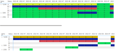
- Use the new table on the columns and the measure on the values result below and attach PBIX file:
Top one is with the measure bottom one is you data raw:
Regards
Miguel Félix
Did I answer your question? Mark my post as a solution!
Proud to be a Super User!
Check out my blog: Power BI em PortuguêsHelpful resources

New to Fabric Survey
If you have recently started exploring Fabric, we'd love to hear how it's going. Your feedback can help with product improvements.

Power BI DataViz World Championships - June 2026
A new Power BI DataViz World Championship is coming this June! Don't miss out on submitting your entry.

| User | Count |
|---|---|
| 46 | |
| 43 | |
| 39 | |
| 19 | |
| 15 |
| User | Count |
|---|---|
| 68 | |
| 67 | |
| 31 | |
| 27 | |
| 24 |


