FabCon is coming to Atlanta
Join us at FabCon Atlanta from March 16 - 20, 2026, for the ultimate Fabric, Power BI, AI and SQL community-led event. Save $200 with code FABCOMM.
Register now!- Power BI forums
- Get Help with Power BI
- Desktop
- Service
- Report Server
- Power Query
- Mobile Apps
- Developer
- DAX Commands and Tips
- Custom Visuals Development Discussion
- Health and Life Sciences
- Power BI Spanish forums
- Translated Spanish Desktop
- Training and Consulting
- Instructor Led Training
- Dashboard in a Day for Women, by Women
- Galleries
- Data Stories Gallery
- Themes Gallery
- Contests Gallery
- QuickViz Gallery
- Quick Measures Gallery
- Visual Calculations Gallery
- Notebook Gallery
- Translytical Task Flow Gallery
- TMDL Gallery
- R Script Showcase
- Webinars and Video Gallery
- Ideas
- Custom Visuals Ideas (read-only)
- Issues
- Issues
- Events
- Upcoming Events
Get Fabric Certified for FREE during Fabric Data Days. Don't miss your chance! Request now
- Power BI forums
- Forums
- Get Help with Power BI
- Desktop
- Re: Help with Magic Gartner quadrant type Visual
- Subscribe to RSS Feed
- Mark Topic as New
- Mark Topic as Read
- Float this Topic for Current User
- Bookmark
- Subscribe
- Printer Friendly Page
- Mark as New
- Bookmark
- Subscribe
- Mute
- Subscribe to RSS Feed
- Permalink
- Report Inappropriate Content
Help with Magic Gartner quadrant type Visual
Hi All
I have one data set ( pasted below) which is more of text than any Measures ( I removed some unwanted fields likeowner, business unit and others whcih are more of slicers) , our management want to see this data in a way like Quadrant chart , What I have seen so far for Quadrant chart in examples every where its done with some measures not with text data.
| Application_Name | Durability | Composition | Hosting |
| Application1 | Physical | Physical | On-Premise |
| Application2 | Hypervisor Independent | Virtual | On-Premise |
| Application3 | Auto Failover (App) | SaaS | Cloud |
| Application4 | Auto Failover (App) | SaaS | Cloud |
| Application5 | Physical | Physical | On-Premise |
| Application6 | Physical | Physical | On-Premise |
| Application7 | Hypervisor Independent | Virtual | On-Premise |
| Application8 | Auto Failover (App) | SaaS | Cloud |
| Application9 | Hypervisor Independent | Virtual | On-Premise |
| Application10 | Auto Failover (App) | SaaS | Cloud |
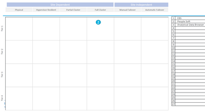
This is the sample report they provided me how they want to see data. I can make the title bar on top for Site dependency , but I could not get the data in the way theu wanted in table inside with Composition and Durability as axis/quadrants.
I even tries to give some number to the Composition and Durability so that I thought I can plot them as axis. Any Idea on how to have the data top get the below results or something close is ok.
Solved! Go to Solution.
- Mark as New
- Bookmark
- Subscribe
- Mute
- Subscribe to RSS Feed
- Permalink
- Report Inappropriate Content
Hi Just give an update I was able to create something close using some measures , by giving each application some weight based on the categories and adding record number to that value. I got satisfactory results for now. I will now mark this as answered
Thanks for trying to help me.
Suresh
Update: I tried to upload the picture of graph here as example and It gets deleted when I hit post .
- Mark as New
- Bookmark
- Subscribe
- Mute
- Subscribe to RSS Feed
- Permalink
- Report Inappropriate Content
Hi, @venkatasuresh_g
Based on your description, I tried to create the measure which counts the number of Durability and another measure which counts the number of Composition. When I tried to plot them as axis, the result is far from your requirement. I think it is unavailable to fully realize it currently.
For further information, you may refer to the following links.
https://appsource.microsoft.com/en-us/product/power-bi-visuals/WA104381011?tab=Overview
https://community.powerbi.com/t5/Desktop/scatter-plot-and-quadrant-chart/m-p/269580#M121438
Best Regards
Allan
If this post helps, then please consider Accept it as the solution to help the other members find it more quickly.
- Mark as New
- Bookmark
- Subscribe
- Mute
- Subscribe to RSS Feed
- Permalink
- Report Inappropriate Content
Hi Just give an update I was able to create something close using some measures , by giving each application some weight based on the categories and adding record number to that value. I got satisfactory results for now. I will now mark this as answered
Thanks for trying to help me.
Suresh
Update: I tried to upload the picture of graph here as example and It gets deleted when I hit post .
- Mark as New
- Bookmark
- Subscribe
- Mute
- Subscribe to RSS Feed
- Permalink
- Report Inappropriate Content
- Mark as New
- Bookmark
- Subscribe
- Mute
- Subscribe to RSS Feed
- Permalink
- Report Inappropriate Content
Hi Amit,
Thanks for your response , I tried many methods including the ones in examples mentioned none of them gave me results expected. as I am trying to plot Descriptive values rather than numeric in x and y axis I am not getting the results
Thanks
Suresh
Helpful resources

Power BI Monthly Update - November 2025
Check out the November 2025 Power BI update to learn about new features.

Fabric Data Days
Advance your Data & AI career with 50 days of live learning, contests, hands-on challenges, study groups & certifications and more!


