FabCon is coming to Atlanta
Join us at FabCon Atlanta from March 16 - 20, 2026, for the ultimate Fabric, Power BI, AI and SQL community-led event. Save $200 with code FABCOMM.
Register now!- Power BI forums
- Get Help with Power BI
- Desktop
- Service
- Report Server
- Power Query
- Mobile Apps
- Developer
- DAX Commands and Tips
- Custom Visuals Development Discussion
- Health and Life Sciences
- Power BI Spanish forums
- Translated Spanish Desktop
- Training and Consulting
- Instructor Led Training
- Dashboard in a Day for Women, by Women
- Galleries
- Data Stories Gallery
- Themes Gallery
- Contests Gallery
- QuickViz Gallery
- Quick Measures Gallery
- Visual Calculations Gallery
- Notebook Gallery
- Translytical Task Flow Gallery
- TMDL Gallery
- R Script Showcase
- Webinars and Video Gallery
- Ideas
- Custom Visuals Ideas (read-only)
- Issues
- Issues
- Events
- Upcoming Events
The Power BI Data Visualization World Championships is back! Get ahead of the game and start preparing now! Learn more
- Power BI forums
- Forums
- Get Help with Power BI
- Desktop
- Re: Help with Magic Gartner quadrant type Visual
- Subscribe to RSS Feed
- Mark Topic as New
- Mark Topic as Read
- Float this Topic for Current User
- Bookmark
- Subscribe
- Printer Friendly Page
- Mark as New
- Bookmark
- Subscribe
- Mute
- Subscribe to RSS Feed
- Permalink
- Report Inappropriate Content
Help with Magic Gartner quadrant type Visual
Hi All
I have one data set ( pasted below) which is more of text than any Measures ( I removed some unwanted fields likeowner, business unit and others whcih are more of slicers) , our management want to see this data in a way like Quadrant chart , What I have seen so far for Quadrant chart in examples every where its done with some measures not with text data.
| Application_Name | Durability | Composition | Hosting |
| Application1 | Physical | Physical | On-Premise |
| Application2 | Hypervisor Independent | Virtual | On-Premise |
| Application3 | Auto Failover (App) | SaaS | Cloud |
| Application4 | Auto Failover (App) | SaaS | Cloud |
| Application5 | Physical | Physical | On-Premise |
| Application6 | Physical | Physical | On-Premise |
| Application7 | Hypervisor Independent | Virtual | On-Premise |
| Application8 | Auto Failover (App) | SaaS | Cloud |
| Application9 | Hypervisor Independent | Virtual | On-Premise |
| Application10 | Auto Failover (App) | SaaS | Cloud |
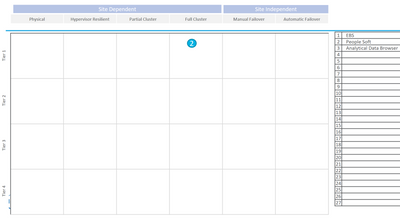
This is the sample report they provided me how they want to see data. I can make the title bar on top for Site dependency , but I could not get the data in the way theu wanted in table inside with Composition and Durability as axis/quadrants.
I even tries to give some number to the Composition and Durability so that I thought I can plot them as axis. Any Idea on how to have the data top get the below results or something close is ok.
Solved! Go to Solution.
- Mark as New
- Bookmark
- Subscribe
- Mute
- Subscribe to RSS Feed
- Permalink
- Report Inappropriate Content
Hi Just give an update I was able to create something close using some measures , by giving each application some weight based on the categories and adding record number to that value. I got satisfactory results for now. I will now mark this as answered
Thanks for trying to help me.
Suresh
Update: I tried to upload the picture of graph here as example and It gets deleted when I hit post .
- Mark as New
- Bookmark
- Subscribe
- Mute
- Subscribe to RSS Feed
- Permalink
- Report Inappropriate Content
Hi, @venkatasuresh_g
Based on your description, I tried to create the measure which counts the number of Durability and another measure which counts the number of Composition. When I tried to plot them as axis, the result is far from your requirement. I think it is unavailable to fully realize it currently.
For further information, you may refer to the following links.
https://appsource.microsoft.com/en-us/product/power-bi-visuals/WA104381011?tab=Overview
https://community.powerbi.com/t5/Desktop/scatter-plot-and-quadrant-chart/m-p/269580#M121438
Best Regards
Allan
If this post helps, then please consider Accept it as the solution to help the other members find it more quickly.
- Mark as New
- Bookmark
- Subscribe
- Mute
- Subscribe to RSS Feed
- Permalink
- Report Inappropriate Content
Hi Just give an update I was able to create something close using some measures , by giving each application some weight based on the categories and adding record number to that value. I got satisfactory results for now. I will now mark this as answered
Thanks for trying to help me.
Suresh
Update: I tried to upload the picture of graph here as example and It gets deleted when I hit post .
- Mark as New
- Bookmark
- Subscribe
- Mute
- Subscribe to RSS Feed
- Permalink
- Report Inappropriate Content
- Mark as New
- Bookmark
- Subscribe
- Mute
- Subscribe to RSS Feed
- Permalink
- Report Inappropriate Content
Hi Amit,
Thanks for your response , I tried many methods including the ones in examples mentioned none of them gave me results expected. as I am trying to plot Descriptive values rather than numeric in x and y axis I am not getting the results
Thanks
Suresh
Helpful resources

Power BI Dataviz World Championships
The Power BI Data Visualization World Championships is back! Get ahead of the game and start preparing now!

| User | Count |
|---|---|
| 41 | |
| 37 | |
| 35 | |
| 35 | |
| 28 |
| User | Count |
|---|---|
| 134 | |
| 101 | |
| 71 | |
| 67 | |
| 65 |


