FabCon is coming to Atlanta
Join us at FabCon Atlanta from March 16 - 20, 2026, for the ultimate Fabric, Power BI, AI and SQL community-led event. Save $200 with code FABCOMM.
Register now!- Power BI forums
- Get Help with Power BI
- Desktop
- Service
- Report Server
- Power Query
- Mobile Apps
- Developer
- DAX Commands and Tips
- Custom Visuals Development Discussion
- Health and Life Sciences
- Power BI Spanish forums
- Translated Spanish Desktop
- Training and Consulting
- Instructor Led Training
- Dashboard in a Day for Women, by Women
- Galleries
- Data Stories Gallery
- Themes Gallery
- Contests Gallery
- QuickViz Gallery
- Quick Measures Gallery
- Visual Calculations Gallery
- Notebook Gallery
- Translytical Task Flow Gallery
- TMDL Gallery
- R Script Showcase
- Webinars and Video Gallery
- Ideas
- Custom Visuals Ideas (read-only)
- Issues
- Issues
- Events
- Upcoming Events
Get Fabric Certified for FREE during Fabric Data Days. Don't miss your chance! Request now
- Power BI forums
- Forums
- Get Help with Power BI
- Desktop
- Re: Growth movement of scatter plot
- Subscribe to RSS Feed
- Mark Topic as New
- Mark Topic as Read
- Float this Topic for Current User
- Bookmark
- Subscribe
- Printer Friendly Page
- Mark as New
- Bookmark
- Subscribe
- Mute
- Subscribe to RSS Feed
- Permalink
- Report Inappropriate Content
Growth movement of scatter plot
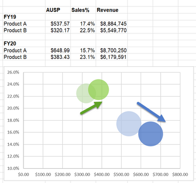
Hi, is it possible to plot the below chart in power bi?
I want to compare the result for last year and this year in the same chart.
Solved! Go to Solution.
- Mark as New
- Bookmark
- Subscribe
- Mute
- Subscribe to RSS Feed
- Permalink
- Report Inappropriate Content
Hi @PBI_newuser ,
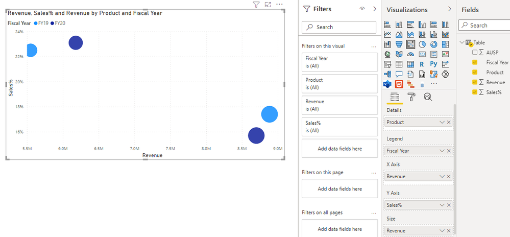
I created a sample pbix file(see attachment), please check whether that is what you want.
Best Regards
- Mark as New
- Bookmark
- Subscribe
- Mute
- Subscribe to RSS Feed
- Permalink
- Report Inappropriate Content
Hi @PBI_newuser ,
I created a sample pbix file(see attachment), please check whether that is what you want.
Best Regards
- Mark as New
- Bookmark
- Subscribe
- Mute
- Subscribe to RSS Feed
- Permalink
- Report Inappropriate Content
Hi @Anonymous , I have a question.
My data's fiscal year starts on October 01 and ends on September 30.
For example, current month is July. I would like to calculate all the measures from October to June only.
In FY2019 (Oct'18 to Sep'19) and FY2020 (Oct'19 to Sep'20), I have 12 months data but for FY2021 (Oct'19 to Jun'21), I have only 9 months data.
In the scatterplot, the Sales % and Revenue should calculate from Oct to Jun only for each fiscal year.
FY2019 = Oct'18 to Jun'19
FY2020 = Oct'19 to Jun'20
FY2021 = Oct'20 to Jun'21
May I know how calculate the measures up to last month for all the fiscal year? Thank you.
- Mark as New
- Bookmark
- Subscribe
- Mute
- Subscribe to RSS Feed
- Permalink
- Report Inappropriate Content
Hi @PBI_newuser ,
You can create measure as below(Assume that the table exist [Fisal Year] and [month number] field):
Measure =
VAR _maxdatemonth =
    MONTH ( MAX ( 'Table'[Date] ) )
VAR _revenue =
    CALCULATE (
        SUM ( 'Table'[Revenue] ),
        FILTER (
            'Table',
            'Table'[Fiscal Year] = SELECTEDVALUE ( 'Table'[Fiscal Year] )
                && IF (
                    _maxdatemonth >= 10,
                    'Table'[Month] >= 10
                        && 'Table'[Month] <= _maxdatemonth,
                    ( 'Table'[Month]
                        IN { 10, 11, 12 }
                        || 'Table'[Month] >= 1
                        && 'Table'[Month] <= _maxdatemonth )
                )
        )
    )
RETURN
    _revenue
Best Regards
- Mark as New
- Bookmark
- Subscribe
- Mute
- Subscribe to RSS Feed
- Permalink
- Report Inappropriate Content
Hi @Anonymous , the measure doesn't work. Here is the sample.
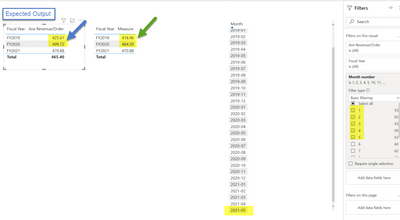
In the sample data, the max month is 2021-05.
I would like to view the result for each fiscal year from Oct to May. How to do it? Thanks.
- Mark as New
- Bookmark
- Subscribe
- Mute
- Subscribe to RSS Feed
- Permalink
- Report Inappropriate Content
Hi @PBI_newuser ,
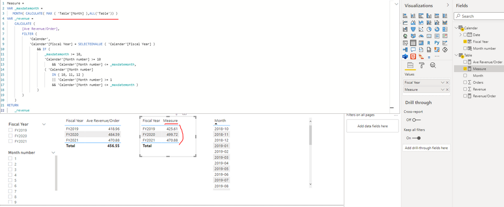
I update the formula of measure as below and it can get your expected output just as shown in below screenshot. Please find the details in the attachment.
|
Measure =
VAR _maxdatemonth =
MONTH( CALCULATE( MAX ( 'Table'[Month] ),ALL('Table')) )
VAR _revenue =
CALCULATE (
[Ave Revenue/Order],
FILTER (
'Calendar',
'Calendar'[Fiscal Year] = SELECTEDVALUE ( 'Calendar'[Fiscal Year] )
&& IF (
_maxdatemonth >= 10,
'Calendar'[Month number] >= 10
&& 'Calendar'[Month number] <= _maxdatemonth,
( 'Calendar'[Month number]
IN { 10, 11, 12 }
|| 'Calendar'[Month number] >= 1
&& 'Calendar'[Month number] <= _maxdatemonth )
)
)
)
RETURN
_revenue
|
Best Regards
- Mark as New
- Bookmark
- Subscribe
- Mute
- Subscribe to RSS Feed
- Permalink
- Report Inappropriate Content
Thanks @Anonymous !! 😀
- Mark as New
- Bookmark
- Subscribe
- Mute
- Subscribe to RSS Feed
- Permalink
- Report Inappropriate Content
HI @PBI_newuser
You can follow this link its very helpful for you
https://radacad.com/storytelling-with-power-bi-scatter-chart
Thank & Reagrds
Rohit Jaiswal
- Mark as New
- Bookmark
- Subscribe
- Mute
- Subscribe to RSS Feed
- Permalink
- Report Inappropriate Content
- Mark as New
- Bookmark
- Subscribe
- Mute
- Subscribe to RSS Feed
- Permalink
- Report Inappropriate Content
@PBI_newuser , Tried something like this.
Product and Year on Details. ( Drill till last level using reverse Y sign)
AUSP and Sales % on axis.
And conditional formating using scale on YOY measure
Helpful resources

Power BI Monthly Update - November 2025
Check out the November 2025 Power BI update to learn about new features.

Fabric Data Days
Advance your Data & AI career with 50 days of live learning, contests, hands-on challenges, study groups & certifications and more!


