Become a Certified Power BI Data Analyst!
Join us for an expert-led overview of the tools and concepts you'll need to pass exam PL-300. The first session starts on June 11th. See you there!
Get registered- Power BI forums
- Get Help with Power BI
- Desktop
- Service
- Report Server
- Power Query
- Mobile Apps
- Developer
- DAX Commands and Tips
- Custom Visuals Development Discussion
- Health and Life Sciences
- Power BI Spanish forums
- Translated Spanish Desktop
- Training and Consulting
- Instructor Led Training
- Dashboard in a Day for Women, by Women
- Galleries
- Webinars and Video Gallery
- Data Stories Gallery
- Themes Gallery
- Contests Gallery
- Quick Measures Gallery
- Notebook Gallery
- Translytical Task Flow Gallery
- R Script Showcase
- Ideas
- Custom Visuals Ideas (read-only)
- Issues
- Issues
- Events
- Upcoming Events
Power BI is turning 10! Let’s celebrate together with dataviz contests, interactive sessions, and giveaways. Register now.
- Power BI forums
- Forums
- Get Help with Power BI
- Desktop
- Re: Growth movement of scatter plot
- Subscribe to RSS Feed
- Mark Topic as New
- Mark Topic as Read
- Float this Topic for Current User
- Bookmark
- Subscribe
- Printer Friendly Page
- Mark as New
- Bookmark
- Subscribe
- Mute
- Subscribe to RSS Feed
- Permalink
- Report Inappropriate Content
Growth movement of scatter plot
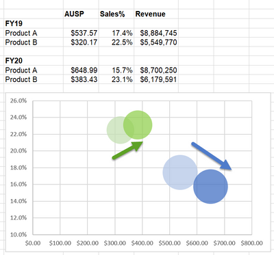
Hi, is it possible to plot the below chart in power bi?
I want to compare the result for last year and this year in the same chart.
Solved! Go to Solution.
- Mark as New
- Bookmark
- Subscribe
- Mute
- Subscribe to RSS Feed
- Permalink
- Report Inappropriate Content
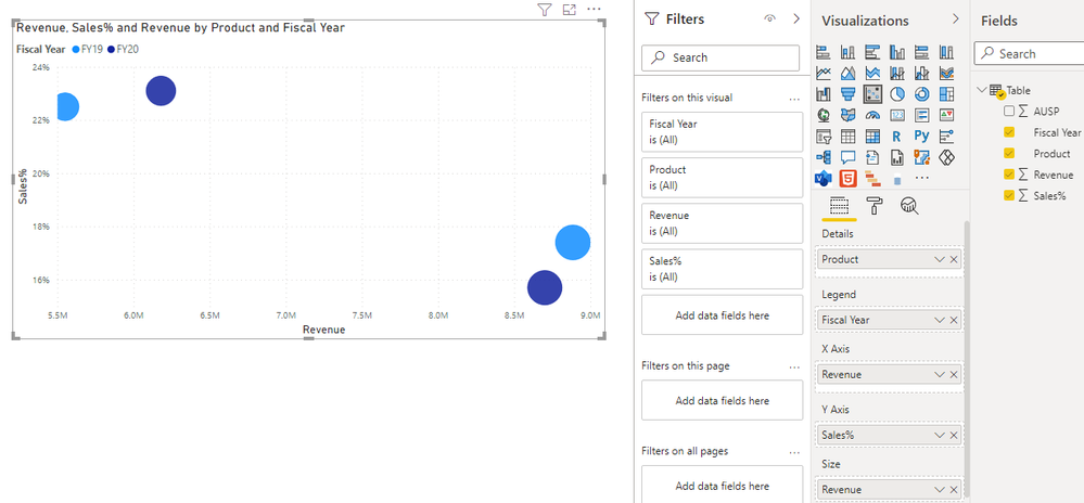
Hi @PBI_newuser ,
I created a sample pbix file(see attachment), please check whether that is what you want.
Best Regards
- Mark as New
- Bookmark
- Subscribe
- Mute
- Subscribe to RSS Feed
- Permalink
- Report Inappropriate Content
Hi @PBI_newuser ,
I created a sample pbix file(see attachment), please check whether that is what you want.
Best Regards
- Mark as New
- Bookmark
- Subscribe
- Mute
- Subscribe to RSS Feed
- Permalink
- Report Inappropriate Content
Hi @Anonymous , I have a question.
My data's fiscal year starts on October 01 and ends on September 30.
For example, current month is July. I would like to calculate all the measures from October to June only.
In FY2019 (Oct'18 to Sep'19) and FY2020 (Oct'19 to Sep'20), I have 12 months data but for FY2021 (Oct'19 to Jun'21), I have only 9 months data.
In the scatterplot, the Sales % and Revenue should calculate from Oct to Jun only for each fiscal year.
FY2019 = Oct'18 to Jun'19
FY2020 = Oct'19 to Jun'20
FY2021 = Oct'20 to Jun'21
May I know how calculate the measures up to last month for all the fiscal year? Thank you.
- Mark as New
- Bookmark
- Subscribe
- Mute
- Subscribe to RSS Feed
- Permalink
- Report Inappropriate Content
Hi @PBI_newuser ,
You can create measure as below(Assume that the table exist [Fisal Year] and [month number] field):
Measure =
VAR _maxdatemonth =
    MONTH ( MAX ( 'Table'[Date] ) )
VAR _revenue =
    CALCULATE (
        SUM ( 'Table'[Revenue] ),
        FILTER (
            'Table',
            'Table'[Fiscal Year] = SELECTEDVALUE ( 'Table'[Fiscal Year] )
                && IF (
                    _maxdatemonth >= 10,
                    'Table'[Month] >= 10
                        && 'Table'[Month] <= _maxdatemonth,
                    ( 'Table'[Month]
                        IN { 10, 11, 12 }
                        || 'Table'[Month] >= 1
                        && 'Table'[Month] <= _maxdatemonth )
                )
        )
    )
RETURN
    _revenue
Best Regards
- Mark as New
- Bookmark
- Subscribe
- Mute
- Subscribe to RSS Feed
- Permalink
- Report Inappropriate Content
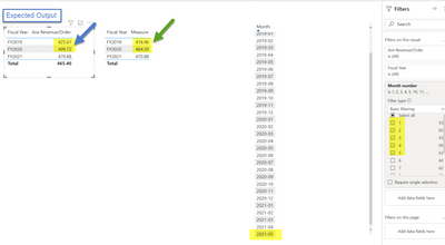
Hi @Anonymous , the measure doesn't work. Here is the sample.
In the sample data, the max month is 2021-05.
I would like to view the result for each fiscal year from Oct to May. How to do it? Thanks.
- Mark as New
- Bookmark
- Subscribe
- Mute
- Subscribe to RSS Feed
- Permalink
- Report Inappropriate Content
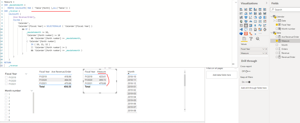
Hi @PBI_newuser ,
I update the formula of measure as below and it can get your expected output just as shown in below screenshot. Please find the details in the attachment.
|
Measure =
VAR _maxdatemonth =
MONTH( CALCULATE( MAX ( 'Table'[Month] ),ALL('Table')) )
VAR _revenue =
CALCULATE (
[Ave Revenue/Order],
FILTER (
'Calendar',
'Calendar'[Fiscal Year] = SELECTEDVALUE ( 'Calendar'[Fiscal Year] )
&& IF (
_maxdatemonth >= 10,
'Calendar'[Month number] >= 10
&& 'Calendar'[Month number] <= _maxdatemonth,
( 'Calendar'[Month number]
IN { 10, 11, 12 }
|| 'Calendar'[Month number] >= 1
&& 'Calendar'[Month number] <= _maxdatemonth )
)
)
)
RETURN
_revenue
|
Best Regards
- Mark as New
- Bookmark
- Subscribe
- Mute
- Subscribe to RSS Feed
- Permalink
- Report Inappropriate Content
Thanks @Anonymous !! 😀
- Mark as New
- Bookmark
- Subscribe
- Mute
- Subscribe to RSS Feed
- Permalink
- Report Inappropriate Content
HI @PBI_newuser
You can follow this link its very helpful for you
https://radacad.com/storytelling-with-power-bi-scatter-chart
Thank & Reagrds
Rohit Jaiswal
- Mark as New
- Bookmark
- Subscribe
- Mute
- Subscribe to RSS Feed
- Permalink
- Report Inappropriate Content
- Mark as New
- Bookmark
- Subscribe
- Mute
- Subscribe to RSS Feed
- Permalink
- Report Inappropriate Content
@PBI_newuser , Tried something like this.
Product and Year on Details. ( Drill till last level using reverse Y sign)
AUSP and Sales % on axis.
And conditional formating using scale on YOY measure
Helpful resources

Join our Fabric User Panel
This is your chance to engage directly with the engineering team behind Fabric and Power BI. Share your experiences and shape the future.

Power BI Monthly Update - June 2025
Check out the June 2025 Power BI update to learn about new features.

| User | Count |
|---|---|
| 84 | |
| 76 | |
| 73 | |
| 42 | |
| 36 |
| User | Count |
|---|---|
| 109 | |
| 56 | |
| 52 | |
| 48 | |
| 43 |


