Get Fabric certified for FREE!
Don't miss your chance to take the Fabric Data Engineer (DP-600) exam for FREE! Find out how by attending the DP-600 session on April 23rd (pacific time), live or on-demand.
Learn more- Power BI forums
- Get Help with Power BI
- Desktop
- Service
- Report Server
- Power Query
- Mobile Apps
- Developer
- DAX Commands and Tips
- Custom Visuals Development Discussion
- Health and Life Sciences
- Power BI Spanish forums
- Translated Spanish Desktop
- Training and Consulting
- Instructor Led Training
- Dashboard in a Day for Women, by Women
- Galleries
- Data Stories Gallery
- Themes Gallery
- Contests Gallery
- QuickViz Gallery
- Quick Measures Gallery
- Visual Calculations Gallery
- Notebook Gallery
- Translytical Task Flow Gallery
- TMDL Gallery
- R Script Showcase
- Webinars and Video Gallery
- Ideas
- Custom Visuals Ideas (read-only)
- Issues
- Issues
- Events
- Upcoming Events
Next up in the FabCon + SQLCon recap series: The roadmap for Microsoft SQL and Maximizing Developer experiences in Fabric. All sessions are available on-demand after the live show. Register now
- Power BI forums
- Forums
- Get Help with Power BI
- Desktop
- Graph question
- Subscribe to RSS Feed
- Mark Topic as New
- Mark Topic as Read
- Float this Topic for Current User
- Bookmark
- Subscribe
- Printer Friendly Page
- Mark as New
- Bookmark
- Subscribe
- Mute
- Subscribe to RSS Feed
- Permalink
- Report Inappropriate Content
Graph question
Hello:
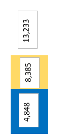
Is there any way to trun the current graph that I made:
into this. I want each data label to show + the total
Also, when numbers are really low "stacked column" chart doesnt show some number becuase of the axis. How can I show numbers here. How can I adjust the numbers in axis.
Solved! Go to Solution.
- Mark as New
- Bookmark
- Subscribe
- Mute
- Subscribe to RSS Feed
- Permalink
- Report Inappropriate Content
Hi @samnaw ,
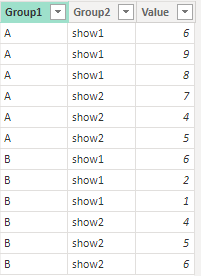
I created some data:
Here are the steps you can follow:
1. Create calculated table.
Table 2 =
var _table1=
DISTINCT('Table'[Group2])
var _table2=
{"Total"}
return
UNION(
    _table1,_table2)
2. Create measure
Measure =
IF(
    MAX('Table 2'[Group2])="Total",
    SUMX(
        FILTER(ALL('Table'),'Table'[Group1]=MAX('Table'[Group1])),[Value])
        ,
    SUMX(
        FILTER(ALL('Table'),'Table'[Group1]=MAX('Table'[Group1])&&'Table'[Group2]=MAX('Table 2'[Group2])),[Value])
)
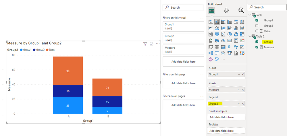
3. Result:
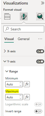
If you want to display values with low numbers, you can customize Range's Maximum in Visualizations – Format – Y-axis.
Range that is too large automatically omits values with smaller numbers.
Best Regards,
Liu Yang
If this post helps, then please consider Accept it as the solution to help the other members find it more quickly
Helpful resources

New to Fabric Survey
If you have recently started exploring Fabric, we'd love to hear how it's going. Your feedback can help with product improvements.

Power BI DataViz World Championships - June 2026
A new Power BI DataViz World Championship is coming this June! Don't miss out on submitting your entry.

Join our Fabric User Panel
Share feedback directly with Fabric product managers, participate in targeted research studies and influence the Fabric roadmap.

| User | Count |
|---|---|
| 48 | |
| 43 | |
| 39 | |
| 19 | |
| 17 |
| User | Count |
|---|---|
| 67 | |
| 63 | |
| 30 | |
| 30 | |
| 23 |


