FabCon is coming to Atlanta
Join us at FabCon Atlanta from March 16 - 20, 2026, for the ultimate Fabric, Power BI, AI and SQL community-led event. Save $200 with code FABCOMM.
Register now!- Power BI forums
- Get Help with Power BI
- Desktop
- Service
- Report Server
- Power Query
- Mobile Apps
- Developer
- DAX Commands and Tips
- Custom Visuals Development Discussion
- Health and Life Sciences
- Power BI Spanish forums
- Translated Spanish Desktop
- Training and Consulting
- Instructor Led Training
- Dashboard in a Day for Women, by Women
- Galleries
- Data Stories Gallery
- Themes Gallery
- Contests Gallery
- QuickViz Gallery
- Quick Measures Gallery
- Visual Calculations Gallery
- Notebook Gallery
- Translytical Task Flow Gallery
- TMDL Gallery
- R Script Showcase
- Webinars and Video Gallery
- Ideas
- Custom Visuals Ideas (read-only)
- Issues
- Issues
- Events
- Upcoming Events
Vote for your favorite vizzies from the Power BI Dataviz World Championship submissions. Vote now!
- Power BI forums
- Forums
- Get Help with Power BI
- Desktop
- Graph Not Display Any Data Unless User Filters
- Subscribe to RSS Feed
- Mark Topic as New
- Mark Topic as Read
- Float this Topic for Current User
- Bookmark
- Subscribe
- Printer Friendly Page
- Mark as New
- Bookmark
- Subscribe
- Mute
- Subscribe to RSS Feed
- Permalink
- Report Inappropriate Content
Graph Not Display Any Data Unless User Filters
Dear All,
I have a Line Graph where it should display different measures based on filter selection.
I have a table that contains these following columns:
1) App Name (more than 100 units)
2) Platform
3) Country
4) Category
5) Ranking
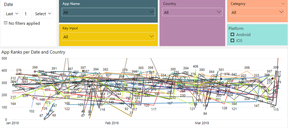
Currently, the graph is very messy as it has all of these elements display at the same time.
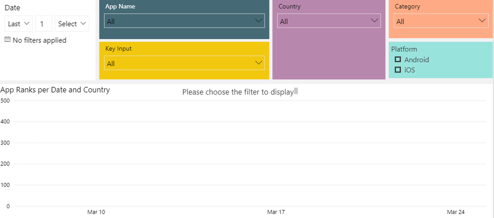
Is there a way that the graph will not display anything unless user chooses a specific value in the filter selection? I would like to have something like the attached screenshot (Desired State)
Many thanks in advance for your time and support. It is very much appreciated.
Best regards,
Trang


- Mark as New
- Bookmark
- Subscribe
- Mute
- Subscribe to RSS Feed
- Permalink
- Report Inappropriate Content
@Anonymous ,
You may take a look at the post below.
https://community.powerbi.com/t5/Desktop/Filtering-a-Demension-Filter/m-p/601883#M286404
If this post helps, then please consider Accept it as the solution to help the other members find it more quickly.
- Mark as New
- Bookmark
- Subscribe
- Mute
- Subscribe to RSS Feed
- Permalink
- Report Inappropriate Content
Hi @v-chuncz-msft , thank you very much for your help. I tried the solution in the message that you have sent me:
Measure =
CALCULATE ( SELECTEDVALUE ( Table1[Name] ), ALLSELECTED ( Table1[Name] ) )
However, it only works with 1 column. I have 4 columns that users must choose before so the graph can populate the correct data. Do you know how to use the above expression with 4 columns?
Many thanks,
Trang
Helpful resources

Power BI Dataviz World Championships
Vote for your favorite vizzies from the Power BI World Championship submissions!

Join our Community Sticker Challenge 2026
If you love stickers, then you will definitely want to check out our Community Sticker Challenge!

Power BI Monthly Update - January 2026
Check out the January 2026 Power BI update to learn about new features.

| User | Count |
|---|---|
| 58 | |
| 53 | |
| 43 | |
| 17 | |
| 16 |
| User | Count |
|---|---|
| 123 | |
| 107 | |
| 44 | |
| 32 | |
| 24 |
