Join the Fabric User Panel to shape the future of Fabric.
Share feedback directly with Fabric product managers, participate in targeted research studies and influence the Fabric roadmap.
Sign up now- Power BI forums
- Get Help with Power BI
- Desktop
- Service
- Report Server
- Power Query
- Mobile Apps
- Developer
- DAX Commands and Tips
- Custom Visuals Development Discussion
- Health and Life Sciences
- Power BI Spanish forums
- Translated Spanish Desktop
- Training and Consulting
- Instructor Led Training
- Dashboard in a Day for Women, by Women
- Galleries
- Data Stories Gallery
- Themes Gallery
- Contests Gallery
- QuickViz Gallery
- Quick Measures Gallery
- Visual Calculations Gallery
- Notebook Gallery
- Translytical Task Flow Gallery
- TMDL Gallery
- R Script Showcase
- Webinars and Video Gallery
- Ideas
- Custom Visuals Ideas (read-only)
- Issues
- Issues
- Events
- Upcoming Events
Get Fabric certified for FREE! Don't miss your chance! Learn more
- Power BI forums
- Forums
- Get Help with Power BI
- Desktop
- Dynamic date filter in graph
- Subscribe to RSS Feed
- Mark Topic as New
- Mark Topic as Read
- Float this Topic for Current User
- Bookmark
- Subscribe
- Printer Friendly Page
- Mark as New
- Bookmark
- Subscribe
- Mute
- Subscribe to RSS Feed
- Permalink
- Report Inappropriate Content
Dynamic date filter in graph
hi all,
i have a dashboard with a lot of bar graphs with the date (from a date table with day, week, month, quarter, year) on the X-axis and value on the Y-axis. You can switch from year to quarter to month with the arrow up and arrow down symbol on each bar graph, but then the user has to switch it in every bar graph. Is there way to create a measure based on a filter, where the user can select fe Year, Quarter, Month or Week, and that the x-axis of all graphs on that page switch to this selected value?
Thanks in advance,
Regards, Frank
Solved! Go to Solution.
- Mark as New
- Bookmark
- Subscribe
- Mute
- Subscribe to RSS Feed
- Permalink
- Report Inappropriate Content
Hi @frankhofmans
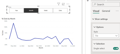
I implemented same fo my client usinf field parameter. please follow these steps:
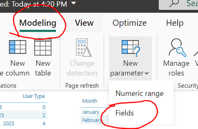
Step1: Go to modeling tab > select field option
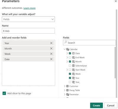
step2 : give Parameter name to X Axis > Drag and drop year, month qtr, date from right side to the left side.
Click create.
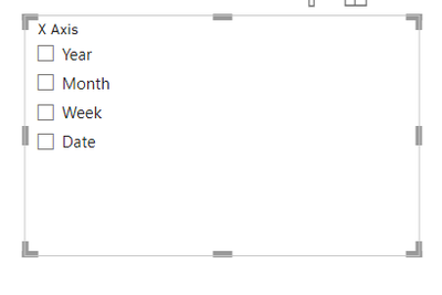
Step3: New slicer is added on page.
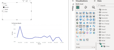
steps4: take your X axis value in Line chart X Axis.
step5: change slicer format to tiles. and if dont want any hierarchy change it to single select.
I hope this would work for you.
- Mark as New
- Bookmark
- Subscribe
- Mute
- Subscribe to RSS Feed
- Permalink
- Report Inappropriate Content
Hi,
You can create a field parameter and use it on the x-axis and on a slicer and it will work like you want.
Take a look at this linkedin post:https://www.linkedin.com/feed/update/urn:li:activity:7053624375098433538/
Is something like this that you're looking for?
Did I answer your question? Mark my post as a solution! Kudos are welcome.
Proud to be a Super User!
- Mark as New
- Bookmark
- Subscribe
- Mute
- Subscribe to RSS Feed
- Permalink
- Report Inappropriate Content
Hello @frankhofmans ,
you can create a 2 field parameters one for x-axis and one for y-axis and apply their values on all the visuals, thus when a field is selected then it will apply to all.
check how to do field parameters
https://learn.microsoft.com/en-us/power-bi/create-reports/power-bi-field-parameters
Proud to be a Super User! |  |
Helpful resources

Join our Community Sticker Challenge 2026
If you love stickers, then you will definitely want to check out our Community Sticker Challenge!

Power BI Monthly Update - January 2026
Check out the January 2026 Power BI update to learn about new features.

| User | Count |
|---|---|
| 65 | |
| 65 | |
| 45 | |
| 21 | |
| 18 |
| User | Count |
|---|---|
| 115 | |
| 114 | |
| 38 | |
| 36 | |
| 26 |
