Get certified for free when you join Fabric Data Days 2026 and dive into Fabric, Power BI, SQL, AI, and other essential data skills.
Join nowJuly 28 - August 9 | Final Round of the Power BI Dataviz World Championships. This is your chance. Learn more
Hi,
I have sales and calls data for each territory and region (See below). I would like to have a table that shows ‘Top 5’ at different levels (Area, Territory, some other in the future, etc). The user wants a slicer/dropdown that allows for changing the metric. For example, if a user selects "Area" in the dropdown then data in the below table should be filtered for those top 5 areas. Similarly for Territory. Please let me know if it makes sense. Thanks, Anuj
| Area | Territory | Calls | Sales |
| Area1 | Territory1 | 13 | 1357 |
| Area1 | Territory2 | 10 | 1066 |
| Area1 | Territory3 | 3 | 377 |
| Area1 | Territory4 | 63 | 6331 |
| Area2 | Territory5 | 41 | 4154 |
| Area2 | Territory6 | 71 | 7174 |
| Area2 | Territory7 | 12 | 1268 |
| Area2 | Territory8 | 15 | 1597 |
| Area3 | Territory9 | 22 | 2272 |
| Area3 | Territory10 | 32 | 3237 |
| Area3 | Territory11 | 80 | 8015 |
| Area3 | Territory12 | 29 | 2957 |
| Area4 | Territory13 | 18 | 1885 |
| Area4 | Territory14 | 18 | 1817 |
| Area4 | Territory15 | 29 | 2967 |
| Area4 | Territory16 | 46 | 4647 |
| Area5 | Territory17 | 9 | 929 |
| Area5 | Territory18 | 65 | 6572 |
| Area5 | Territory19 | 73 | 7301 |
| Area5 | Territory20 | 50 | 5073 |
| Area6 | Territory21 | 51 | 5144 |
| Area6 | Territory22 | 89 | 8964 |
| Area6 | Territory23 | 42 | 4231 |
| Area6 | Territory24 | 10 | 1084 |
Solved! Go to Solution.
Hi @itsmeanuj
Kindly check below results:
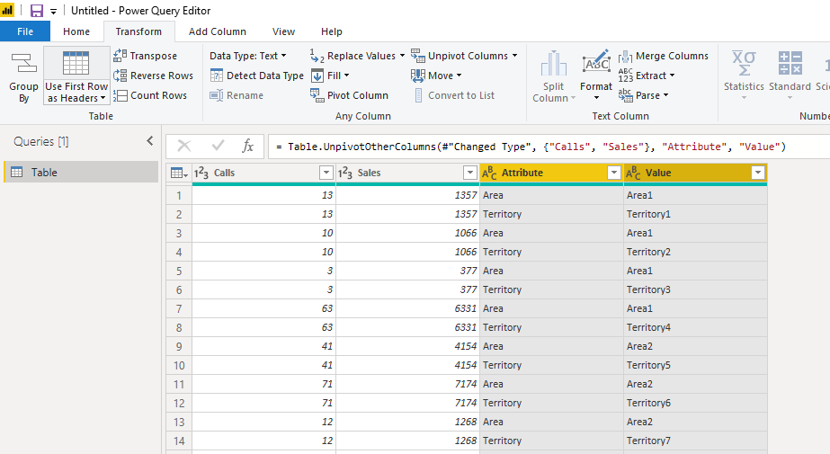
1. You should unpviot the columns firstly:
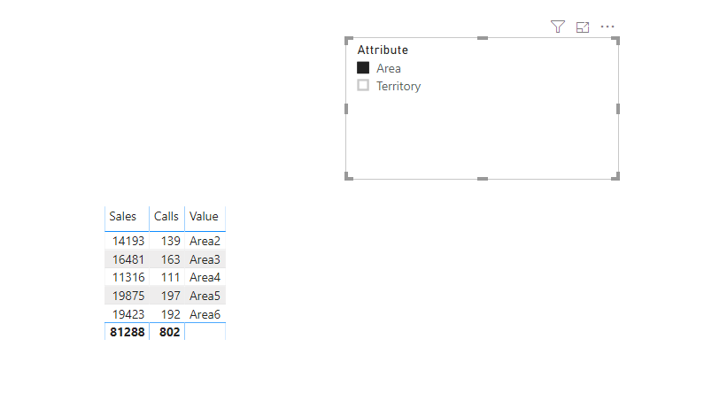
2. Then create the hierarchy by dragging the values to attibute, and generate the visual:
Pbix attached.
You have create different rank or Top N measure and then use filter like
and use top N to get top measure
https://docs.microsoft.com/en-us/dax/topn-function-dax
Appreciate your Kudos. In case, this is the solution you are looking for, mark it as the Solution.
In case it does not help, please provide additional information and mark me with @
Thanks. My Recent Blogs -Decoding Direct Query - Time Intelligence, Winner Coloring on MAP, HR Analytics, Power BI Working with Non-Standard TimeAnd Comparing Data Across Date Ranges
Proud to be a Datanaut Connect on Linkedin
@amitchandak - in the link you shared, there is only one column of date where are you calculating and filtering on different time periods. However, in my example, there are 2 different columns and based on the slicer filter it should show the "TOP N". e.g. if a user selects Area in slicer, result would be Top 5 areas on the basis of Sales.
| Area | Territory |
| Area | Sales | Calls |
| Area5 | 19875 | 197 |
| Area6 | 19423 | 192 |
| Area3 | 16481 | 163 |
| Area2 | 14193 | 139 |
| Area4 | 11316 | 111 |
Hi @itsmeanuj
Kindly check below results:
1. You should unpviot the columns firstly:
2. Then create the hierarchy by dragging the values to attibute, and generate the visual:
Pbix attached.
Join us in Barcelona for FabCon and SQLCon, the Fabric, Power BI, SQL, and AI community event. Save €200 with code FABCMTY200.
If you love stickers, then you will definitely want to check out our community sticker challenge, Barcelona edition!
Check out the July 2026 Power BI update to learn about new features.
| User | Count |
|---|---|
| 25 | |
| 23 | |
| 22 | |
| 17 | |
| 14 |
| User | Count |
|---|---|
| 25 | |
| 24 | |
| 20 | |
| 20 | |
| 19 |