FabCon is coming to Atlanta
Join us at FabCon Atlanta from March 16 - 20, 2026, for the ultimate Fabric, Power BI, AI and SQL community-led event. Save $200 with code FABCOMM.
Register now!- Power BI forums
- Get Help with Power BI
- Desktop
- Service
- Report Server
- Power Query
- Mobile Apps
- Developer
- DAX Commands and Tips
- Custom Visuals Development Discussion
- Health and Life Sciences
- Power BI Spanish forums
- Translated Spanish Desktop
- Training and Consulting
- Instructor Led Training
- Dashboard in a Day for Women, by Women
- Galleries
- Data Stories Gallery
- Themes Gallery
- Contests Gallery
- QuickViz Gallery
- Quick Measures Gallery
- Visual Calculations Gallery
- Notebook Gallery
- Translytical Task Flow Gallery
- TMDL Gallery
- R Script Showcase
- Webinars and Video Gallery
- Ideas
- Custom Visuals Ideas (read-only)
- Issues
- Issues
- Events
- Upcoming Events
The Power BI Data Visualization World Championships is back! Get ahead of the game and start preparing now! Learn more
- Power BI forums
- Forums
- Get Help with Power BI
- Desktop
- Re: Display multiple KPIs in one chart and matrix
- Subscribe to RSS Feed
- Mark Topic as New
- Mark Topic as Read
- Float this Topic for Current User
- Bookmark
- Subscribe
- Printer Friendly Page
- Mark as New
- Bookmark
- Subscribe
- Mute
- Subscribe to RSS Feed
- Permalink
- Report Inappropriate Content
Display multiple KPIs in one chart and matrix
Hello community,
I have calculated 7 KPIs in my data. Each one of these KPIs have its own column.
My problem is that I cannot find a way to use a visualization that can show all these KPIs in one chart and matrix.
The chart and matrix should include:
1. ATD (date)
2. Number of shipments (count and %)
3. KPI 1, 2, 3, 4, 5, 6 and 7. (Good, Bad and Missing data)
Is this possible?
Thank you for your assistance.
- Mark as New
- Bookmark
- Subscribe
- Mute
- Subscribe to RSS Feed
- Permalink
- Report Inappropriate Content
Hi again,
Thank you for your input. I still not there yet.
Basically, the data looks like this:
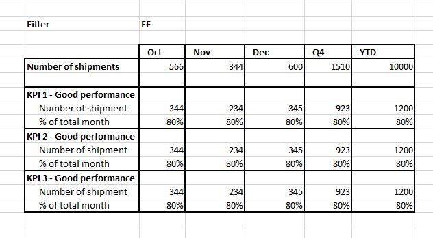
Now the matrix should look like this:
Any thoughts?
Thank you
- Mark as New
- Bookmark
- Subscribe
- Mute
- Subscribe to RSS Feed
- Permalink
- Report Inappropriate Content
Hi, @pcolas
Based on your description, It is suggested that you may use Multi KPI from MarketPlace, which is for presenting a key performance indicator along with a variety of supporting information.
Here are the key features include:
- KPI trend over time: hover-over the main chart to see a KPI for each date.
- Rich Formatting Options: set alternate titles, and tooltips, font sizes, colors, background colors.
- Numerous Chart Features: multi KPI support number types, precision, Y-axis tick marks, and hover-over tooltips.
- Sparkline Interpolation: Interpolate sparkline values to get rid of noisy points.
- Auto-Scaling: design a larger tile in your report with rich details. After pinning it to a Power BI Dashboard, you may resize it to smaller versions of the tile without losing essential details.
Best Regards
Allan
- Mark as New
- Bookmark
- Subscribe
- Mute
- Subscribe to RSS Feed
- Permalink
- Report Inappropriate Content
You can use Multi-Row Card
Or Refer -Multi KPI
https://appsource.microsoft.com/en-us/product/power-bi-visuals/WA104381763?src=office&tab=Overview
- Mark as New
- Bookmark
- Subscribe
- Mute
- Subscribe to RSS Feed
- Permalink
- Report Inappropriate Content
Helpful resources

Power BI Dataviz World Championships
The Power BI Data Visualization World Championships is back! Get ahead of the game and start preparing now!

| User | Count |
|---|---|
| 39 | |
| 37 | |
| 33 | |
| 32 | |
| 29 |
| User | Count |
|---|---|
| 132 | |
| 88 | |
| 82 | |
| 68 | |
| 64 |


