- Power BI forums
- Get Help with Power BI
- Desktop
- Service
- Report Server
- Power Query
- Mobile Apps
- Developer
- DAX Commands and Tips
- Custom Visuals Development Discussion
- Health and Life Sciences
- Power BI Spanish forums
- Translated Spanish Desktop
- Training and Consulting
- Instructor Led Training
- Dashboard in a Day for Women, by Women
- Galleries
- Data Stories Gallery
- Themes Gallery
- Contests Gallery
- QuickViz Gallery
- Quick Measures Gallery
- Visual Calculations Gallery
- Notebook Gallery
- Translytical Task Flow Gallery
- TMDL Gallery
- R Script Showcase
- Webinars and Video Gallery
- Ideas
- Custom Visuals Ideas (read-only)
- Issues
- Issues
- Events
- Upcoming Events
Learn from the best! Meet the four finalists headed to the FINALS of the Power BI Dataviz World Championships! Register now
- Power BI forums
- Forums
- Get Help with Power BI
- Desktop
- Display graph data with filter
- Subscribe to RSS Feed
- Mark Topic as New
- Mark Topic as Read
- Float this Topic for Current User
- Bookmark
- Subscribe
- Printer Friendly Page
- Mark as New
- Bookmark
- Subscribe
- Mute
- Subscribe to RSS Feed
- Permalink
- Report Inappropriate Content
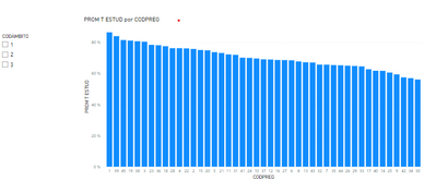
Display graph data with filter
Hello
I have a question regarding a Graph.
I want to make a Bar Chart with all the questions that the students answered in my survey, however, there are too many and the bar graph is not understood. What I would like is that the Graph is built from the filter you put, so that you can choose the group of questions you want to see.
How can I build the Graph so that, at the beginning it looks blank and is with the filter shows the data?
- Mark as New
- Bookmark
- Subscribe
- Mute
- Subscribe to RSS Feed
- Permalink
- Report Inappropriate Content
Hello
Thank you very much for your answer, I created the measure you recommended, however, I do not know how to enter it in the graph, since when I put it in the fields, the graph still appears.
- Mark as New
- Bookmark
- Subscribe
- Mute
- Subscribe to RSS Feed
- Permalink
- Report Inappropriate Content
Can you show me the measure please? Thanks
- Mark as New
- Bookmark
- Subscribe
- Mute
- Subscribe to RSS Feed
- Permalink
- Report Inappropriate Content
Hi @Syndicate_Admin !
In your measure you can try using the function ISFILTERED. So:
IF(
    ISFILTERED( CategoryToFilter ),
    ValueToDisplay,
    BLANK()
)
Let me know if that helps!
Helpful resources
| User | Count |
|---|---|
| 50 | |
| 39 | |
| 29 | |
| 18 | |
| 17 |
| User | Count |
|---|---|
| 67 | |
| 57 | |
| 40 | |
| 22 | |
| 19 |


