Get Fabric certified for FREE!
Don't miss your chance to take the Fabric Data Engineer (DP-600) exam for FREE! Find out how by attending the DP-600 session on April 23rd (pacific time), live or on-demand.
Learn more- Power BI forums
- Get Help with Power BI
- Desktop
- Service
- Report Server
- Power Query
- Mobile Apps
- Developer
- DAX Commands and Tips
- Custom Visuals Development Discussion
- Health and Life Sciences
- Power BI Spanish forums
- Translated Spanish Desktop
- Training and Consulting
- Instructor Led Training
- Dashboard in a Day for Women, by Women
- Galleries
- Data Stories Gallery
- Themes Gallery
- Contests Gallery
- QuickViz Gallery
- Quick Measures Gallery
- Visual Calculations Gallery
- Notebook Gallery
- Translytical Task Flow Gallery
- TMDL Gallery
- R Script Showcase
- Webinars and Video Gallery
- Ideas
- Custom Visuals Ideas (read-only)
- Issues
- Issues
- Events
- Upcoming Events
Next up in the FabCon + SQLCon recap series: The roadmap for Microsoft SQL and Maximizing Developer experiences in Fabric. All sessions are available on-demand after the live show. Register now
- Power BI forums
- Forums
- Get Help with Power BI
- Desktop
- Custom Data bars
- Subscribe to RSS Feed
- Mark Topic as New
- Mark Topic as Read
- Float this Topic for Current User
- Bookmark
- Subscribe
- Printer Friendly Page
- Mark as New
- Bookmark
- Subscribe
- Mute
- Subscribe to RSS Feed
- Permalink
- Report Inappropriate Content
Custom Data bars
Hello everyone,
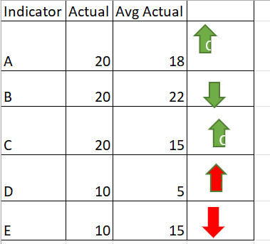
how can i active below data icons in power bi.
For Indicator (A) Actual is greater than Avg Actual i need to have up arrow with green colour
For Indicator (B) Actual is less than Avg Actual i need to have down arrow with green colour
For Indicator (C) Actual is greater than Avg Actual i need to have up arrow with green
For indicator (D) Actual is greater than Avg Actual i need to have up arrow with red
For indicator (E) Actual is less than Avg Actual i need to have down arrow with red
Solved! Go to Solution.
- Mark as New
- Bookmark
- Subscribe
- Mute
- Subscribe to RSS Feed
- Permalink
- Report Inappropriate Content
Hi @_Abhilash ,
You can try to create a measure with your scenarios and give it a value. For example,
CondiIcons =

VAR _Actual = YOUR_ACTUAL_SUM_MEASURE
VAR _Avg = YOUR_AVG_MEASURE
VAR _Indicator = MAX(YOUR_TABLE[Indicator])

RETURN

SWITCH( TRUE(),
_Indicator = "A" && _Actual > _Avg, 1,      // Green Up
_Indicator = "B" && _Actual < _Avg, 2,      // Green Down
_Indicator = "C" && _Actual > _Avg, 1,      // Green Up
_Indicator = "D" && _Actual > _Avg, 3,      // Red Up
_Indicator = "E" && _Actual < _Avg, 4       // Red Down
)
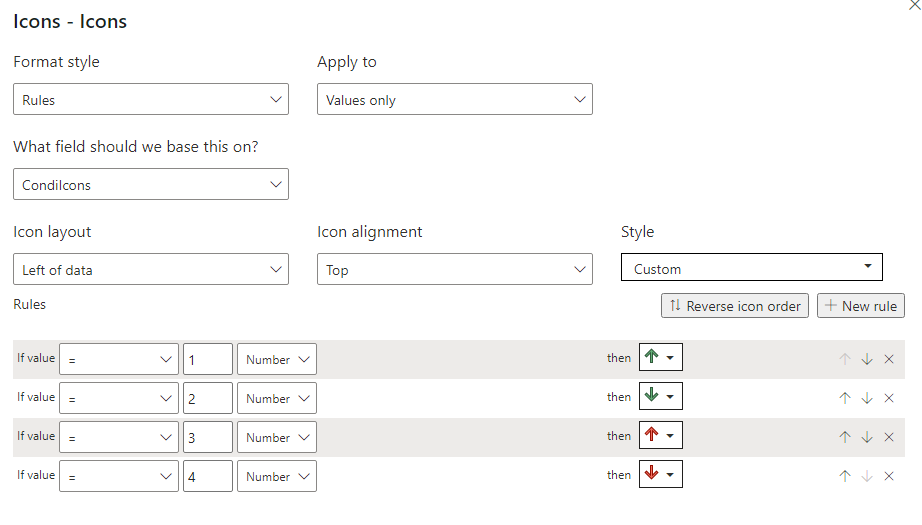
Then in the conditional format settings, turn on Icons and have the setting to this:
Let me know if this is what you're looking for.
Did I answer your question?
Please help by clicking the thumbs up button and mark my post as a solution!
- Mark as New
- Bookmark
- Subscribe
- Mute
- Subscribe to RSS Feed
- Permalink
- Report Inappropriate Content
Hi @_Abhilash
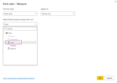
You can try this, create the 2 measures below,
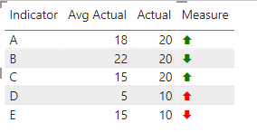
Measure = IF(MIN('Table'[Actual])>MIN('Table'[Avg Actual]), UNICHAR(129093),UNICHAR(129095))Color = IF(MIN('Table'[Indicator]) in {"A","B","C"}, "green","red")
result
Best Regards,
Community Support Team _Tang
If this post helps, please consider Accept it as the solution to help the other members find it more quickly.
- Mark as New
- Bookmark
- Subscribe
- Mute
- Subscribe to RSS Feed
- Permalink
- Report Inappropriate Content
Hi @_Abhilash ,
You can try to create a measure with your scenarios and give it a value. For example,
CondiIcons =

VAR _Actual = YOUR_ACTUAL_SUM_MEASURE
VAR _Avg = YOUR_AVG_MEASURE
VAR _Indicator = MAX(YOUR_TABLE[Indicator])

RETURN

SWITCH( TRUE(),
_Indicator = "A" && _Actual > _Avg, 1,      // Green Up
_Indicator = "B" && _Actual < _Avg, 2,      // Green Down
_Indicator = "C" && _Actual > _Avg, 1,      // Green Up
_Indicator = "D" && _Actual > _Avg, 3,      // Red Up
_Indicator = "E" && _Actual < _Avg, 4       // Red Down
)
Then in the conditional format settings, turn on Icons and have the setting to this:
Let me know if this is what you're looking for.
Did I answer your question?
Please help by clicking the thumbs up button and mark my post as a solution!
- Mark as New
- Bookmark
- Subscribe
- Mute
- Subscribe to RSS Feed
- Permalink
- Report Inappropriate Content
@hnguy71 thanks for the solution.
i have i have 26 inidcators from A to Z, Any other option aprart from using switch because if i use switch i need to enter 26 inidcators manually.
Thanks & Regards
Abhilash.P
- Mark as New
- Bookmark
- Subscribe
- Mute
- Subscribe to RSS Feed
- Permalink
- Report Inappropriate Content
Hi @_Abhilash ,
Sure it's possible to use a configuration dimension with a relationship to your indicators to get the right colors and icons, or if you can understand your patterns a bit more we can remove your indicators totally. Currently it's unclear how you're coming up with the logic for your arrows.
1. Why is D an up red arrow against A which follows the same pattern?
2. Why is E a down red arrow when A also follows the same pattern?
Did I answer your question?
Please help by clicking the thumbs up button and mark my post as a solution!
Helpful resources

New to Fabric Survey
If you have recently started exploring Fabric, we'd love to hear how it's going. Your feedback can help with product improvements.

Power BI DataViz World Championships - June 2026
A new Power BI DataViz World Championship is coming this June! Don't miss out on submitting your entry.

FabCon &SQLCon Highlights
Experience the highlights from FabCon & SQLCon, available live and on-demand starting April 14th.

| User | Count |
|---|---|
| 48 | |
| 46 | |
| 41 | |
| 20 | |
| 17 |
| User | Count |
|---|---|
| 70 | |
| 67 | |
| 32 | |
| 27 | |
| 26 |


