FabCon is coming to Atlanta
Join us at FabCon Atlanta from March 16 - 20, 2026, for the ultimate Fabric, Power BI, AI and SQL community-led event. Save $200 with code FABCOMM.
Register now!- Power BI forums
- Get Help with Power BI
- Desktop
- Service
- Report Server
- Power Query
- Mobile Apps
- Developer
- DAX Commands and Tips
- Custom Visuals Development Discussion
- Health and Life Sciences
- Power BI Spanish forums
- Translated Spanish Desktop
- Training and Consulting
- Instructor Led Training
- Dashboard in a Day for Women, by Women
- Galleries
- Data Stories Gallery
- Themes Gallery
- Contests Gallery
- QuickViz Gallery
- Quick Measures Gallery
- Visual Calculations Gallery
- Notebook Gallery
- Translytical Task Flow Gallery
- TMDL Gallery
- R Script Showcase
- Webinars and Video Gallery
- Ideas
- Custom Visuals Ideas (read-only)
- Issues
- Issues
- Events
- Upcoming Events
Vote for your favorite vizzies from the Power BI Dataviz World Championship submissions. Vote now!
- Power BI forums
- Forums
- Get Help with Power BI
- Desktop
- Create monthly overview
- Subscribe to RSS Feed
- Mark Topic as New
- Mark Topic as Read
- Float this Topic for Current User
- Bookmark
- Subscribe
- Printer Friendly Page
- Mark as New
- Bookmark
- Subscribe
- Mute
- Subscribe to RSS Feed
- Permalink
- Report Inappropriate Content
Create monthly overview
Hi,
I'm a newbie at PowerBI, and need some startup help for my data shaping. I have a table similar to the shown below (just a bit larger). What I want is to shape the data in order to be able to calculate total revenue, profit, etc. on each unit, and also to see the numbers for each month.
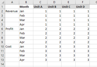
Some basic guidance on how to shape the data would be very much appreciated.
Solved! Go to Solution.
- Mark as New
- Bookmark
- Subscribe
- Mute
- Subscribe to RSS Feed
- Permalink
- Report Inappropriate Content
Hi stiand ,
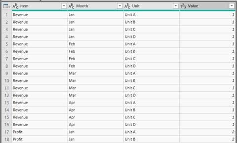
I create sample data to reproduce the scenario showing below picture ,setting the Item column has three instances as Revenue, Profit, Cost, and the Unit column has five instances from Unit A to Unit D ,when transfer your Excel format data to query format data in Query Edit.
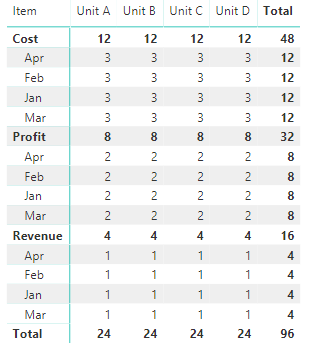
The Matrix visual displays the whole data like below picture.
Then, create measure named "Sum Item" to calculate total Revenue, Profit, Cost, assuming the table named Table1.
Sum Item = CALCULATE(SUM(Table1[Value]),ALLSELECTED(Table1[Item]))
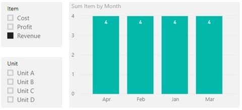
Finally, choose Clustered column chart visual to display the total Revenue, Profit, Cost for each month. For example, when make some selections in slicers, return the result showing below picture.
Here is my test pbix file link: https://qiuyunus-my.sharepoint.com/:u:/g/personal/pbipro_qiuyunus_onmicrosoft_com/EcuHdbGGNHFJq5y-11...
Best Regards,
Amy
If this post helps, then please consider Accept it as the solution to help the other members find it more quickly.
- Mark as New
- Bookmark
- Subscribe
- Mute
- Subscribe to RSS Feed
- Permalink
- Report Inappropriate Content
Hi stiand ,
I create sample data to reproduce the scenario showing below picture ,setting the Item column has three instances as Revenue, Profit, Cost, and the Unit column has five instances from Unit A to Unit D ,when transfer your Excel format data to query format data in Query Edit.

The Matrix visual displays the whole data like below picture.
Then, create measure named "Sum Item" to calculate total Revenue, Profit, Cost, assuming the table named Table1.
Sum Item = CALCULATE(SUM(Table1[Value]),ALLSELECTED(Table1[Item]))
Finally, choose Clustered column chart visual to display the total Revenue, Profit, Cost for each month. For example, when make some selections in slicers, return the result showing below picture.
Here is my test pbix file link: https://qiuyunus-my.sharepoint.com/:u:/g/personal/pbipro_qiuyunus_onmicrosoft_com/EcuHdbGGNHFJq5y-11...
Best Regards,
Amy
If this post helps, then please consider Accept it as the solution to help the other members find it more quickly.
- Mark as New
- Bookmark
- Subscribe
- Mute
- Subscribe to RSS Feed
- Permalink
- Report Inappropriate Content
Thanks for help!
The main problem I had was to pivot the columns properly. So for other newbies, the different pivotfunctions in queries are effective.
Helpful resources

Power BI Dataviz World Championships
Vote for your favorite vizzies from the Power BI World Championship submissions!

Join our Community Sticker Challenge 2026
If you love stickers, then you will definitely want to check out our Community Sticker Challenge!

Power BI Monthly Update - January 2026
Check out the January 2026 Power BI update to learn about new features.

| User | Count |
|---|---|
| 56 | |
| 52 | |
| 45 | |
| 17 | |
| 16 |
| User | Count |
|---|---|
| 108 | |
| 108 | |
| 39 | |
| 33 | |
| 25 |
