Join the Fabric User Panel to shape the future of Fabric.
Share feedback directly with Fabric product managers, participate in targeted research studies and influence the Fabric roadmap.
Sign up now- Power BI forums
- Get Help with Power BI
- Desktop
- Service
- Report Server
- Power Query
- Mobile Apps
- Developer
- DAX Commands and Tips
- Custom Visuals Development Discussion
- Health and Life Sciences
- Power BI Spanish forums
- Translated Spanish Desktop
- Training and Consulting
- Instructor Led Training
- Dashboard in a Day for Women, by Women
- Galleries
- Data Stories Gallery
- Themes Gallery
- Contests Gallery
- QuickViz Gallery
- Quick Measures Gallery
- Visual Calculations Gallery
- Notebook Gallery
- Translytical Task Flow Gallery
- TMDL Gallery
- R Script Showcase
- Webinars and Video Gallery
- Ideas
- Custom Visuals Ideas (read-only)
- Issues
- Issues
- Events
- Upcoming Events
Get Fabric certified for FREE! Don't miss your chance! Learn more
- Power BI forums
- Forums
- Get Help with Power BI
- Desktop
- Re: Create Rundown/Burndown Curve
- Subscribe to RSS Feed
- Mark Topic as New
- Mark Topic as Read
- Float this Topic for Current User
- Bookmark
- Subscribe
- Printer Friendly Page
- Mark as New
- Bookmark
- Subscribe
- Mute
- Subscribe to RSS Feed
- Permalink
- Report Inappropriate Content
Create Rundown/Burndown Curve
Hi all,
My company has recently adopted Power BI as the progress reporting tool of choice and I'm in process of learning how to use it.
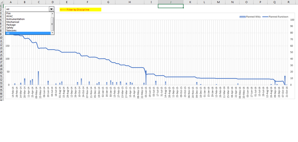
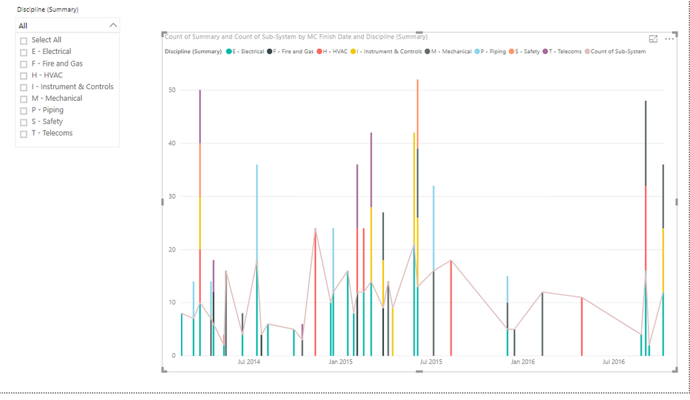
The below screen shot shows a rundown/burndown curve I've developed in Excel. I need to re-create something similar in Power BI. The 'Progress Dashboard' link has a power BI file that I've uploaded the same two spreadsheets required to make the rundown curve as seen in the screenshot.
The common column between the two tables is titled "sub-system".
The "MC Finish Date" table only has two column of importance (Sub-system and MC Finish Date).
The "Checksheets" table also only has two columns of importance (Sub-System and Discipline (Summary)).
I only started reviewing Power BI turorials a few days ago so would appreciate any assistance people can offer.
Thanks in advance.
Solved! Go to Solution.
- Mark as New
- Bookmark
- Subscribe
- Mute
- Subscribe to RSS Feed
- Permalink
- Report Inappropriate Content
Thanks for replying Jimmy.
In order for me to make it work in Excel I had to lookup the MC Finish Date for each sub-system from the MC Finish Date table and count how many dates fell in a particular week. Once calculated, I'd tabulate the totals and generate the rundown curve accordingly. The below link shows how I do it in excel:
https://1drv.ms/f/s!Ap_6-ICMV1K6ed9-ueXp0nMNL-0
This is the sequence of activities required to generate in excel:
1. Import MC finish date to checksheet tab (column AN)
2. Count total weekly completed sub-systems (CalcSheet tab - columns K3:EU3)
3. Generate rundown figures for chart (CalcSheet tab - columns K4:EU4)
4. Create chart with above figures (Dashboard tab charts)
Hope this helps shine a bit more light on what I need to develop.
- Mark as New
- Bookmark
- Subscribe
- Mute
- Subscribe to RSS Feed
- Permalink
- Report Inappropriate Content
- Mark as New
- Bookmark
- Subscribe
- Mute
- Subscribe to RSS Feed
- Permalink
- Report Inappropriate Content
Thanks for replying Jimmy.
In order for me to make it work in Excel I had to lookup the MC Finish Date for each sub-system from the MC Finish Date table and count how many dates fell in a particular week. Once calculated, I'd tabulate the totals and generate the rundown curve accordingly. The below link shows how I do it in excel:
https://1drv.ms/f/s!Ap_6-ICMV1K6ed9-ueXp0nMNL-0
This is the sequence of activities required to generate in excel:
1. Import MC finish date to checksheet tab (column AN)
2. Count total weekly completed sub-systems (CalcSheet tab - columns K3:EU3)
3. Generate rundown figures for chart (CalcSheet tab - columns K4:EU4)
4. Create chart with above figures (Dashboard tab charts)
Hope this helps shine a bit more light on what I need to develop.
- Mark as New
- Bookmark
- Subscribe
- Mute
- Subscribe to RSS Feed
- Permalink
- Report Inappropriate Content
Above link now contains solution.
Helpful resources

Join our Community Sticker Challenge 2026
If you love stickers, then you will definitely want to check out our Community Sticker Challenge!

Power BI Monthly Update - January 2026
Check out the January 2026 Power BI update to learn about new features.

| User | Count |
|---|---|
| 64 | |
| 63 | |
| 48 | |
| 21 | |
| 18 |
| User | Count |
|---|---|
| 119 | |
| 117 | |
| 38 | |
| 36 | |
| 27 |


