FabCon is coming to Atlanta
Join us at FabCon Atlanta from March 16 - 20, 2026, for the ultimate Fabric, Power BI, AI and SQL community-led event. Save $200 with code FABCOMM.
Register now!- Power BI forums
- Get Help with Power BI
- Desktop
- Service
- Report Server
- Power Query
- Mobile Apps
- Developer
- DAX Commands and Tips
- Custom Visuals Development Discussion
- Health and Life Sciences
- Power BI Spanish forums
- Translated Spanish Desktop
- Training and Consulting
- Instructor Led Training
- Dashboard in a Day for Women, by Women
- Galleries
- Data Stories Gallery
- Themes Gallery
- Contests Gallery
- QuickViz Gallery
- Quick Measures Gallery
- Visual Calculations Gallery
- Notebook Gallery
- Translytical Task Flow Gallery
- TMDL Gallery
- R Script Showcase
- Webinars and Video Gallery
- Ideas
- Custom Visuals Ideas (read-only)
- Issues
- Issues
- Events
- Upcoming Events
The Power BI Data Visualization World Championships is back! Get ahead of the game and start preparing now! Learn more
- Power BI forums
- Forums
- Get Help with Power BI
- Desktop
- Counting data per day if data rows are date/time f...
- Subscribe to RSS Feed
- Mark Topic as New
- Mark Topic as Read
- Float this Topic for Current User
- Bookmark
- Subscribe
- Printer Friendly Page
- Mark as New
- Bookmark
- Subscribe
- Mute
- Subscribe to RSS Feed
- Permalink
- Report Inappropriate Content
Counting data per day if data rows are date/time format
Hi, I am just starting to use Power BI and currently, I am trying to generate a graph of user logins. My data sample looks like:
| Server | Date | User |
| ServerA | 10/9/2019 12:24 | User A |
| ServerA | 10/9/2019 14:16 | User A |
| ServerA | 10/11/2019 8:44 | User B |
| ServerA | 10/11/2019 13:54 | User C |
| ServerB | 10/9/2019 14:35 | User D |
| ServerA | 10/18/2019 16:55 | User B |
| ServerA | 10/18/2019 17:41 | User C |
| ServerA | 10/21/2019 12:05 | User D |
| ServerB | 10/24/2019 8:23 | User C |
| ServerB | 10/24/2019 9:30 | User C |
| ServerB | 10/24/2019 13:22 | User C |
| ServerB | 10/24/2019 17:52 | User C |
I would like to create a bar graph, based on filtered date, showing how many users logged in per day. I have tried to create a date dimension table and created a relationship with my data table, but I can't seem to just show the graph that I would like to have. Do I need to create a measure to get what I would like to do? Unfortunately, I have not used DAX yet, and hopefully, I will be able to learn that as well in the future.
Hoping somebody can show me how I can do this. TIA!
Solved! Go to Solution.
- Mark as New
- Bookmark
- Subscribe
- Mute
- Subscribe to RSS Feed
- Permalink
- Report Inappropriate Content
Hi @Anonymous
Could you please let me know if you'd like to get this one?
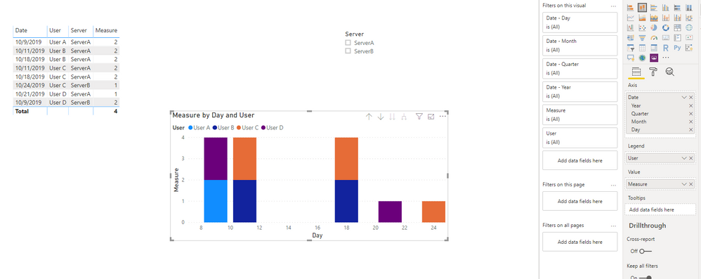
1. I changed your date/time column as Date in power query:
2. Add the measure :
Measure = CALCULATE(DISTINCTCOUNT(Table1[User]),ALL(Table1),VALUES(Table1[Date]))3. Create the visual:
Pbix attached.
If this post helps, then please consider Accept it as the solution to help the other members find it more
quickly.
- Mark as New
- Bookmark
- Subscribe
- Mute
- Subscribe to RSS Feed
- Permalink
- Report Inappropriate Content
Thanks for the tip! What I did was similar to this, creating a new column with just the date, no timing. I was finally able to achieve what I wanted.
- Mark as New
- Bookmark
- Subscribe
- Mute
- Subscribe to RSS Feed
- Permalink
- Report Inappropriate Content
HI,
Can u share ur file and a required look in excel
Please check
https://drive.google.com/file/d/1lfEDPAzvvLrBPKZgfT07WCVsm1L0xDsZ/view?usp=sharing
is it help u?
TIA
- Mark as New
- Bookmark
- Subscribe
- Mute
- Subscribe to RSS Feed
- Permalink
- Report Inappropriate Content
Hi @nahid3152,
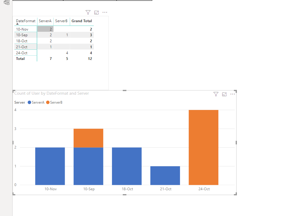
Thanks for sharing some thoughts on this and sharing your sample file. Unfortunately, I am unable to share online files due to org's security policy. However, I am attaching an Excel graph which is what I want to have in Power BI.
The file you shared is not what I was looking for.

Any thoughts on how to do this in Power BI?
- Mark as New
- Bookmark
- Subscribe
- Mute
- Subscribe to RSS Feed
- Permalink
- Report Inappropriate Content
HI @Anonymous
Here is the link
https://drive.google.com/file/d/1zAzPdKyhjLabfpN-c_-aiHodQMr52pSG/view?usp=sharing
Is it OK NOW?
- Mark as New
- Bookmark
- Subscribe
- Mute
- Subscribe to RSS Feed
- Permalink
- Report Inappropriate Content
Sorry @nahid3152, as there will be hundreds of servers on the official data, I was hoping that I will just be able to create the visual without doing another pivot. I just showed the graph I created in Excel as an example of what I want the end result to be, just using the original data source. Is that possible in Power BI? Or do I need to create a measure to calculate the number of users who logged in per day? Thanks!
- Mark as New
- Bookmark
- Subscribe
- Mute
- Subscribe to RSS Feed
- Permalink
- Report Inappropriate Content
Helpful resources

Power BI Dataviz World Championships
The Power BI Data Visualization World Championships is back! Get ahead of the game and start preparing now!

| User | Count |
|---|---|
| 39 | |
| 37 | |
| 33 | |
| 32 | |
| 29 |
| User | Count |
|---|---|
| 132 | |
| 88 | |
| 82 | |
| 68 | |
| 64 |


