Join the #PBI10 DataViz contest
Power BI is turning 10, and we’re marking the occasion with a special community challenge. Use your creativity to tell a story, uncover trends, or highlight something unexpected.
Get started- Power BI forums
- Get Help with Power BI
- Desktop
- Service
- Report Server
- Power Query
- Mobile Apps
- Developer
- DAX Commands and Tips
- Custom Visuals Development Discussion
- Health and Life Sciences
- Power BI Spanish forums
- Translated Spanish Desktop
- Training and Consulting
- Instructor Led Training
- Dashboard in a Day for Women, by Women
- Galleries
- Webinars and Video Gallery
- Data Stories Gallery
- Themes Gallery
- Contests Gallery
- Quick Measures Gallery
- Notebook Gallery
- Translytical Task Flow Gallery
- R Script Showcase
- Ideas
- Custom Visuals Ideas (read-only)
- Issues
- Issues
- Events
- Upcoming Events
Join us for an expert-led overview of the tools and concepts you'll need to become a Certified Power BI Data Analyst and pass exam PL-300. Register now.
- Power BI forums
- Forums
- Get Help with Power BI
- Desktop
- Re: Counting data per day if data rows are date/ti...
- Subscribe to RSS Feed
- Mark Topic as New
- Mark Topic as Read
- Float this Topic for Current User
- Bookmark
- Subscribe
- Printer Friendly Page
- Mark as New
- Bookmark
- Subscribe
- Mute
- Subscribe to RSS Feed
- Permalink
- Report Inappropriate Content
Counting data per day if data rows are date/time format
Hi, I am just starting to use Power BI and currently, I am trying to generate a graph of user logins. My data sample looks like:
| Server | Date | User |
| ServerA | 10/9/2019 12:24 | User A |
| ServerA | 10/9/2019 14:16 | User A |
| ServerA | 10/11/2019 8:44 | User B |
| ServerA | 10/11/2019 13:54 | User C |
| ServerB | 10/9/2019 14:35 | User D |
| ServerA | 10/18/2019 16:55 | User B |
| ServerA | 10/18/2019 17:41 | User C |
| ServerA | 10/21/2019 12:05 | User D |
| ServerB | 10/24/2019 8:23 | User C |
| ServerB | 10/24/2019 9:30 | User C |
| ServerB | 10/24/2019 13:22 | User C |
| ServerB | 10/24/2019 17:52 | User C |
I would like to create a bar graph, based on filtered date, showing how many users logged in per day. I have tried to create a date dimension table and created a relationship with my data table, but I can't seem to just show the graph that I would like to have. Do I need to create a measure to get what I would like to do? Unfortunately, I have not used DAX yet, and hopefully, I will be able to learn that as well in the future.
Hoping somebody can show me how I can do this. TIA!
Solved! Go to Solution.
- Mark as New
- Bookmark
- Subscribe
- Mute
- Subscribe to RSS Feed
- Permalink
- Report Inappropriate Content
Hi @roosechua
Could you please let me know if you'd like to get this one?
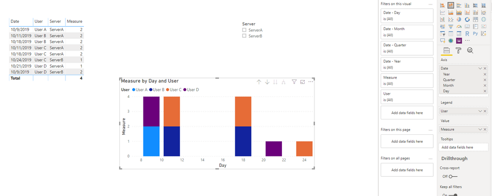
1. I changed your date/time column as Date in power query:
2. Add the measure :
Measure = CALCULATE(DISTINCTCOUNT(Table1[User]),ALL(Table1),VALUES(Table1[Date]))3. Create the visual:
Pbix attached.
If this post helps, then please consider Accept it as the solution to help the other members find it more
quickly.
- Mark as New
- Bookmark
- Subscribe
- Mute
- Subscribe to RSS Feed
- Permalink
- Report Inappropriate Content
Thanks for the tip! What I did was similar to this, creating a new column with just the date, no timing. I was finally able to achieve what I wanted.
- Mark as New
- Bookmark
- Subscribe
- Mute
- Subscribe to RSS Feed
- Permalink
- Report Inappropriate Content
HI,
Can u share ur file and a required look in excel
Please check
https://drive.google.com/file/d/1lfEDPAzvvLrBPKZgfT07WCVsm1L0xDsZ/view?usp=sharing
is it help u?
TIA
- Mark as New
- Bookmark
- Subscribe
- Mute
- Subscribe to RSS Feed
- Permalink
- Report Inappropriate Content
Hi @nahid3152,
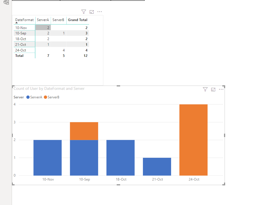
Thanks for sharing some thoughts on this and sharing your sample file. Unfortunately, I am unable to share online files due to org's security policy. However, I am attaching an Excel graph which is what I want to have in Power BI.
The file you shared is not what I was looking for.

Any thoughts on how to do this in Power BI?
- Mark as New
- Bookmark
- Subscribe
- Mute
- Subscribe to RSS Feed
- Permalink
- Report Inappropriate Content
HI @roosechua
Here is the link
https://drive.google.com/file/d/1zAzPdKyhjLabfpN-c_-aiHodQMr52pSG/view?usp=sharing
Is it OK NOW?
- Mark as New
- Bookmark
- Subscribe
- Mute
- Subscribe to RSS Feed
- Permalink
- Report Inappropriate Content
Sorry @nahid3152, as there will be hundreds of servers on the official data, I was hoping that I will just be able to create the visual without doing another pivot. I just showed the graph I created in Excel as an example of what I want the end result to be, just using the original data source. Is that possible in Power BI? Or do I need to create a measure to calculate the number of users who logged in per day? Thanks!
- Mark as New
- Bookmark
- Subscribe
- Mute
- Subscribe to RSS Feed
- Permalink
- Report Inappropriate Content
Helpful resources

Join our Fabric User Panel
This is your chance to engage directly with the engineering team behind Fabric and Power BI. Share your experiences and shape the future.

Power BI Monthly Update - June 2025
Check out the June 2025 Power BI update to learn about new features.

| User | Count |
|---|---|
| 64 | |
| 55 | |
| 53 | |
| 36 | |
| 34 |
| User | Count |
|---|---|
| 85 | |
| 73 | |
| 55 | |
| 45 | |
| 43 |


