Get certified for free when you join Fabric Data Days 2026 and dive into Fabric, Power BI, SQL, AI, and other essential data skills.
Join nowJuly 7 - July 17 | Round 2 of the Power BI Dataviz World Championships. Don't miss your chance! Learn more
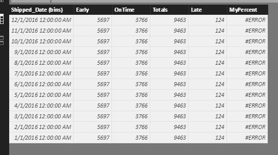
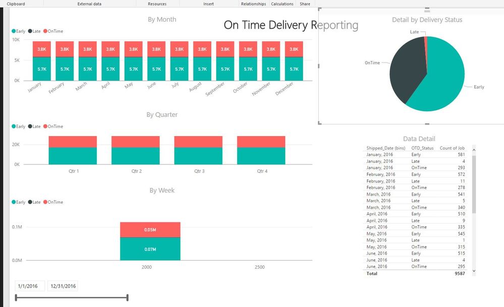
I have a delivery table that contains a date column and a status column. I'm looking to graph that data by status by month and rolling week. The data appears correctly on the Data Detail table I made (pictured), but will not graph accordingly. I've created a table (OTD) that bins the data by month, but does not sum the status correctly by month as it should. Being new to DAX, I'm not sure how to capture both the date range and the status in my column. Any help would be gratefully appreciated.OTD Power BI Table
Graphs
vw_PBI-OnTimeDelivery SQL View
@Phil_Seamark Here's my code for the OTD table.
OTD = DISTINCT('vw_PBI-OnTimeDelivery'[Shipped_Date (bins)])
Hi @kyleldi,
If you want to get the distinct count of selected date range, you can try to use below formula:
Count of Selected DateRange=
var selectedMin=FIRSTDATE(ALLSELECTED('Table'[Date]))
var selectedMax=LASTDATE(ALLSELECTED('Table'[Date]))
return
CALCULATE(DISTINCTCOUNT('vw_PBI-OnTimeDelivery'[Shipped_Date (bins)]),FILTER(ALL('Table'),[Date]>=selectedMin&&[Date]<=selectedMax))
Notice: table is the source table of the date slicer.
Regards,
Xiaoxin Sheng
Join us in Barcelona for FabCon and SQLCon, the Fabric, Power BI, SQL, and AI community event. Save €200 with code FABCMTY200.
Join Data Days 2026: 60 days of free live/on-demand sessions, challenges, study groups, and certification opportunities.
| User | Count |
|---|---|
| 26 | |
| 23 | |
| 19 | |
| 18 | |
| 15 |
| User | Count |
|---|---|
| 46 | |
| 44 | |
| 43 | |
| 36 | |
| 31 |